
Stockholm Design Lab has created a visual identity for the remastering of recording artist Ted Gärdestad inspired by the music’s note sheets, movement, and flow.
The creative team of Stockholm Design Lab had the pleasure of visualizing the remastering of Ted Gärdestad, who was one of Sweden’s most acclaimed recording artists. With lyrics written by his brother Kenneth, the singer and musician managed to capture hope, heartbreak, and a love for nature in a variety of melodic songs.
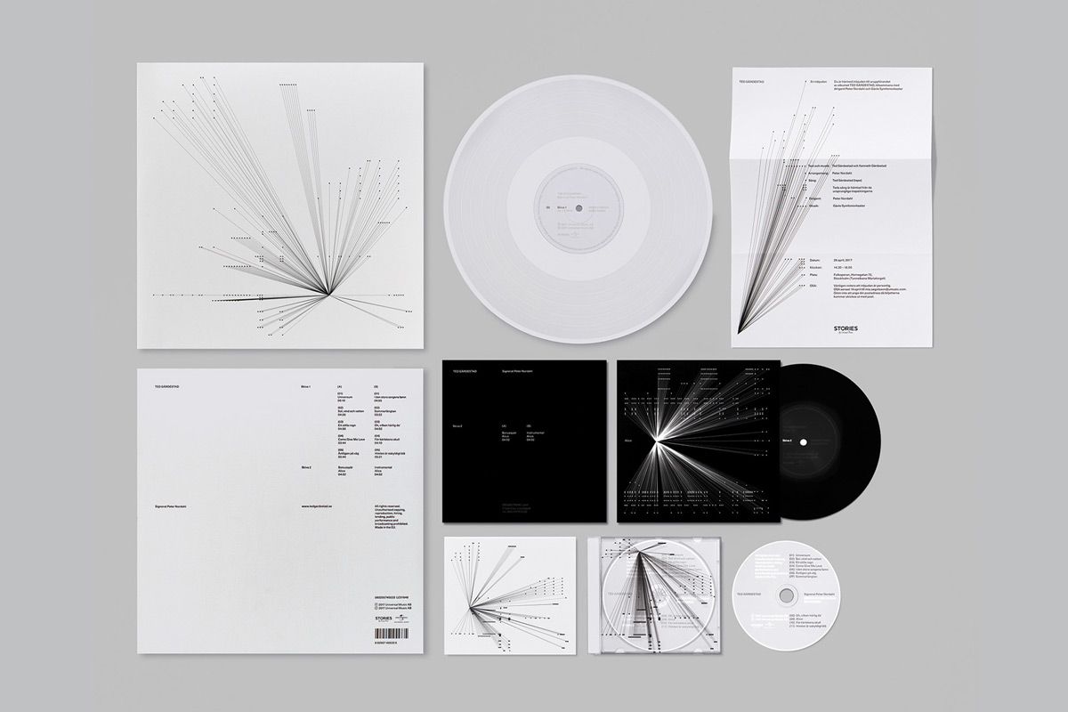
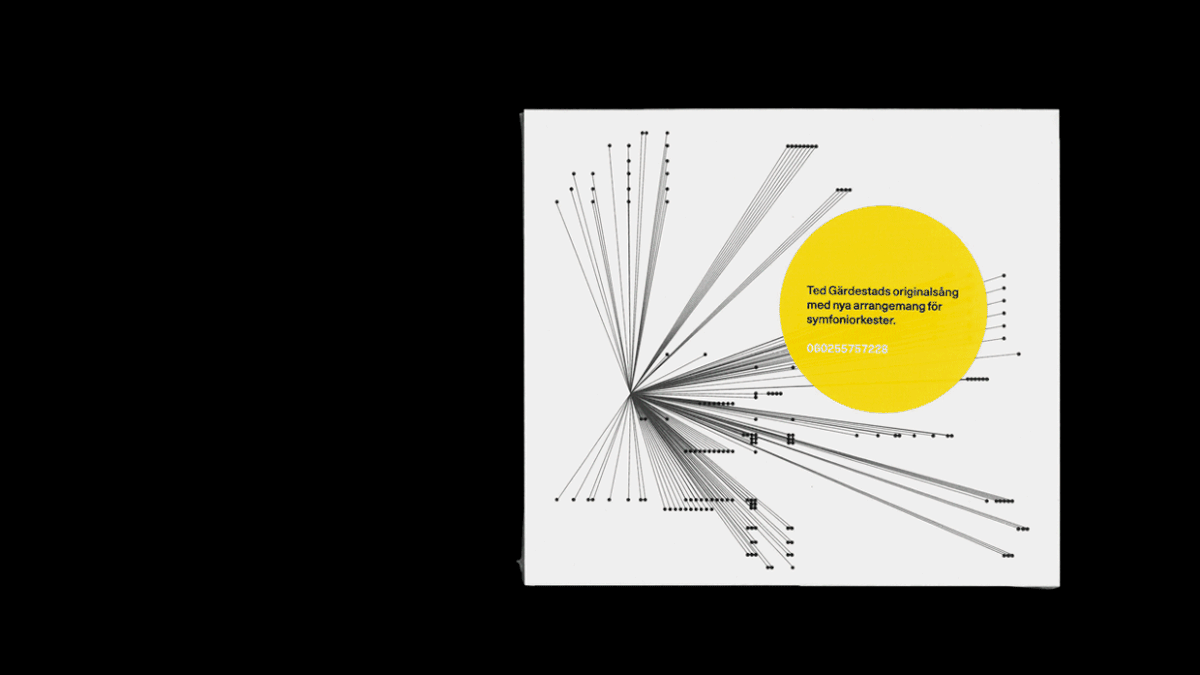
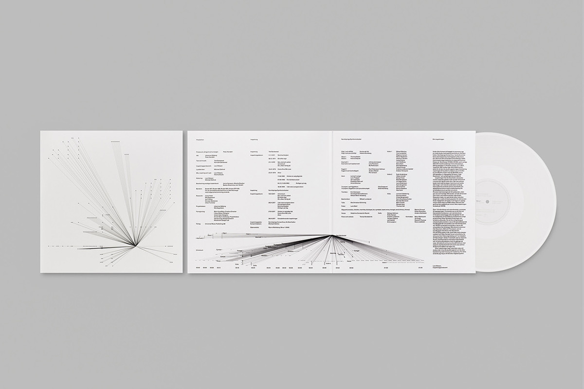
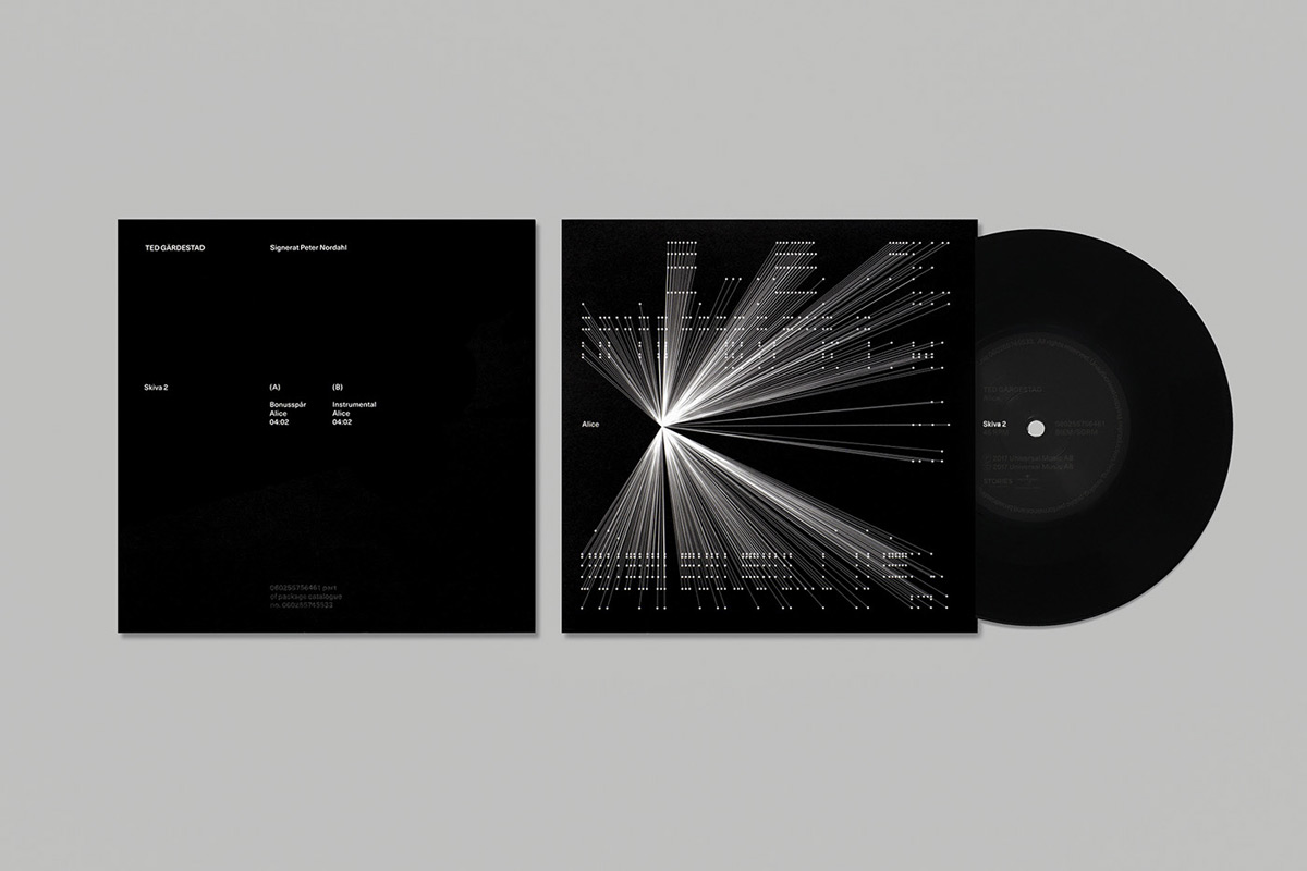
Stockholm Design Lab came up with a graphic design concept that is deeply inspired by Ted Gärdestad’s music and lyrics. The result is a visual identity based on many layers, symbolizing the music’s note sheets, movement, and flow. In addition, it represents the collaboration between all the many parties involved in the project. They have created a graphic system that is highly recognizable yet flexible where each song has its unique composition based on the notes. Below you can find a few images. For more of Stockholm Design Lab’s creative work, please visit their website or follow them on Behance.
All images © by Stockholm Design Lab. You can find more inspiring projects in our Graphic Design and Branding categories.
Subscribe to our newsletter!


