
Parsyl, a pioneer in supply chain insurance, recently unveiled a reimagined brand identity created by the multidisciplinary design studio Wunder Werkz. This redesign marks a critical transition for Parsyl from a promising tech startup to a trusted global partner in perishable supply chain insurance. With a bold, minimalist approach, the new visual system reflects Parsyl’s mission to innovate while ensuring trust and stability in an often static industry.
A Strategic Evolution
Traditionally, legacy players with century-long histories have defined the insurance industry. Parsyl disrupted this norm by integrating advanced data technologies to address risks in the supply chain of sensitive goods like vaccines and perishables. To align with their expanding role, the company sought a brand identity that projected their growth and forward-thinking ethos.
Wunder Werkz identified the challenge: Parsyl needed to shift its narrative. No longer just a tech disruptor, they required a visual identity that reinforced their credibility as a mature insurer committed to innovation.
Design Approach: Clarity and Simplicity
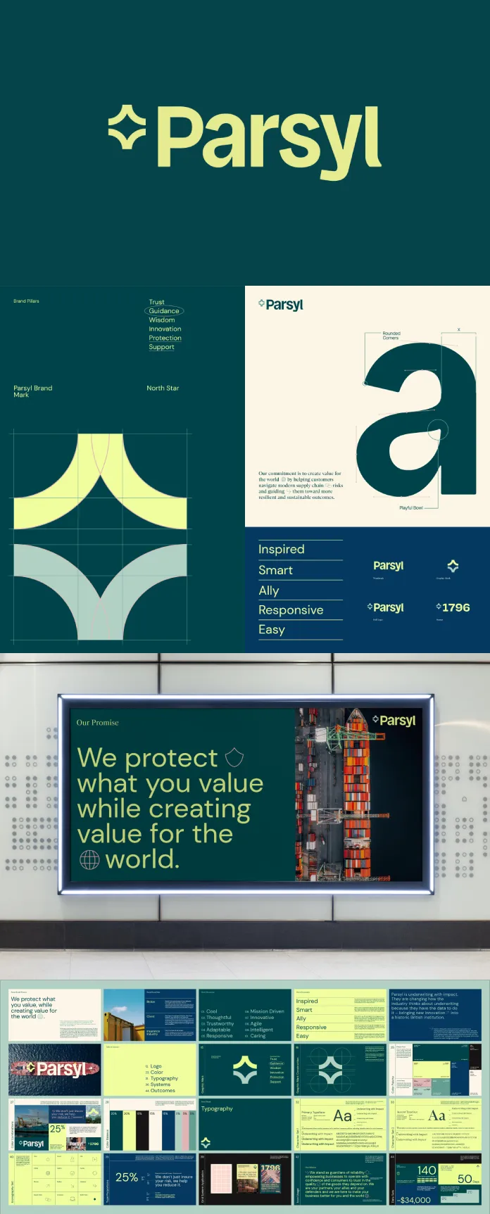
The design studio overhauled Parsyl’s branding, focusing on accessibility and professionalism. The updated system includes a modernized wordmark, a refreshed color palette, and sophisticated typography. Inline iconography and layout designs emphasize clarity, ensuring that complex information is communicated effectively.
Rejecting the trend of overly intricate data visuals, Wunder Werkz developed a system centered on clean, simplified graphics. This makes Parsyl’s messaging and case studies approachable and visually compelling. The new look balances the warmth of a startup-style design with the gravitas of an established insurer.
A Global Perspective
Parsyl’s global presence demanded a brand that transcended linguistic and cultural barriers. Wunder Werkz introduced inline icons as visual “punctuation,” creating a unifying thread across all materials. These elements ensure that Parsyl’s core values—clarity, dependability, and partnership—resonate with diverse audiences worldwide.

Jon Hartman, Partner at Wunder Werkz, noted that the design resisted trends in financial branding by emphasizing a human-centered approach. The result is a brand identity that feels personal yet professional, ensuring accessibility without sacrificing expertise.
A Message of Innovation and Stability
Ben Hubbard, CEO of Parsyl, highlighted how the rebrand preserves the company’s innovative DNA while signaling a new level of maturity. “We’re not an old-fashioned insurer, but we’re not a shiny object either. This new visual identity communicates that we are a battle-tested innovator,” he stated.
Wunder Werkz succeeded in creating a brand system that bridges innovation and tradition. By integrating Parsyl’s technological strengths with a design rooted in simplicity, the studio reinforced the company’s reputation as a leader in supply chain risk management.
The Wunder Werkz Philosophy
Based in Denver and Reykjavik, Wunder Werkz specializes in crafting thoughtful, human-centered design solutions. Their approach, which emphasizes style, craft, and simplicity, is evident in their work for Parsyl. By focusing on the nuances of human interaction and visual storytelling, the studio transformed Parsyl’s brand into an enduring asset.
Parsyl’s rebrand demonstrates the power of design to redefine perceptions in even the most traditional industries. Wunder Werkz has delivered a system that not only communicates Parsyl’s values but also positions them as a leader for years to come.
All images © by Wunder Werkz. Feel free to find other inspiring projects, created by talented designers and studios from around the globe, in the Graphic Design and Branding categories on WE AND THE COLOR.
Subscribe to our newsletter!


