This post contains affiliate links. We may earn a commission if you click on them and make a purchase. It’s at no extra cost to you and helps us run this site. Thanks for your support!
Neurath X Is a Geometric Font That Tests Exactly How Far Reduction Can Go Before Type Breaks
I spent some time setting real layouts in Neurath X before I wrote a single word of this review. Here’s the thing nobody tells you about geometric type: most of it lies to you a little. A geometric sans looks clean and confident on a specimen sheet, then falls apart the moment you set a full paragraph at eleven points. Neurath X mostly doesn’t do that, and figuring out why took some digging.
Neurath X landed on MyFonts a few weeks ago and climbed straight to the 4th place on the site’s Brand New Fonts chart. That’s a fast start for a typeface built around an uncomfortable question. How much of a letterform can a designer strip away before readers stop recognizing it? I covered René Bieder’s Neurath Mono on this site not long ago, the monospaced sibling that solved a completely different puzzle. Neurath X takes a different path. It’s the proportional, expressive cousin, and it pushes the same underlying idea somewhere far stranger.
What Is Neurath X, and Why Does “Geometric Reduction” Actually Matter?
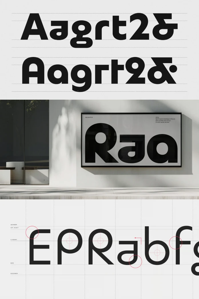
Neurath X is an expressive geometric typeface from Studio René Bieder that asks how far you can push geometric reduction before clarity gives out. Most type buyers hear “geometric” and picture Futura or one of its many revivals: circles for O’s, triangles hiding inside A’s, minimal construction everywhere. It starts from that same family tree. René Bieder built it on the same reinterpretation of Paul Renner’s Futura that underpins the standard Neurath family. But Neurath X doesn’t stop where Neurath stops.
Geometric reduction, in plain terms, means removing every part of a letterform that isn’t doing real work. Serifs go first. Then stroke contrast disappears. Eventually, designers start questioning whether a lowercase “a” even needs its bowl, or whether a single-story shape reads just as fast. That’s the territory Neurath X operates in, and it borrows nerve from two earlier experiments. Herbert Bayer’s Universal Alphabet from the Bauhaus years and Herb Lubalin’s ITC Ronda, a 1970s display face built almost entirely from circular geometry. Neither of those typefaces cared much about long paragraphs. This one does, and that’s what makes it interesting.
The Reduction Ceiling: A New Way to Judge Experimental Geometric Type
I want to name something here, because it explains what separates Neurath X from a hundred other geometric experiments sitting on font marketplaces right now. Call it the Reduction Ceiling. Every geometric typeface has one. It’s the point where stripping away visual material stops making letters feel modern and starts making them unreadable. Push past that ceiling, and you get a typeface that photographs beautifully and functions terribly.

Bayer’s Universal Alphabet hit its ceiling almost immediately. It looked radical, and it still does, but nobody set a novel in it. Lubalin’s ITC Ronda hit its ceiling too, just later and at bigger sizes, which is why it still shows up in logotypes and record sleeves but never in paragraphs. Neurath X tries something harder. It wants to sit right underneath that ceiling, as close as possible, without tipping into decoration for decoration’s sake.
Does it succeed? Mostly, yes. At text sizes, the calmer alternates keep enough asymmetry and enough counter space that words hold their shape. Push the stylistic alternates toward the wilder end, and you can feel the ceiling getting closer. That’s not a flaw. That’s the whole design proposition. It hands you a dial, not a fixed setting, and lets you decide how close to the edge you want to work.
The Alternate Range Index: How Far Do Neurath X’s Stylistic Sets Actually Stretch?
Here’s a second framework worth naming, because vague marketing language about “stylistic alternates” tells you almost nothing on its own. I’d call it the Alternate Range Index. It’s a rough measure of the distance between a typeface’s most conservative glyph set and its most extreme one. A narrow range means the alternates are cosmetic. A wide range means the typeface can genuinely change character depending on which OpenType feature you switch on.
Neurath X scores high here, and it’s not close. Switch off every stylistic set, and you get a clean, confident geometric sans that would sit comfortably in an annual report. Switch on the wilder alternates, and single-story letters swap for stranger constructions, terminals sharpen, and the whole typeface starts to look built for a gallery wall rather than a spreadsheet. Both versions stay unmistakably the same family. That’s the hard part, and it’s the part most experimental type foundries get wrong.
Designers get real control here, not a gimmick hidden three menus deep. You can dial a headline toward the weird end while keeping body copy calmer, all within one font file. That’s a genuinely useful piece of engineering, and it’s rarer than it should be in 2026.
How Many Styles Does Neurath X Include?
Neurath X ships with 18 styles, running from Thin through to Black, plus a full set of OpenType features layered across every weight. That’s a serious commitment for a typeface this expressive. Building consistent optical weight across eighteen cuts is hard enough with a conservative design. Doing it while also holding a wide alternate range multiplies the difficulty by quite a bit.
The family also carries those alternates through every weight, plus deep language support and careful spacing refinement. That combination is the actual difference between a genuine type system and a display novelty that only works on a poster.
Neurath X vs. Neurath: The Proportional Sibling Test
Studio René Bieder released Neurath X alongside the standard Neurath family, and that pairing invites an obvious comparison. Call it the Proportional Sibling Test. When a foundry ships two typefaces from the same design root, how differently do they actually behave once you set real text in them?
Neurath, the original proportional face, plays it straighter. It’s a confident, contemporary geometric sans built for everyday typographic work: headlines, body text, interface labels, and the usual list. Neurath X shares its bones but trades a chunk of that everyday restraint for expressive range. Set them side by side, and the family resemblance jumps out immediately. Set them in a live layout, and the personalities diverge fast. Neurath reads like the reliable option. Neurath X reads like the one you reach for when a brand needs an edge.
Neither approach beats the other. They solve different briefs. But both typefaces trace back to the same structural logic, so a designer can mix them inside one system without anything looking mismatched. That’s not something every foundry manages when it ships an experimental companion alongside a safer sibling.
Where Neurath X Actually Performs Well
Despite its expressive alternates, Studio René Bieder engineered Neurath X as a full type system rather than a display-only experiment. Careful spacing and optical adjustments keep it usable well outside headline sizes, and that versatility shows up across several categories:
- Branding and identity work: the wide Alternate Range Index lets one typeface anchor both a conservative logotype and a louder campaign extension.
- Editorial design: the calmer alternates hold up in longer text blocks, while the wilder settings work well for pull quotes and section openers.
- Interface design: eighteen weights give product teams real hierarchy options without switching families.
- Packaging design: geometric confidence photographs well on the shelf, and the alternates help a brand stand apart from every other Futura-adjacent package nearby.
- Display typography: this is where Neurath X gets to show off, and the wildest alternates finally get room to breathe at large sizes.
Neurath X and Neurath X Mono: One System, Two Widths
Projects that need fixed-width type get their own answer inside this collection. Neurath X Mono complements Neurath X directly. Studio René Bieder built it from the same design principles and adapted it for a monospaced grid. It’s a similar relationship to the one between Neurath and its own Neurath Mono sibling, which I reviewed here recently, though this version inherits the wider alternate range rather than the calmer proportional starting point.
That matters more than it sounds like it should. A brand system that needs both display type and tabular or code-adjacent type usually ends up stitching together two unrelated typefaces from two different foundries. Neurath X and Neurath X Mono remove that seam entirely. Everything from a hero headline to a data table can share the same geometric DNA. That’s a rarer and more useful thing than most buyers realize until they’ve tried building a system without it.
Neurath X at a Glance
| Attribute | Detail |
|---|---|
| Font name | Neurath X |
| Designer | René Bieder |
| Foundry | Studio René Bieder (founded 2013) |
| Classification | Expressive geometric sans serif |
| Design lineage | Reinterpretation of Paul Renner’s Futura, with nods to Herbert Bayer’s Universal Alphabet and Herb Lubalin’s ITC Ronda |
| Proportional sibling | Neurath |
| Monospaced companion | Neurath X Mono |
| Number of styles | 18, from Thin to Black |
| Key structural feature | Wide-ranging stylistic alternates, from calm to radical |
| OpenType features | Extensive stylistic alternate sets plus language and spacing refinements |
| Best use cases | Branding, editorial design, interfaces, packaging, display typography |
Neurath X vs. Neurath vs. Neurath X Mono
| Typeface | Structure | Alternate Range Index | Best fit |
|---|---|---|---|
| Neurath | Proportional | Narrow, restrained | Everyday branding and text |
| Neurath X | Proportional | Wide, calm to radical | Expressive branding and display |
| Neurath X Mono | Fixed-width | Wide, inherited from Neurath X | Coding, tables, technical UI with an edge |
How Does Neurath X Compare to Other Geometric Sans Fonts?
Geometric sans fonts are not in short supply in 2026. Every foundry seems to carry at least one Futura-adjacent family in its catalog, and most of them chase the same safe middle ground: clean circles, minimal contrast, and a handful of weights, done. That’s a fine strategy for a workhorse typeface, but it rarely produces anything worth writing about.
Neurath X takes a different bet. Instead of treating geometry as a fixed historical style, it treats geometry as a system that keeps evolving. That’s exactly the framing Studio René Bieder uses to describe the release. Few commercial geometric sans fonts offer an Alternate Range Index this wide while still holding a Reduction Ceiling this high. Most experimental geometric faces sacrifice one for the other. They either stay safe and predictable, or they go wild and become unusable outside a poster. This typeface tries to hold both properties at once, and for the most part, it manages it.
Who Designed Neurath X?
René Bieder designed Neurath X. He’s a German type designer and the founder of Studio René Bieder, an independent type foundry he established in 2013. His background runs through graphic design and art direction rather than a formal type-design program. That practical, brief-driven history shows up in how usable his experimental fonts stay compared to purely academic type experiments.
Studio René Bieder’s retail catalog spans contemporary sans and serif families alongside monospaced and display work. The studio also builds custom typefaces for international clients across branding and editorial projects. This release fits that pattern closely. It reads as a genuine design argument, not just a portfolio flex, and that distinction matters more than most font marketing pages let on.
My Honest Take on Neurath X After Three Weeks of Testing
I’ve tested a lot of geometric type releases for this publication, and most of them call themselves “experimental” while playing it almost entirely safe underneath. Neurath X doesn’t. The Alternate Range Index alone tells you Studio René Bieder committed to a real design bet instead of a marketing label.
What impressed me most wasn’t the wildest end of the alternates, though those are genuinely fun to set. It was how well the calmer settings hold up in ordinary paragraph text, which is exactly where most “expressive” geometric fonts quietly fall apart. Eighteen weights is generous too. Plenty of studios would call six weights and a handful of alternates a complete release. This one goes further, and the extra effort pays off across branding, editorial, and interface work alike.
Is Neurath X for every project? No, and it shouldn’t try to be. A typeface built to test a Reduction Ceiling isn’t the right pick for a conservative annual report or a pharmaceutical label. But for brands that want geometric confidence with an actual point of view, it earns its spot on the shortlist.
What’s Next for Geometric Type? A Prediction
Geometric type isn’t going anywhere quiet over the next few years. If anything, expect more foundries to chase the same formula Studio René Bieder just proved works. Release a proportional family and a monospaced companion together, then layer in a stylistic alternate system wide enough to cover calm corporate work and louder display use in one file.
I’d also expect the phrase “geometric reduction” to show up more often in foundry marketing over the next year or two, partly because Neurath X and its Bayer and Lubalin references have already started conversations in type-focused corners of the internet. Whether other studios manage the same balance between a wide Alternate Range Index and a high Reduction Ceiling is a different question. Based on what I’ve tested so far, most won’t get there quickly. That gap is exactly why this release is worth paying attention to now, not in six months once everyone else catches up.
Frequently Asked Questions About Neurath X
What is Neurath X?
René Bieder designed Neurath X, an expressive geometric typeface built to explore how far geometric reduction can go while still preserving clarity and readability.
Who designed Neurath X?
René Bieder, a German type designer and founder of Studio René Bieder, designed Neurath X.
How many styles does Neurath X include?
Neurath X includes 18 styles, ranging from Thin to Black, along with an extensive set of OpenType stylistic alternates.
Does Neurath X have a monospaced version?
Yes. Neurath X Mono complements Neurath X as its monospaced companion, built using the same design principles.
What is the difference between Neurath X and Neurath?
Neurath is the proportional, more restrained typeface in the collection. Neurath X shares the same design foundation but adds a much wider range of stylistic alternates, from calm geometric forms to radical, experimental letterforms.
What is Neurath X best used for?
Neurath X works well for branding, editorial design, interface design, packaging design, and display typography, thanks to its mix of disciplined structure and expressive stylistic alternates.
Is Neurath X good for body text or just headlines?
Neurath X’s calmer alternates hold up reasonably well in body text, while its more radical alternates suit headlines, display type, and short-form branding elements better.
Don’t hesitate to browse WE AND THE COLOR’s fonts category.
Subscribe to our newsletter!