A versatile brand identity developed by Rice Creative for Maison Marou.
Rice Creative is a branding and graphic design studio based in Ho Chi Minh City, Vietnam. Some of you may have already seen a few examples of Rice Creative’s outstanding projects on WE AND THE COLOR. This time I want to show you their beautiful work for Maison Marou, a cafe, patisserie, and gourmet chocolate factory located in a 1930s Art Deco house on Calmette Street in the heart of Ho Chi Minh City. The team of Rice Creative was asked to help with a full brand identity concept including graphic, packaging, and interior design. Please read more below the following image.

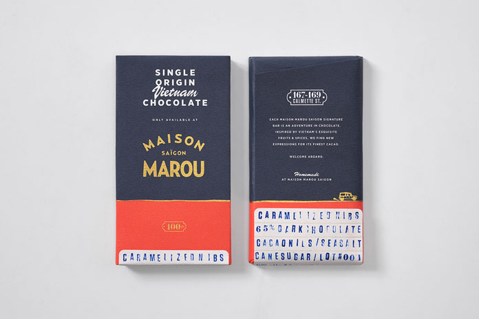
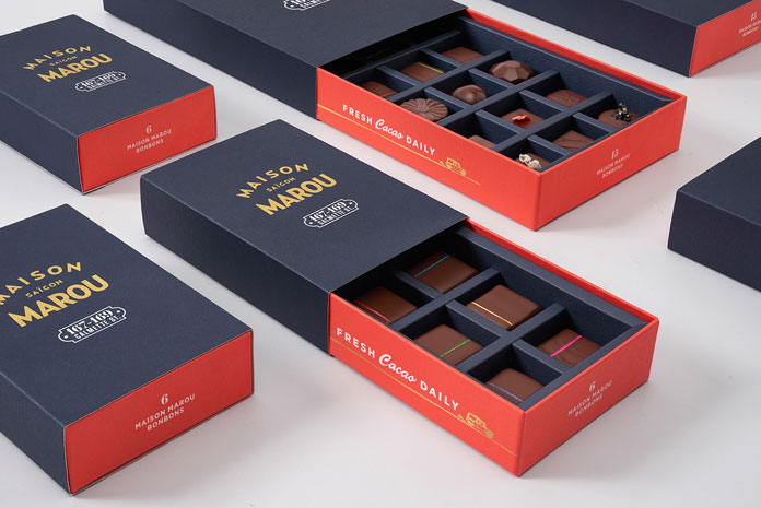
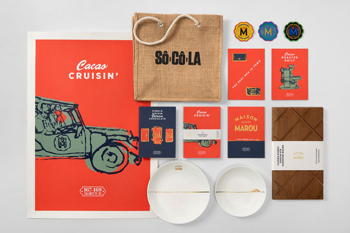
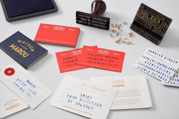
Marble and slabs of plywood refer to stacked bars, while vertical rectangular units symbolize the typical grid pattern of chocolate bars. A custom typeface has been applied to a variety of branding materials and metal plates which can be arranged in several ways. Some rough illustrations express the rugged side of the brand. In addition, a flexible packaging system has been created in different shapes and sizes. Some examples of the well designed brand and packaging materials can be found below. For more, please visit the Rice Creative website: rice-creative.com


All images © by Rice Creative.







Awesome branding, it is hard to resist their chocolate bars packaging in stores !