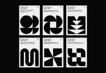
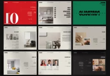
A sophisticated brand identity developed by Bratus for Long Van Group.
Originally established in 1992 as Long Van NTV, the Vietnamese manufactory produces high quality aluminum for the international market. Due to its rapid growth, the company transformed into Long Van Group. The Ho Chi Minh City based agency, Bratus was asked to help with a re-branding concept that helps to visualize the company’s restructured strategy. Futhermore, they asked for a design solution, which strengthens the market position of the company. With this in mind, the creative design team of agency Bratus started to develop a strong and clear brand identity. Supported by a custom logotype, the design of the new brand mark creates a closer connection to aluminum. Feel free and read more below.

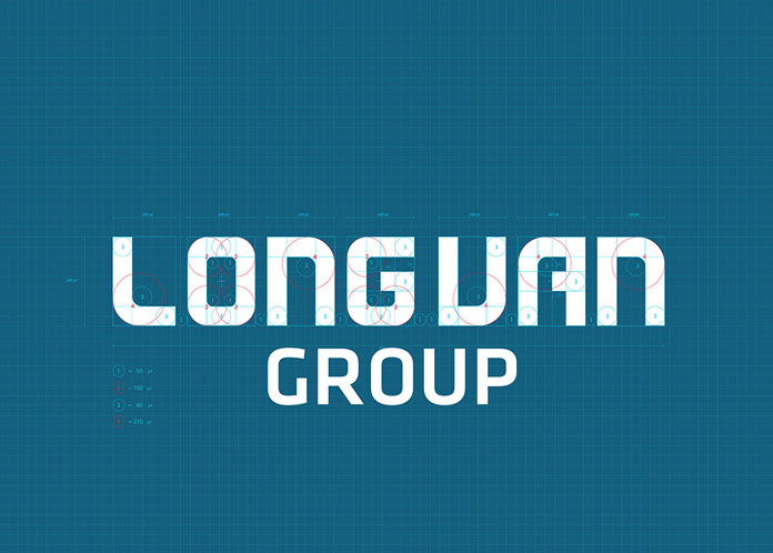
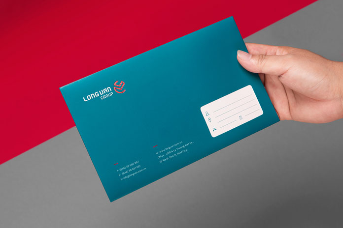
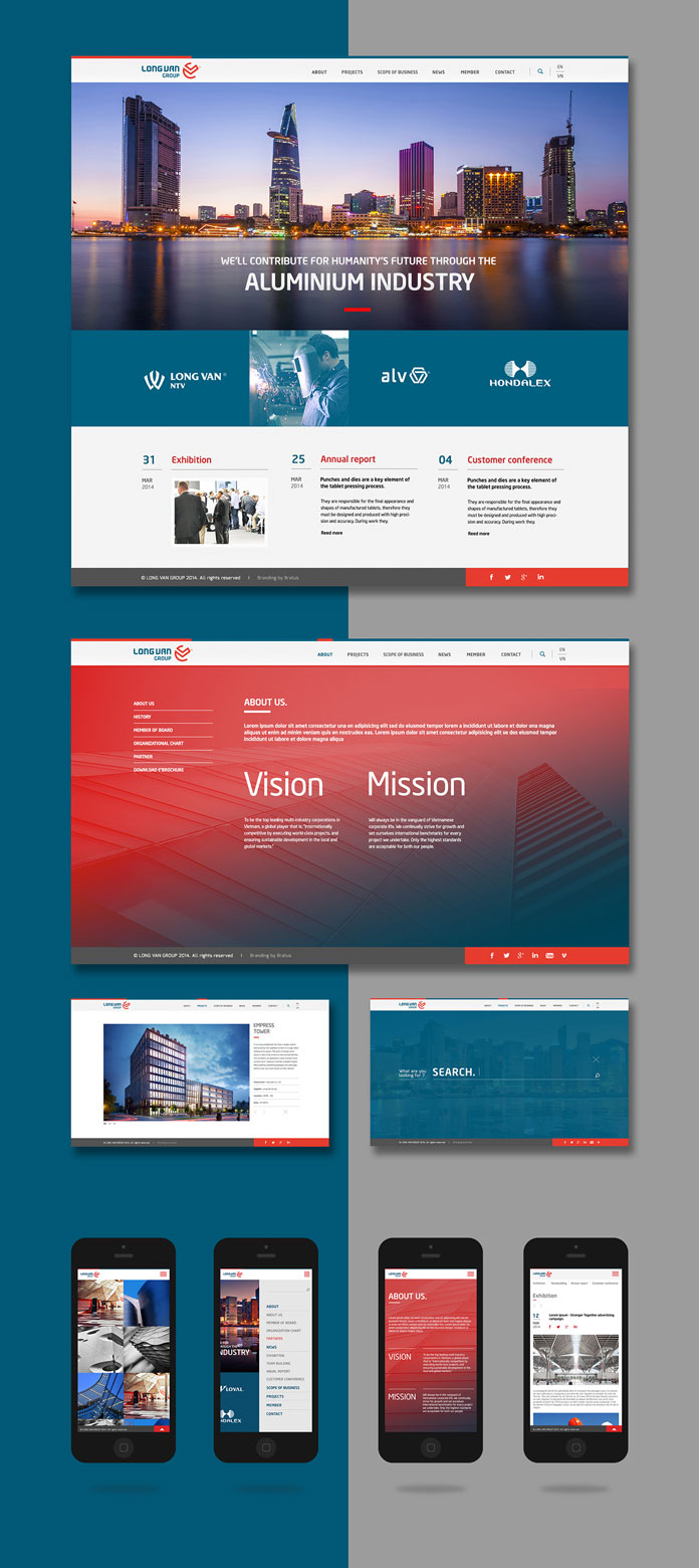
The new brand mark looks unique, modern, and solid. Thanks to its simple design, it’s very flexible in use. In addition, the associated logotype is based on a custom typeface, which follows the well-balanced philosophy of being hard and soft. Also the color combination of blue and red reflects this philosophy of opposites. The goal was to create a visual experience, which people associate with strength and reliability. Agency Bratus also designed all stationery and branding materials as well as a new responsive website. Below you can find more images of the new visual language. If you want to know more about the Ho Chi Minh City based agency, feel free and have a look at their website.
