Polish lost its value this year, and logo design in 2027 will pay for proof instead. I compared every major 2026 rebrand I could find. Tinder’s new logo came out in July, McLaren’s on September 22, and one pattern kept repeating.
A machine now draws a clean, symmetrical logo design in seconds. So clean no longer impresses anyone. The brands that win in 2027 will show who made their logo design and which rules govern it. I call that a provable mark.
This comprehensive guide ranks ten logo design trends for 2027. Every trend rests on a real 2026 launch with a date you can check. Some of my calls will annoy you. Good.
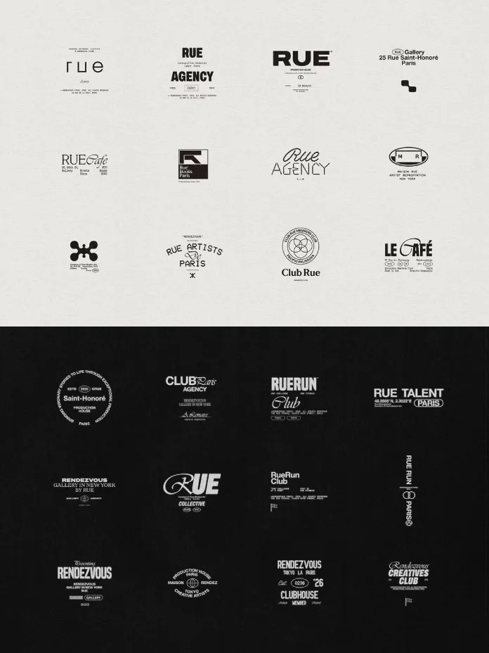
What Will Logo Design Look Like in 2027?
Expect fewer flat, symmetrical badges in logo design and more marks with a visible origin. So that’s my thesis. A provable mark is a logo whose origin, rules, or human decisions the brand can show. Everything below follows from that definition.
The cost of generic logo design has hit zero. A startup can generate fifty lettermarks before lunch. Yet none of them will own anything. Recognition needs a reason to exist, and a reason needs a story someone can check.
My forecast is specific. By the end of 2027, leading brand identity agencies will sell logo design as a ruleset plus a paper trail. They won’t sell it as one file. But some readers will disagree. I’d still bet on it.


The 10 Logo Design Trends for 2027
Read these as ten ways to make logo design provable. Two deserve most of your attention. Provenance Marks and Range Logos will shape more briefs than the other eight combined.
1. Provenance Marks: Logo Design That Shows Its Hands
Apple TV built its new logo from real glass. The team filmed it on camera, with no computer-generated frame. TBWA\Media Arts Lab and Optical Arts pulled it off. The work took the Design Grand Prix at Cannes Lions 2026. Jurors rewarded a hand-built object over a render.
McLaren took a different route on September 22. Its new wordmark draws on a hand-painted sign from the service station Bruce McLaren’s parents ran in Remuera, New Zealand. Think about what that gives the brand. A generated mark has no address. But this one does.
Here’s my rule for 2027. A handmade look proves nothing in logo design, because texture is free now. The process is not. Publish the process film or the source sign. If you have no artifact, skip the faux-craft aesthetic.
I predict that by mid-2027, launch announcements for major logo design projects will lead with a process film. Then the final file will come second. Clients will start asking to see the making before they see the mark.
2. Range Logos: One Rule, Many Marks
A range logo is a logo design that ships as parameters and limits instead of one fixed file. The best evidence comes from 2026 rollouts. Google’s redesigned Workspace icons swap hard color blocks for gradients. Several apps no longer carry all four Google colors.
Coca-Cola made the same bet on July 20. Its JKR-built identity system leaves the script logo alone. Instead, it locks the Dynamic Ribbon and the Arden Square across more than 200 markets. Everything around the script, though, obeys rules.
Walmart’s Great Value redesign shows the scale problem. The new lettering reaches nearly 10,000 products over two years, starting with salty snacks. Besides, nobody hand-checks 10,000 packs. A rule does that job. Logo design at that scale runs on rules.
So stop sending clients one perfect logo design. Send a range guide. Show the size limits and the combinations that fail. Call it a responsive logo design system if that helps the client sign the invoice.
Try this on your own logo design. Next, write down the two things that may never change. Everything else becomes a range. If you can’t name those two things, you don’t have a system yet.
Apple’s icon tools already work this way. One layered file produces dark and tinted versions on its own. Expect the first logo design guidelines with a published contact sheet of allowed and forbidden combinations by late 2027.
3. Voice Wordmarks: Custom Lettering Takes Over
A voice wordmark is custom lettering that also drives a brand’s typeface. Instagram gave this logo design trend its loudest test on August 13. The new wordmark replaces the script the app has used since 2016. It’s also bolder and more compact. Three type families now back it up, and Instagram Pen and Instagram Mono join Instagram Sans.
Then users answered fast. They nicknamed it “Instagzam.” I think the new “r” costs Instagram more than it earns. A logotype shouldn’t need a second look to read. Still, the logo design system behind it is smart.
Other brands took the same road this year. Threads worked with Studio NARI on custom letterforms with directional cuts. Stack Overflow, with Koto, built Stack Sans with small notches. Sporting CP let its SCP initials shape both a crown and a typeface called Sporting Sans.
The lesson for custom wordmark design is simple. Draw the letters once, then let them write everything else. Logo design that can’t set a headline is only half done.
4. Archive Revivals: The Old Asset Comes Back
Harley-Davidson put its Bar & Shield back at the center in April. McLaren kept the Speedmark and added the Speedy Kiwi and the Heritage Shield. The Tennessee Titans dropped their flame motifs on March 12 and revived Titans Blue from the Houston Oilers years.
Sporting CP went furthest. Its 120th-anniversary crest rebuilds the 1945 version. Coca-Cola and KFC also bet on their most recognizable assets, the script and the bucket. Still, none of these brands invented anything new. They found what they already owned. Archive revival turns logo design into excavation.
Heritage is the cheapest story in logo design and the easiest to fake. A revival works only when a real product, rider, or player stands behind it. Harley launched with real-rider imagery. That’s the bar.
5. Soft Depth: Gloss Returns With Rules
Xbox swapped its flat black-and-white sphere for a glossy, glassmorphic green one on April 23. That green revives the 2001 original. I think it’s the best-looking big-tech mark of 2026. Flat logo design had run its course.
Google’s Workspace icons lean on gradients too. Instagram keeps its gradient but uses it more sparingly. Jif went the other way on August 10 and removed its drop shadow. So depth is a choice, not a law.
I’ll name the fix. Every brand needs a depth budget, a written limit on how much gloss, gradient, and shadow the logo design may carry. Without one, the gradient orb comes back, and everyone hates it by 2028.
6. One-Detail Marks: A Single Surprise
Carter’s replaced the apostrophe in its script with a shooting star on September 15. Tropical Smoothie Cafe introduced the Palm T a day later, an abstract palm tree shaped like the letter T. HONOR added the Ring of HONOR on July 23, two open arcs that face each other.
The one-detail rule says a mark may hold exactly one surprise. Two surprises, however, are clutter. This trend suits small business logo design well, because one clever detail costs less than a new symbol.
7. Native Motion: Designed to Move First
Motion no longer trails logo design. It arrives with it. Apple TV pairs its glass mark with a five-second show opener and a sonic logo by Finneas. Tropical Smoothie Cafe writes motion into its identity from day one. Instagram uses its gradient in motion across layouts.
Yet static habits break in motion. Thin strokes flicker, and overlapping shapes clip at odd frames. If you want to learn how to design a logo that works in motion, draw it as a loop first.
Export a two-second loop before you approve any logo design. Then watch the smallest detail. If it disappears, redraw it.
8. Attitude Systems: Controlled Wobble
Tinder’s July rebrand, made with Porto Rocha, is the smartest of the summer. The flame got a sharper silhouette, and the wordmark moved to bold capitals. Around it, the brand piles up point-and-shoot photos and oil paintings, then adds anime screenshots and memes.
I call this controlled wobble. A rigid mark sits inside loose, human imagery. The mark stays disciplined, so the mess reads as intent. It also gives the brand a voice, a fictional columnist named “T.”
Does your logo design need attitude? Ask whether your customers already distrust polish. If they do, copy the structure, not the memes.
9. Authorship Trails: Logo Design That Survives Due Diligence
Here’s the legal problem with AI logo design in plain terms. The US Copyright Office says copyright needs human authorship, and prompts alone rarely qualify. A logo design made only from a prompt may not earn copyright protection. Trademark law works differently because it asks whether the mark is distinctive and used in commerce.
So the AI-generated logo copyright question splits in two. You might register the mark, yet you may struggle to stop someone from copying the artwork. Buyers and investors now ask about AI-made assets during due diligence. I’m not a lawyer, so check with a trademark attorney.
An authorship trail is a dated record of the human decisions behind a logo design. Keep sketches, version history, and decision notes. Also redraw AI output by hand where you can. The trail costs almost nothing today and saves a lot later.
10. Sibling Identities: Same Family, Different Faces
Brands under a parent now want their own logo design. Threads dropped the Instagram Sans-based wordmark for custom letterforms in May. gFiber, formerly Google Fiber, launched a new logo on September 15 with a palette of teal, fuchsia, gold, and orange. It kept a link to its Google origins.
McLaren shows a third version. Its September 22 identity gives McLaren Racing and McLaren Automotive one shared foundation without merging the businesses. A sibling identity shares one family trait and gives each brand its own face.
Pick the trait carefully. Color is the weakest choice, because competitors can copy it. A shared curve or a shared letter cut holds up better.

Which Logo Design Habits Will Fade in 2027?
The generic startup lettermark will fade first. You know it. A geometric letter sits on a blue gradient orb. Anyone can type that into a generator, and everyone did.
Fake craft will fade next. A grain filter on a flat logo design fools nobody anymore. Perfect symmetry for its own sake will also lose ground, because it looks like output rather than a decision.
How Do You Test a Logo Design Against These Trends?
Run four tests on any logo design. Each test takes under ten minutes, and none needs software beyond what you already own.
The 16-pixel test. Shrink the mark to 16 pixels wide and squint. If the idea vanishes, the logo design carries too much detail.
The cover test. Hide the logo on a page of your brand identity. Can a stranger still tell whose page it is? Typography and color should answer that.
The loop test. Animate the mark for two seconds and watch for flicker. Thin strokes fail here first.
The trail test. Ask for the dated sketches behind the final mark. If nobody can produce them, you have a legal gap and a story gap.
Logo Design Trends 2027 at a Glance
| Trend | 2026 proof point | What changes in logo design | 2027 prediction |
|---|---|---|---|
| Provenance Marks | Apple TV glass logo; McLaren hand-painted sign | The making becomes part of the launch | Process films lead announcements by mid-2027 |
| Range Logos | Coca-Cola system across 200+ markets; Google Workspace icons | Deliver limits, not one file | Guidelines publish forbidden combinations |
| Voice Wordmarks | Instagram, Threads, Stack Overflow, Sporting CP | Lettering drives the typeface | More brands draw a wordmark and a font together |
| Archive Revivals | Harley-Davidson, Titans, Sporting CP | Old assets return to the center | Revivals need real proof behind them |
| Soft Depth | Xbox glass sphere; Google gradients | Gloss returns under a written limit | Depth budgets appear in guidelines |
| One-Detail Marks | Carter’s star; Tropical Smoothie Palm T; HONOR ring | One surprise per mark | Small brands adopt it fastest |
| Native Motion | Apple TV opener and sonic logo; Instagram gradient | Draw the loop first | Motion tests join every approval |
| Attitude Systems | Tinder with Porto Rocha | Rigid mark, loose imagery | Controlled wobble spreads to consumer apps |
| Authorship Trails | Copyright limits on prompt-only work | Human decisions get documented | Buyers ask for trails during due diligence |
| Sibling Identities | Threads, gFiber, McLaren | One family trait, separate faces | Parent brands loosen control |
Logo Design FAQs for 2027
What are the biggest logo design trends for 2027?
The biggest trends are Provenance Marks, Range Logos, Voice Wordmarks, Archive Revivals, and Soft Depth. Native Motion, One-Detail Marks, Attitude Systems, Authorship Trails, and Sibling Identities complete the ten. So all of them reward marks a brand can prove.
What is a provable mark?
A provable mark is a logo whose origin, rules, or human decisions the brand can show. Apple TV’s glass logo and McLaren’s sign-based wordmark both qualify.
Is minimalism dead in logo design?
No. Minimalism survives as a discipline in logo design, but it stops working as a default. Coca-Cola kept its script and rebuilt everything around it.
Can I use an AI-generated logo for my business?
You can, but the risk is real. Prompt-only logo design rarely earns copyright protection in the US. Keep an authorship trail and talk to a trademark attorney.
How much should a small business change its logo design?
Change less than you think. Fix legibility at small sizes and keep the asset people already recognize. Add one distinctive detail if you must. Carter’s, for instance, changed one apostrophe.
Do logos need motion versions in 2027?
Yes. Most first looks at logo design now happen on a screen that moves. Export a two-second loop and check whether the thinnest stroke survives at 16 pixels.
Don’t hesitate to browse WE AND THE COLOR’s Graphic Design, Branding, and Templates categories for more.
Subscribe to our newsletter!