
Studio Unbound presents the launch of a revolutionary Irish Cream Liqueur, MU.
With the incentives for plant-based milk on the rise, milk producers must now focus on delivering a premium product. With this new change of perspective, Studio Unbound has taken the opportunity to turn something traditional like Cream Liqueur on its head and bring something new to the fore.
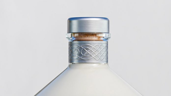
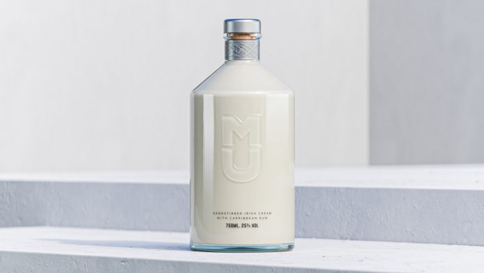
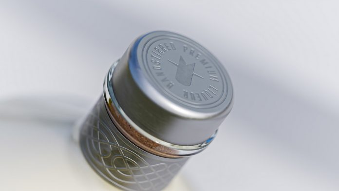
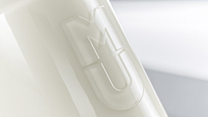
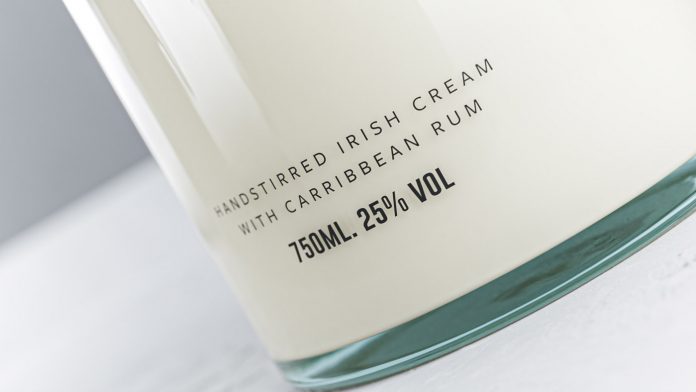
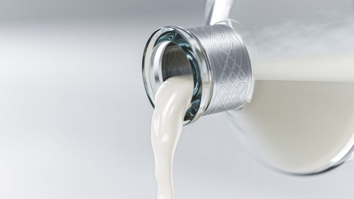
Studio Unbound set itself the task of questioning the perception of Irish Cream Liqueur as an outdated drink. Their approach demonstrates the purity of the product. This also gives it a more contemporary feel compared to the market. While being quite minimal, the bottle’s design details are boldly intentional and true to the nature of the product. On first impressions, we can see that the bottle is shaped like a milk jug and if we look closely at the neck we see an Irish knot, which creates a link to the heritage and creaminess of the product. The logo itself is embossed in the middle and leaves a negative space between the letters. If we look closely, we notice a subtle but sophisticated imprint of the cow’s head. Once you see it, it is no longer missing.
Below you can see a few images of this beautiful branding and packaging project. For more, just visit Studio Unbound’s website.
All images © by Studio Unbound. Do not hesitate to have a look at our Graphic Design, Branding, and Packaging Design categories to find more inspiring work.
Subscribe to our newsletter!


