This post contains affiliate links. We may earn a commission if you click on them and make a purchase. It’s at no extra cost to you and helps us run this site. Thanks for your support!
A memorable brand doesn’t just happen by accident. It is meticulously crafted, piece by piece. Central to this craft is a cohesive visual identity, the silent ambassador that speaks volumes before a single word is read. This identity is the collection of all visual elements—from the logo and color scheme to the typography and imagery—that work together to represent the brand’s essence. When executed correctly, a cohesive visual identity builds immediate recognition and fosters a deep sense of trust. It tells a story, evokes emotion, and makes a promise to the customer.
Think about the brands you love. Their visual language is so distinct that you could recognize it from a single color or font. This guide is for the entrepreneur, the marketer, and the creator who understands this power but doesn’t have a design background. It will walk you through building a powerful visual presence from the ground up.
Why a Cohesive Visual Identity Is Your Greatest Asset
A strong visual presence is more than just looking good; it’s a fundamental business strategy. Consistency across all platforms, from your website to your social media profiles and packaging, creates a seamless and professional experience. Subsequently, this professionalism builds credibility. When a customer sees that every detail is thoughtfully aligned, they subconsciously trust that your product or service will be just as meticulous.
Furthermore, this consistency is the key to brand recognition. Humans are visual creatures. We process images significantly faster than text. As a result, a cohesive visual identity makes your brand instantly identifiable in a crowded marketplace. This immediate recall is invaluable. It’s the difference between being scrolled past and being stopped for. Ultimately, a powerful visual brand identity connects with people on an emotional level, turning passive viewers into loyal advocates. What feeling do you want your brand to evoke?
Step 1: Discover Your Brand’s True Essence
Before choosing a single color or font, one must first look inward. A visual identity without a soul is just a collection of pretty elements. It lacks direction and purpose. Therefore, the first and most critical step is to define your brand’s essence. This is the foundation upon which every visual decision will rest.
Ask yourself some fundamental questions.
- What is your mission? Beyond making money, what is the core purpose of your brand? What problem do you solve for your customers?
- What are your values? List three to five core values that guide your business. Are you innovative, traditional, playful, or luxurious? These words will become your creative compass.
- Who is your audience? Get specific. Go beyond simple demographics. What are their aspirations, their pain points, and their passions? A visual identity designed for a 22-year-old tech entrepreneur will look very different from one for a 55-year-old gardening enthusiast.
- What is your brand’s personality or tone of voice? If your brand were a person, how would it speak? Would it be witty and informal, or authoritative and formal? This personality directly informs your visual choices.
Answering these questions provides the strategic brief for your visual brand. This exercise ensures that your cohesive visual identity is not just aesthetically pleasing but also strategically sound and authentically you.
Step 2: Choose a Purposeful Brand Color Palette
Color is a language of emotion. The colors you choose will be one of the most powerful and recognizable elements of your brand. They set the mood and influence perception in an instant. For this reason, selecting a brand color palette should be a deliberate process, rooted in the brand essence you just defined.
Start by exploring color psychology. For example:
- Blue often conveys trust, stability, and professionalism. It’s a favorite in tech and finance.
- Red signals passion, excitement, and urgency. It’s used to grab attention.
- Green is associated with nature, growth, and health. It’s perfect for wellness or eco-friendly brands.
- Yellow evokes optimism, clarity, and warmth.
- Black communicates sophistication, power, and luxury.
However, these are not strict rules. Context and culture matter. A bright, playful yellow feels very different from a muted, earthy ochre. Your goal is to find a palette that reflects your brand’s specific personality. Excellent tools like Coolors and Adobe Color can help you generate beautiful, harmonious palettes. Start with one or two primary colors that represent your core values, and then add two to three secondary and accent colors for flexibility in your designs. This structure is essential for maintaining a cohesive visual identity across different applications. If you want to learn more about this topic, feel free to take a look at our article about how to find the perfect color palette for your brand.
Step 3: Select Typography That Finds Your Voice
If colors set the mood, typography gives your brand its voice. The fonts you choose can make your brand feel modern and clean, classic and elegant, or friendly and approachable. Choosing brand typography is a crucial step in building your visual identity. A thoughtful font selection can significantly enhance readability and personality.
Generally, fonts fall into a few main categories:
- Serif Fonts: These have small “feet” or lines attached to the main strokes of the letters. They often feel traditional, reliable, and sophisticated. Think Times New Roman or Georgia.
- Sans-Serif Fonts: Lacking the “feet,” these fonts look clean, modern, and straightforward. Helvetica, Arial, and Open Sans are popular examples. They are excellent for digital screens.
- Script Fonts: These mimic cursive handwriting and can feel elegant, personal, or playful. They work best for accents or logos, not for long paragraphs of text.
- Display Fonts: This is a broad category of decorative fonts best used for headlines to make a bold statement.
For a balanced and cohesive visual identity, a good practice is to choose two fonts: one for headlines (a display or bold serif/sans-serif) and one for body text (a clean, readable serif or sans-serif). Resources like Google Fonts offer a vast library of free, high-quality fonts, while platforms such as MyFonts or Creative Market provide premium typefaces, and Adobe Fonts is the ideal option for those with a Creative Cloud subscription. When you find a pairing you love, stick to it. Consistency is key. Check out this handpicked selection of the 5 best branding fonts in 2025.
Step 4: Use Smart Templates to Ensure Consistency
Here is where the non-designer can truly shine. You have defined your essence, chosen your colors, and selected your fonts. Now, how do you apply this cohesive visual identity consistently across every single touchpoint without hiring a designer for every task? The answer is templates.
Templates are your secret weapon for brand consistency. They are pre-designed files where you can easily plug in your own content while the core visual structure remains intact. This ensures every social media post, presentation, or newsletter looks like it came from the same brand.
Look for template resources that align with your needs:
- Social Media: Tools like Canva or Adobe Express offer thousands of templates for Instagram, Facebook, and more. Customize a set of them with your brand’s colors, fonts, and logo.
- Documents & Presentations: Create branded templates in Microsoft Word or Google Docs for invoices and reports. Likewise, build a master slide deck in PowerPoint or Google Slides for all your presentations.
- Creative Marketplaces: Websites like Creative Market sell professional “brand kits” or “social media kits” that include a suite of coordinated templates designed by professionals.
Using templates saves an immense amount of time. More importantly, it creates a visual system that reinforces your brand identity with every piece of content you publish.
Step 5: Create a Brand Style Guide for a Cohesive Visual Identity
A brand style guide is the single source of truth for your visual identity. It’s a document that outlines all your visual rules, ensuring that anyone working on your brand—whether it’s you, a future employee, or a freelancer—can apply the identity correctly. Creating a brand style guide is the ultimate step in formalizing your cohesive visual identity.
Your style guide doesn’t need to be a hundred pages long. A simple one-page document is often enough to start. It should include:
- Logo Usage: Show your primary logo, any secondary versions, and an icon. Specify clear space rules (how much room to leave around it) and show examples of incorrect usage (e.g., stretching or changing its color).
- Color Palette: Display your primary and secondary colors. Importantly, include their specific color codes (HEX for web, RGB for digital screens, and CMYK for print).
- Typography: Name your headline and body fonts. Specify their sizes, weights (e.g., bold, regular), and when to use each.
- Imagery Style: Briefly describe the type of photography or illustration that fits your brand. Is it bright and airy, or dark and moody? Should it feature people or products? Including a few sample images helps communicate the vibe.
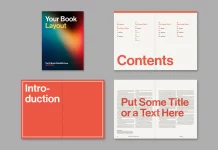
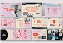
This guide acts as a reference point, eliminating guesswork and empowering consistency. On platforms like Adobe Stock, Envato Elements, or Creative Market, you can find plenty of downloadable, fully customizable brand style guide templates to help you get started on this crucial document.

Bonus: AI Tools to Accelerate Your Creative Process
Artificial intelligence is no longer a futuristic concept; it’s a practical tool that can significantly speed up the process of building a visual identity. While AI can’t replace the strategic thinking of defining your brand essence, it can be a powerful assistant for visual exploration.
- Mood Boarding & Ideation: Use AI image generators like Midjourney or Adobe Firefly to create visual mood boards. For example, you could prompt it with “mood board for a sustainable coffee brand with a minimalist and earthy feel” to get instant visual inspiration.
- Brainstorming: If you’re stuck on your brand’s personality, you can use a tool like ChatGPT to brainstorm. Try asking WE AND THE COLOR’s Graphic Design AI Bot, “Give me 10 personality words for a brand that is trustworthy, innovative, and customer-focused.”
- Generating Assets: Tools like Adobe Firefly can generate unique images or graphic elements based on your text descriptions, which can be useful for social media content or blog post illustrations that perfectly match your desired style.
These tools are best used for inspiration and rapid prototyping. They can help you visualize ideas quickly, making the creative journey more efficient and accessible, even if you’re not a designer.
Building a cohesive visual identity is a journey, not a destination. Your brand is a living entity that will grow and evolve, and its visual expression should have the flexibility to do so as well. Do not aim for perfection from day one. Instead, aim for a strong, well-reasoned foundation. Use the steps outlined here to create an identity that feels authentic to you and connects with your audience right now.
Then, listen and observe. Pay attention to feedback. See what resonates. As your business grows and your understanding of your market deepens, you may find the need to refine a color, update a font, or refresh your imagery. That is a sign of a healthy, responsive brand. Your visual identity is a powerful tool. Use it, refine it, and let it grow with you.

