")
What do you think sound would look like? Not just sound waves on an oscilloscope, but the feeling, the tradition, the very essence of sound itself? It’s a fascinating question. For Klangwelt Toggenburg, an incredible institution nestled in the Swiss Alps, this wasn’t just a philosophical musing. It became the core challenge for their new visual identity. And let me tell you, the solution crafted by Zurich’s studio marcus kraft is something special. We’re talking about the Klangwelt Toggenburg Brand Identity, a project that doesn’t just represent sound – it visually sings.
Imagine this: For over two decades, Klangwelt Toggenburg has been a unique hub. It’s a place dedicated to exploring sound, resonance, voice, and deep-rooted musical traditions. Think of the stunning foothills of the Alps in Eastern Switzerland, an area humming with an original singing and music culture. This isn’t just background noise; it’s the soul of the place. Now, picture a major evolution on the horizon: the opening of the brand new Klanghaus (Sound House) in May 2025. This isn’t just any building; it’s designed as a walk-in instrument, a space where architecture, nature, and sound merge in a way you likely won’t find anywhere else on Earth. Pretty amazing, right? This pivotal moment demanded a fresh look, a visual language that could carry Klangwelt from being a cherished “insider tip” to an institution with genuine international magnetism. That’s where the new Klangwelt Toggenburg Brand Identity comes into play. Mirjam Hadorn, the CEO, puts it perfectly: “The opening marks an important milestone… The new image reflects our transformation.”
Capturing the Echo: The Core Idea
So, how do you visually capture something as intangible yet powerful as sound and resonance, especially within such a rich cultural and natural context? Studio marcus kraft embarked on a three-year journey alongside Klangwelt Toggenburg to answer precisely that. They didn’t just slap on a new logo. Instead, they developed a comprehensive visual identity designed to communicate the sheer depth and complexity of Klangwelt. The result is thoughtful, intricate, and deeply connected to the subject matter.
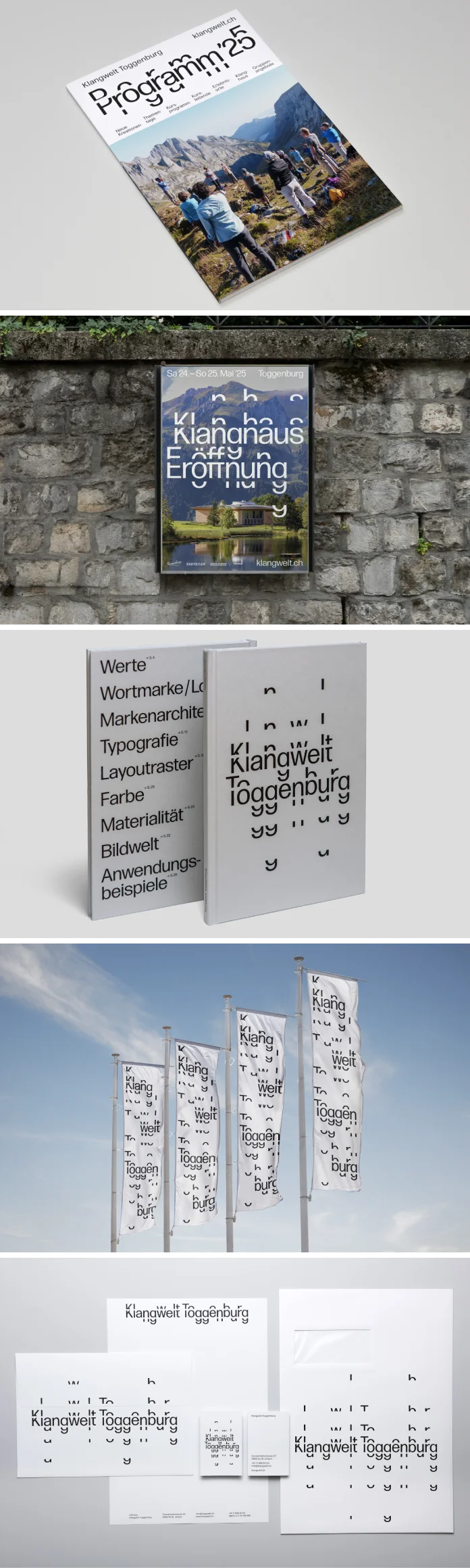
At the absolute heart of this Klangwelt Toggenburg Brand Identity lies something truly innovative: a custom-made, dynamic corporate typeface. Now, when we say dynamic, we mean it literally resonates visually. Think about overtones, those subtle higher frequencies that give a sound its unique color. Or think about sound frequencies rippling outwards. Think about the very landscape – the peaks and valleys of the Toggenburg region. The designers cleverly built a typeface that can be expanded using recurring letter elements. These elements stack and interact, creating a kind of typographic echo or resonance. It’s as if the letters themselves are vibrating, visually mimicking the core concepts of Klangwelt. Can you picture type that almost hums on the page or screen? It’s a brilliant way to translate auditory concepts into a visual medium.
The Resonating Typeface: A Closer Look at the Klangwelt Toggenburg Brand Identity’s Star
This bespoke typeface isn’t just a gimmick; it’s the conceptual anchor for the entire system. Developed with the technical expertise of font engineer David Jonathan Ross, it allows for flexibility while maintaining a distinct character. Imagine posters where headlines seem to stretch and echo, reflecting the alpine landscape. Picture brochures with specific words that visually emphasized the idea of resonance. This modularity means the Klangwelt Toggenburg Brand Identity can adapt to different contexts and messages without losing its core identity. It’s inspired by the very physics of sound and the geography of its home. You can almost see the sound propagating, the vibrations taking shape in the letterforms. It’s a thoughtful, sophisticated approach that goes far beyond standard font choices. Doesn’t it make you reconsider what typography can achieve?
A Symphony of Elements: More Than Just Letters
While the typeface is undoubtedly the star, studio marcus kraft understood that a powerful brand identity needs a full orchestra. The three-year rebranding process was truly holistic. They meticulously redesigned the entire visual system. This included defining the brand architecture – how different parts of Klangwelt relate visually. They developed a new imagery concept, likely drawing inspiration from the stunning natural surroundings and the human element of music-making.

Furthermore, a carefully considered color palette was introduced, perhaps reflecting both the earthiness of tradition and the vibrancy of sound. The materiality – the textures and finishes used on printed items or signage – was also part of the redesign, adding another sensory layer. Add to that thoughtfully crafted animations (developed by Miriam Palopoli), bringing the resonant typography to life digitally, and clear layout principles for consistency. This comprehensive approach ensures the Klangwelt Toggenburg Brand Identity is cohesive and impactful across every single touchpoint. We’re talking about everything from the humble business card and intricate brochures to eye-catching posters, engaging video trailers, physical signage guiding visitors, dynamic social media content, unique merchandise, and a completely revamped website (built by Vitamin 2). It’s a testament to seeing the brand as a complete ecosystem. The first taste of this new identity actually came last year with the reopening of the updated Klangweg (Sound Trail), giving visitors an early glimpse of this exciting visual transformation.
Bridging Culture and Tourism Through Design
Marcus Kraft, the art director and designer behind the studio, highlights a key consideration: “As a cultural institution in a popular travel destination, Klangwelt Toggenburg operates at the exciting interface between culture and tourism.” This dual audience requires a delicate balance. The visual identity needs to speak to seasoned cultural enthusiasts and curious tourists alike. Kraft emphasizes that a major goal was “ensuring that the institution’s wide range of offers and diverse themes can be communicated as flexibly and recognizably as possible for the various audiences.” The dynamic, modular nature of the Klangwelt Toggenburg Brand Identity, particularly the typeface, is perfectly suited for this challenge. It provides a strong, recognizable foundation while allowing for variations that can tailor the communication style as needed. It’s a smart system designed for real-world applications.
The Crescendo: Klanghaus Opening in 2025
All this incredible design work culminates beautifully with the grand opening of the Klanghaus. Mark your calendars for May 24th and 25th, 2025! This event promises a diverse cultural program celebrating sound in its many forms. Simultaneously, the Resonanzzentrum Peter Roth (Resonance Center) will open its doors, featuring a groundbreaking addition: Switzerland’s very first publicly accessible sound dome. Can you imagine the immersive sonic experiences awaiting visitors? The new Klangwelt Toggenburg Brand Identity will be fully deployed, providing the visual language for this exciting new chapter. It’s the perfect harmony of innovative architecture, unique programming, and a visual identity that truly understands and amplifies the core mission.
This project by studio marcus kraft for Klangwelt Toggenburg is more than just a successful rebranding. It’s a masterclass in translating complex, intangible concepts – sound, resonance, tradition, landscape – into a compelling and flexible visual system. It demonstrates how thoughtful design, especially innovative typography, can create deep meaning and connection. It truly makes you see the sound. What do you think? Does this approach change how you perceive the possibilities of brand identity design? It certainly offers a unique perspective worth exploring further.
About Klangwelt Toggenburg:
Nestled in the foothills of the Säntis Alps, Klangwelt Toggenburg serves as a unique cultural institution. It provides spaces for experiencing, developing, and researching sound and resonance. By maintaining and evolving traditions, Klangwelt Toggenburg preserves vital cultural heritage while simultaneously fostering environments for innovative sound experimentation.
Find out more: klangwelt.ch
About Studio Marcus Kraft:
Based in Zurich, Switzerland, studio marcus kraft is an award-winning design studio creating bespoke projects for national and international clients. Their focus lies in elaborate design concepts and exceptional typographic quality. They often collaborate with a wide network of photographers, architects, artists, and other specialists to develop multidisciplinary commissions. Many of their past works have gained international recognition through exhibitions and publications.
Explore their work: marcuskraft.com
Project Credits:
- Concept, Art Direction & Design: studio marcus kraft
- Font Engineering: David Jonathan Ross
- Animation: Miriam Palopoli
- Photography: Beat Bälzer & Ralph Brühwiler
- Camera & Video Editing: Axel Kindermann
- Website Development: Vitamin 2
- Sound Logo: Christian Zehnder
Klangwelt Toggenburg Team:
- CEO: Mirjam Hadorn
- Artistic Direction: Christian Zehnder
- Operations Management: Edi Hartmann
- Visual Communication & Marketing Assistance: Eva Macartney
- Project Lead Multimedia: Corinne Zimmermann
All images © by studio marcus kraft. Feel free to find other trending graphic design and branding projects from around the globe on WE AND THE COLOR.
Subscribe to our newsletter!


