
This post contains affiliate links. We may earn a commission if you click on them and make a purchase. It’s at no extra cost to you and helps us run this site. Thanks for your support!
Since we’re already in the third quarter of 2025, it feels like the right time to look back. The graphic design trends predicted at the start of the year have evolved in surprising ways. Fresh technologies, cultural shifts, and ecological concerns have reshaped the visual language of brands and creatives. This in‑depth update builds on WE AND THE COLOR’s earlier list of the top 10 graphic design trends for 2025, exploring what has actually taken hold by mid‑year and why it matters. Each trend is examined through the lens of what it is, why it resonates, and how designers can harness it. Use this guide to inform your own projects and to understand where design is heading next.
1. AI‑Enhanced Design as Creative Co‑Pilot
What It Is
Advances in generative AI have matured from novelty to an everyday tool. Designers increasingly use AI to ideate, automate repetitive tasks, and generate hyper‑realistic imagery. AI‑powered design is one of the driving forces in 2025, producing fluid patterns and surreal visuals that contrast with nostalgic scrapbooking. More and more designers already use AI in their workflow. Rather than replacing creatives, AI tools now act as co‑pilots—suggesting color palettes, refining layouts, or automating animation sequences.
Why It Resonates
AI appeals because it speeds up ideation and execution while giving designers more freedom to experiment. Generative patterns and fluid forms have ushered in a new aesthetic, and AI‑powered design is not the main event anymore; it quietly improves subtle details such as color balance or gradient finesse. Adobe notes that AI should amplify existing skills rather than replace them [adobe.com]. In short, AI is moving from attention‑grabbing showpiece to behind‑the‑scenes assistant.
How to Use It
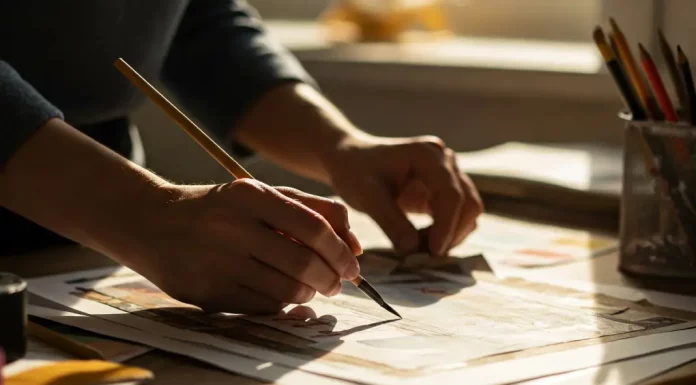
Treat AI as a brainstorming partner. Use generative models to create mood boards, rough layouts, or photorealistic prototypes, then refine them manually. Integrate AI into workflows to automate resizing or animation. Keep the human touch central—don’t allow AI to dictate style; instead, art‑direct its output. For example, use generative tools to produce surreal product mockups, then add personal textures or typography to match your brand.
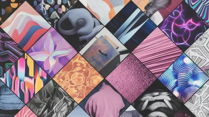
2. Digital Scrapbooking and Mixed‑Media Collage
What It Is
Nostalgia and the need for authentic storytelling have propelled scrapbooking into the digital age. Mixed‑media scrapbooking is a return to physical copy and paste, combining photos, textures, and handwritten elements to create tactile, collage‑like designs. The structured scrapbook trend uses intentional layering, polaroid textures, doodles, and stickers in polished compositions. Digital scrapbooking evokes personal memories while bringing analog charm to websites and packaging.

Why It Resonates
In an era saturated with AI‑generated perfection, audiences crave designs that feel human. Scrapbooking’s layered textures and hand‑drawn touches add warmth and individuality. The trend brings unique scrapbooking features into digital realms with polaroid‑like textures and whimsical lettering. This tactile aesthetic also appeals to younger consumers seeking authenticity over polish.
How to Use It
Start by collecting textures, vintage ephemera, and handwritten typography. Layer them digitally with careful attention to balance and negative space. Use polaroid‑style photo frames, tape graphics, or torn edges to evoke nostalgia. For packaging, incorporate botanical sketches or hand-drawn labels and typefaces. Ensure the composition remains legible and doesn’t overwhelm key messages.
3. Inclusive and Accessible Design
What It Is
Designers are embracing diversity, representation, and accessibility more than ever. You can see it everywhere that diversity and inclusion have moved to the forefront. In 2025, designs depict bodies with tattoos, varied hairstyles, and unique styles instead of airbrushed models. The importance of accessible and inclusive designs is urging creators to meet web content accessibility guidelines, use high‑contrast palettes, and include alt text. The trend extends beyond color contrast to feature visuals representing a range of races, genders, and abilities.
Why It Resonates
Demographic shifts and social justice movements have made inclusivity a brand imperative. Sustainability and inclusivity are essential foundations for projects in 2025. Inclusive design builds trust and fosters genuine connections by reflecting diverse audiences. It also reduces legal risk; more regulations require accessible digital content.
How to Use It
Audit your color palettes for sufficient contrast and enlarge type to at least 16px. Include alt tags and support keyboard navigation. Select imagery that depicts a broad spectrum of people. Consider designing multiple versions of materials to accommodate different abilities—for example, tactile printing for visually impaired users or captioned videos. Inclusivity should guide the entire creative process, not just the final visuals.
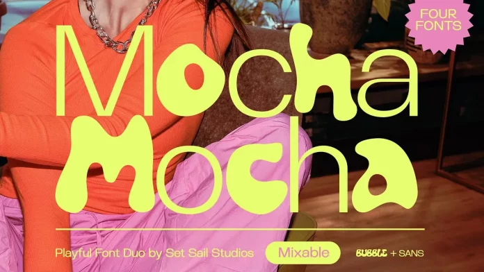
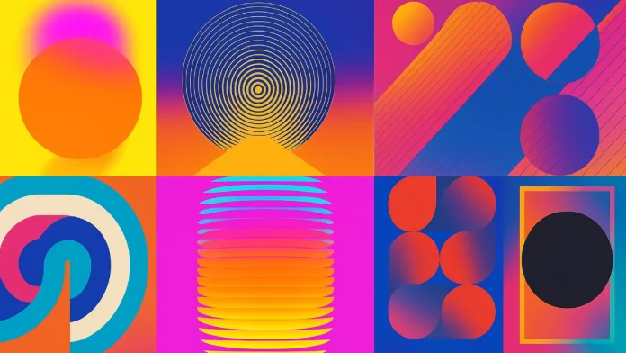
4. Expressive Typography and Bold Color Contrast
What It Is
Typography has become a primary storyteller. The so-called Mismatched and Bright trend mixes fonts of varying sizes and widths with neon colors, inspired by ’90s magazine cutouts. With fonts at the forefront, words are taking center stage with experimental, imperfect typefaces. There is a surge in high‑contrast and bold typography that pairs oversized sans‑serif type with vibrant backgrounds. Additionally, many brands are rediscovering serif and pixelated fonts to stand out.
Why It Resonates
Social media feeds are crowded; bold type and surprising color combinations cut through the noise. Designers describe mismatched fonts and funky wordmarks as a way to grab attention. High contrast isn’t just about accessibility; it signals presence in an overstimulated digital world. Using expressive typography also helps brands differentiate themselves when many have adopted similar sans‑serif logos.
How to Use It
Experiment with unconventional font pairings. Combine chunky display fonts with delicate scripts, but keep legibility paramount. Use contrasting colors strategically: neon on dark backgrounds or unexpected pairings like pink with periwinkle [looka.com]. Leverage pixel or serif fonts for retro tech vibes. Remember that the message should dictate the font; bold type only works if it aligns with your brand voice.
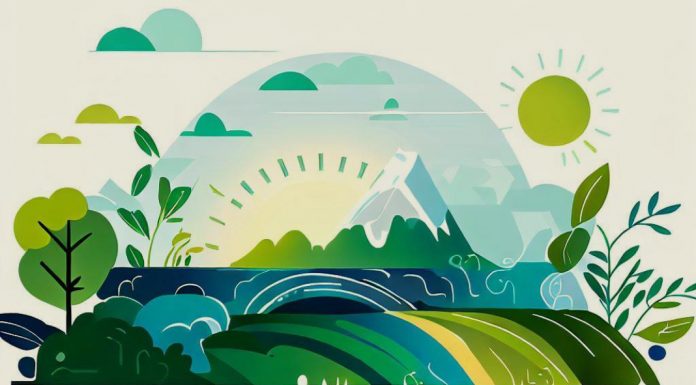
5. Sustainable and Nature‑Inspired Aesthetics
What It Is
Environmental awareness and wellness culture have birthed designs rooted in nature and sustainability. This rewilding design trend draws inspiration from leaves, water, and natural textures, using earthy tones like deep greens and browns. In graphic design, sustainability goes hand in hand with the rise of organic textures and earthy palettes. You may also have heard of zero‑waste design, which focuses on modular components, simplified storytelling, and print‑on‑demand to reduce environmental impact.
Why It Resonates
Consumers are increasingly concerned about environmental and social responsibility. Natural textures and organic shapes communicate calm, authenticity, and eco‑consciousness. Brands can convey environmental responsibility and holistic wellness through rewilding design. Zero‑waste design responds to the carbon emissions and e‑waste generated by digital design work.
How to Use It
Incorporate materials and textures resembling wood, stone, or foliage. Use flowing shapes and organic patterns to mimic natural forms. Choose earthy palettes with occasional pops of vibrant colour for contrast. Adopt modular design systems so elements can be reused across different media, reducing production waste. For print projects, consider on‑demand printing to avoid overproduction.
6. Retro‑Futurism and Psychedelic Nostalgia
What It Is
In 2025, design culture is obsessed with the past and the future simultaneously. For instance, the current trend of Nostalgic Networks draws from early computer aesthetics—pixelated fonts, ASCII art, and primary colors. In addition, retro psychedelic visuals blend 1960s psychedelia with bright colors, fluid shapes, and multiple patterned layers. The broader theme of retro‑futuristic styles is merging neon gradients and pixel graphics with modern innovation, while Contemporary Nouveau reimagines 1920s Art Nouveau with bold typography and dark backgrounds.
Why It Resonates
These approaches evoke nostalgia while satisfying the craving for innovation. Nostalgic Networks combines early digital nostalgia with modern minimalism, appealing to tech and lifestyle brands looking for authenticity. Retro psychedelic art channels the playful spirit of the 1960s while connecting to younger audiences drawn to vibrant self‑expression. Retro‑futurism also provides an emotional anchor in a rapidly changing digital world.
How to Use It
Blend retro elements with modern layouts. Use pixel fonts, simple geometric shapes, and muted primary colors to evoke early internet aesthetics. For psychedelic vibes, layer abstract patterns, wavy type, and vibrant hues like pink, yellow, and orange. Combine neon gradients with grain textures to create retro‑futuristic depth. Use these elements sparingly—one retro accent can be more effective than a full‑blown nostalgia overload.
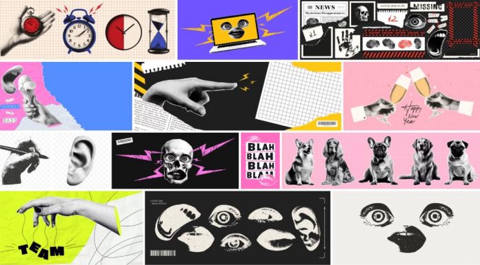
7. Imperfection and Raw Expression
What It Is
In reaction to AI perfection, many designers embrace raw textures, messy lines, and childlike marks. The Etches and Imprints graphic design trend celebrates smudges, fingerprints, and human imperfections, framing them as anti‑synthetic. Childlike textures adopt thick, rough outlines and bright colors reminiscent of children’s drawings. Motion Array identifies brain rot and chaotic maximalism, a Gen‑Alpha‑inspired aesthetic of meme‑driven, oversaturated visuals [motionarray.com]. Furthermore, doodles and hand‑drawn logos bring artisanal warmth to branding.
Why It Resonates
Imperfect design feels honest and playful. Etches and imprints push back against AI’s flawless surfaces, reintroducing tactile authenticity. Childlike textures tap into nostalgia and show a brand’s human side. Chaotic maximalism allows brands to connect with meme culture while delivering self‑aware humor. As generative AI becomes widespread, raw expression becomes a differentiator.
How to Use It
Incorporate handwritten fonts, doodles, or naive illustrations into packaging and identity systems. Use ink smudges, grain, and brush strokes intentionally. Combine childlike marks with sophisticated layouts to avoid looking amateurish. When exploring chaotic maximalism, balance meme culture and brand voice to maintain credibility.
8. Minimalist Maximalism and Bold Minimalism
What It Is
Minimalism remains influential, but designers are injecting it with bold color and eccentric typography. The “Not Quite Minimalism” trend—popularized by Charli XCX’s album Brat—adds vibrant fonts and contrasting colours to minimalist layouts [vistaprint.com]. Minimalist maximalism pairs spacious layouts and restrained color palettes with oversized type or intricate patterns. Adobe calls it bold minimalism and expects simple compositions with heavy emphasis on the few featured elements [adobe.com].
Why It Resonates
People still appreciate minimalism’s clarity, but the saturated digital environment demands stronger focal points. Not Quite Minimalism catches the eye while retaining modern elegance. Minimalist maximalism allows brands to enjoy both calmness and energy by combining neutrality with bursts of color and texture. Bold minimalism streamlines the message while ensuring it remains memorable.
How to Use It
Use ample white space but choose one element—typography, illustration, or color—to exaggerate. The “Brat green” from Charli XCX’s campaign demonstrates how a single vivid color can define a visual identity. Combine clean layouts with unexpected textures or type sizes to create minimalist maximalism. Keep the composition balanced; one bold element should not overwhelm the entire design.
9. 3D and Immersive Experiences
What It Is
Three‑dimensional graphics and immersive technologies are moving from gimmick to mainstream. Organic Futurism pairs AI with 3D design, producing hyper‑realistic, nature‑inspired forms. 3D objects and motion dominate 2025 with brands using hyper‑realistic images and animations for products, logos, and interactive web visuals. In addition, AR and VR have become integral to marketing as consumers demand immersive experiences.
Why It Resonates
3D design adds depth and tactility, making visuals more memorable. Organic futurism creates fluid, captivating forms that marry technology and nature. Brands like Nintendo have already used 3D billboards to capture public attention. AR and VR offer interactive storytelling, allowing users to virtually try products or play games (e.g., Pizza Hut’s Pac‑Man delivery boxes) [venngage.com].
How to Use It
Invest in 3D modelling tools or collaborate with 3D artists to create hyper‑realistic product renders and icons. Consider adding motion to static assets—looping animations can add interest to websites or social media. Explore AR filters for product visualization or VR showrooms that allow customers to interact with your brand environment. Keep user experience central; 3D should enhance comprehension, not distract.

10. Dynamic Branding and Personalization
What It Is
Data‑driven personalization has become a cornerstone of modern visual communication. The trend of Dynamic Branding and Personalization describes how designers adapt visuals in real-time based on user behavior, location, or preferences. Brands like Cleve.ai create unique reports for each user by harvesting LinkedIn data, encouraging sharing and engagement.
Why It Resonates
Consumers expect tailored experiences. McKinsey research quoted by Venngage shows companies that adopt advanced personalization achieve up to 40 % higher revenue growth [venngage.com]. Dynamic visuals feel more relevant and create an emotional connection by acknowledging individual interests. Personalization also aligns with AI and data analytics trends, helping brands stay competitive.
How to Use It
Implement systems that gather user data ethically and transparently. Use this data to customize graphics—change colors, layouts, or content based on user actions or demographics. Create templates that adapt automatically, like personalized infographics or dynamic dashboards. Personalization should enhance the narrative, not invade privacy; always prioritize consent and data security.
11. The Evolution of AI Aesthetics
What It Is
AI’s visual language has become subtler. The evolution of AI has shifted from over‑the‑top hyperrealism to subtle enhancements—AI now quietly balances colors or refines gradients rather than being the star. AI is merging with organic futurism, creating 3D designs that blend technology and nature.
Why It Resonates
The novelty of obvious AI art is fading, and audiences are wary of synthetic perfection. Subtle AI touches help designers work more efficiently without losing a human feel. As AI becomes more integrated, it will act as an invisible partner, making good design better without drawing attention to itself. This shift also addresses ethical concerns about authenticity and trust.
How to Use It
Use AI for tasks like palette generation or minor retouching rather than entire compositions. Combine AI‑generated elements with hand‑drawn textures or photography to avoid a sterile look. Educate clients about AI’s role to set expectations and maintain transparency.
Putting It All Together
The graphic design trends shaping 2025 reflect a tension between technology and humanity, nostalgia and futurism, minimalism and maximalism. AI has matured into a creative assistant; scrapbooking and doodles bring back the human touch; inclusive design ensures everyone can participate; bold typography and color contrasts help brands stand out; sustainable and nature‑inspired aesthetics address ecological concerns; retro‑futurism blends past and present; raw expression celebrates imperfection; minimalist maximalism finds balance; 3D and immersive experiences add depth; and dynamic personalization uses data to build relationships.
For graphic designers and brands, staying relevant means understanding these currents and choosing those that align with your voice and values. Don’t chase every fad—select the trends that enhance your story and resonate with your audience. Use this mid‑year update as a guide and as inspiration for your next project. By marrying thoughtful strategy with creative experimentation, you can create work that feels current, authentic, and, above all, meaningful.
Feel free to find more creative inspiration in WE AND THE COLOR’s Graphic Design category.


