Exceptional logo design and branding do more than just create a pretty picture. They tell a story, build a connection, and can turn a simple idea into a movement. Have you ever looked at a brand and felt like you just get it? That’s the magic of a powerful visual identity. It communicates a mission without a single word. Today, we’re looking at exactly how Felipe Holman of Holman Design achieved this for the Planu Social Calendar App. This isn’t just a breakdown of a logo; it’s a look into the heart of a brand built to bring people together.
Planu came from a common frustration. You know the feeling, right? You hear about an amazing event after it’s already over. Or you find yourself scrolling through five different platforms just to organize a night out with friends. Planu was born to fix this. The vision was a single, beautiful app where you could discover and plan real-world experiences. It needed an identity that felt just as intuitive and human as the app itself. This is the story of how strategic logo design and branding gave Planu its voice.

The Challenge: Crafting a Brand for Real Connection
Imagine launching a new app. The digital space is noisy, isn’t it? To stand out, Planu couldn’t just be functional. It needed to have a soul. The core challenge was to design a brand that could communicate trust and professionalism (B2B qualities) while also feeling magnetic, human, and exciting (B2C appeal). It had to resonate with a digitally-native audience that craves authenticity.
Holman Design’s journey began by immersing itself in Planu’s mission. Through deep research and strategic workshops, they worked to define the brand’s core. What is its purpose? Who does it serve? What does it want to make people feel? The goal was to build a brand identity from the ground up, ensuring every element was packed with intention. This foundational work is what separates a good brand from a truly great one.
Finding the Perfect Name: The “Planu” Story
Before a single line was drawn, the brand needed a name. A name can set the entire tone for a brand’s journey. After exploring many possibilities, a simple, brilliant idea emerged. By blending the words “PLAN” and “YOU,” the name “Planu” was created.
Think about it for a moment. The name itself is a promise. It communicates personalization. It puts you, the user, in control of your social life. It’s short, memorable, and directly speaks to the app’s core function: helping you effortlessly plan your experiences. This strategic naming decision became the first pillar of Planu’s unique logo design and branding system. It’s a perfect example of how branding is about smart, strategic thinking long before the visual design begins.
The Visual Spark: Deconstructing Planu’s Logo Design
Now, let’s talk about the visual centerpiece: the logo. What makes a good app logo? It needs to be simple enough to work as a tiny icon on your phone screen but meaningful enough to carry the weight of the entire brand. Felipe Holman’s design for Planu nails this balance.
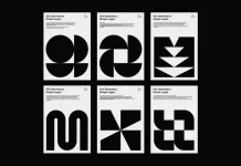
The symbol is a masterclass in simplicity and meaning. It’s a stylized letter “P” for Planu. But look closer. It’s constructed from two simple shapes: a dot and a circle. This isn’t arbitrary. The design cleverly represents a marked date on a calendar. The dot is the pin, and the circle is the highlighted day. Instantly, the logo communicates organization, planning, and events.
This logo design and branding element is both playful and modern. It feels approachable, not corporate or rigid. It’s a design that invites you in, promising ease and fun. The mark is a perfect visual summary of the app’s promise: to make planning your social life simple and clear.
Building a Universe: The Cohesive Visual Identity System
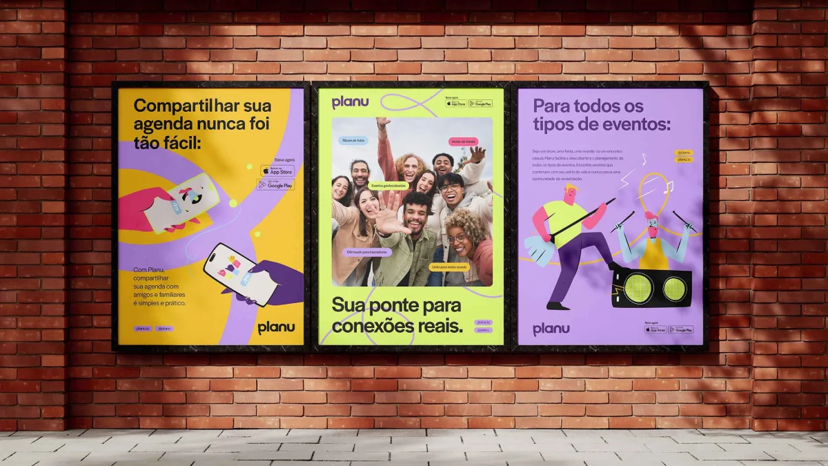
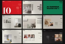
A great logo is just the beginning. To create a truly immersive brand experience, you need a complete visual identity system. Holman Design extended the logo’s core concepts into a rich and flexible branding system for Planu. This is where the brand truly comes to life.
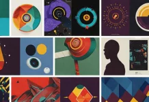
The visual language combines clean, geometric squares with soft, organic circles. What does this combination suggest? The squares subtly reference the grids of a calendar, reinforcing the idea of structure and planning. The circles, on the other hand, add a human, friendly touch, representing community and connection. This blend of shapes creates a visual texture that is both organized and approachable.
Color and typography choices were just as intentional.
- Color Palette: The colors were selected to evoke trust, clarity, and a burst of positive energy. They are vibrant enough to feel exciting on a digital screen but grounded enough to build a sense of reliability.
- Typography: The chosen fonts are clean, modern, and highly legible. In an app where information needs to be understood at a glance, clear typography is non-negotiable. It ensures the user experience is seamless and frustration-free.
This comprehensive visual identity ensures that every touchpoint—from the app’s interface to its social media posts—feels unmistakably like Planu.
From Concept to Screen: How to Integrate Branding into App UI/UX
A beautiful brand identity is useless if it doesn’t work in the real world. One of the most critical parts of this project was ensuring the branding was scalable and functional. How does a brand live and breathe inside a mobile app?
Holman Design crafted all of Planu’s brand assets with scalability in mind. The logo, icons, and other visual elements were designed to remain clear and legible, whether viewed on a large marketing banner or as a tiny notification icon. This is a crucial consideration in modern logo design and branding.
Furthermore, the team ensured the visual identity integrated seamlessly with the app’s User Interface (UI) and User Experience (UX). The branding wasn’t just slapped on top; it was woven into the user’s journey.
- Onboarding: New users are greeted with the brand’s friendly colors and clear typography, making their first experience welcoming.
- Event Discovery: The visual language of squares and circles is used within the app to organize information, making it intuitive to browse events.
- User Interaction: Buttons, icons, and menus all use the brand’s visual style, creating a cohesive and delightful experience from start to finish.
This thoughtful integration is a case study of successful app branding. It shows how visual design can enhance usability and make an app not just useful, but enjoyable to use.
More Than an App: Branding as a Tool for Community
Ultimately, Planu’s mission is about something much bigger than scheduling. It’s about reducing social isolation, encouraging cultural participation, and fostering real, human connection. The branding developed by Felipe Holman is a strategic tool designed to support this powerful mission.
By focusing on human-centered design, the branding communicates warmth, inclusivity, and community. It positions Planu not as a cold piece of technology, but as a friendly companion that helps you live a richer, more connected life. It’s a brand that understands the deep human need to belong and to share experiences. This emotional resonance is what has the potential to make Planu go viral—it taps into a universal desire.
The result is a bold, clear, and deeply engaging brand. It confidently launches Planu into the market with a message that everyone can get behind: real life is meant to be shared, and with a little help, it can be beautifully planned. The next time you see a brand that captures your attention, think about the story it’s telling. Chances are, a great deal of thought, strategy, and creative passion—just like in the logo design and branding for Planu—went into making you feel that way.
All images © Felipe Holman of Holman Design. Feel free to find other graphic design and branding projects here at WE AND THE COLOR.

