
Sophisticated graphic design and brand development by Chapter Studio for Robles Abogados.
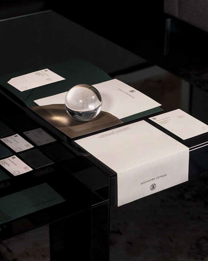
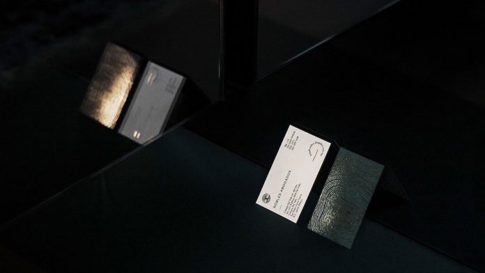
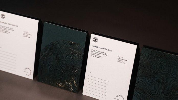
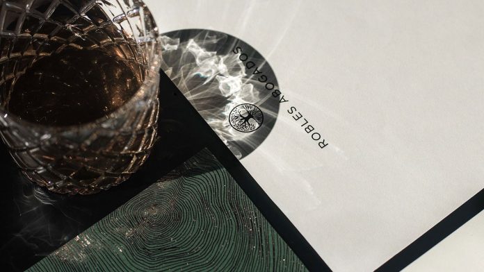
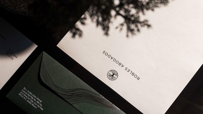
The creative team of Chapter Studio developed a sophisticated corporate identity for Robles Abogados, a law firm situated in Monterrey, Mexico. Roble translates to oak, the type of tree.
‘Roble’ the Spanish word for oak significantly influenced the entire graphic design concept of the corporate identity. Using a delicate foil lining of the inner print of an oak trunk, the creative team came up with a design that masterfully depicts the uniqueness of the law firm. In addition, the oak icon represents robustness, constancy, and deep roots in which Robles Abogados is founded on. Below you can find a selection of images. For more, please visit the website of Chapter Studio.
All images © by Chapter Studio. Feel free to find other outstanding projects in our Graphic Design and Branding categories. WE AND THE COLOR is your source for the daily dose of creative inspiration. For those looking for high-quality stock graphics, we recommend you to have a look at our Templates category. Furthermore, you can find lots of professional typefaces in our Fonts category or have a look at our list of the best stationery online shops.


