
This post contains affiliate links. We may earn a commission if you click on them and make a purchase. It’s at no extra cost to you and helps us run this site. Thanks for your support!
The Granke Typeface Provides a Bold Voice for Modern Design
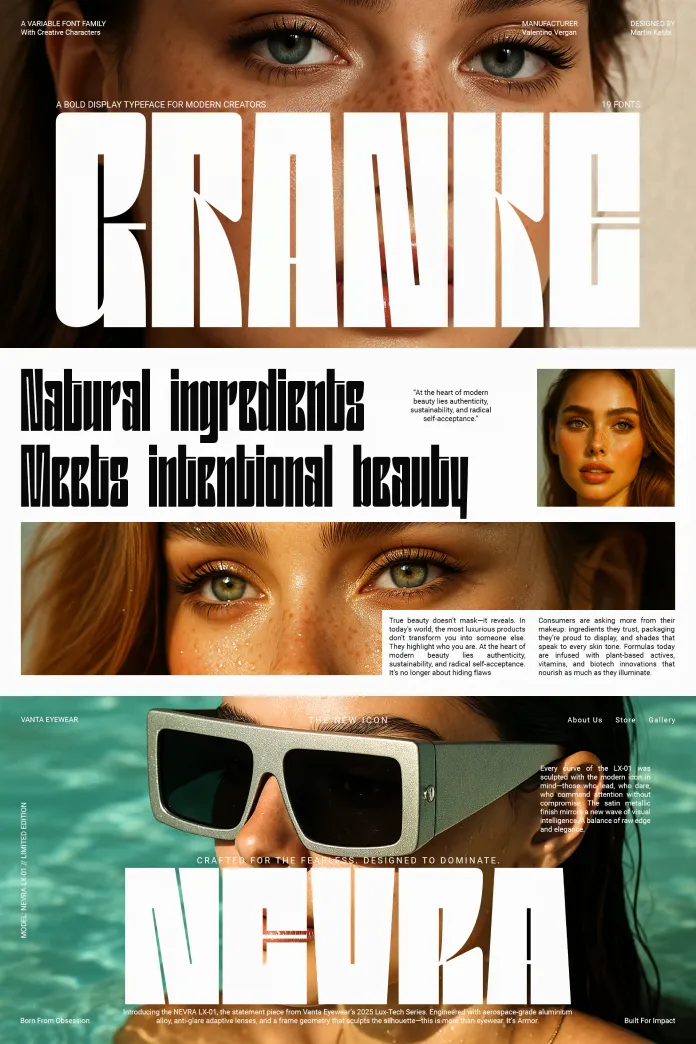
The new Granke font family has arrived as a significant and timely force in typography. Released by publisher Valentino Vergan from the hands of designer Martin Katibi, it answers a clear call. Creatives need display fonts that are not only flexible but also full of distinct character. The Granke font family is an expertly crafted solution for this demand. It delivers a powerful typographic toolkit for professionals. Consequently, designers can build compelling visual stories with both confidence and artistic nuance. This typeface stands apart with its tall, assertive letterforms. It is built for impact.
The complete family is available for purchase from these platforms:
What Makes the Granke Font Family Stand Out?
The Granke font family asserts a unique presence in any design. Its visual signature is defined by a confident and contemporary aesthetic. The font’s tall proportions immediately capture attention, making it a powerful tool for visual hierarchy. This is not just a font; it is a statement piece. It gives designers a way to convey strength, clarity, and sophistication simultaneously. How might this assertive character elevate your next project? Granke challenges creators to be bold and direct in their messaging.
The complete family is available for purchase from these platforms:
A Fusion of Strength and Elegance
While Granke is undeniably bold, it does not sacrifice refinement. A closer look reveals a careful balance between strong, geometric structure and subtle, humanistic details. Its clean lines and consistent stroke weights ensure high readability across all applications. However, the unique alternates and ligatures introduce a layer of creative flair. This duality makes the Granke font family exceptionally versatile. It can anchor a corporate identity. Conversely, it can add an artistic touch to an editorial spread.

The Anatomy of a Modern Typeface: A Granke Deep Dive
The true power of the Granke font family lies in its comprehensive and modern feature set. These elements provide designers with an incredible range of control and creative freedom. They ensure the typeface can adapt to nearly any design challenge.
Comprehensive Weights and a Powerful Variable Font
Granke includes a remarkable spectrum of nine weights. These range from a delicate Thin to an impactful Black, each with a matching oblique. This extensive range gives designers precise control over typographic texture and emphasis. Furthermore, the inclusion of a variable font is a game-changer for digital design. It allows for real-time adjustments to weight and slant. As a result, designers can create fluid, responsive typography for web and mobile interfaces.
Global Communication with Extended Language Support
Today’s design projects often require a global reach. The Granke font family is prepared for this reality. It offers extended language support that includes both Latin and Cyrillic scripts. This crucial feature enables brands to maintain a consistent visual identity across international markets. Therefore, a campaign can speak with one clear, typographic voice, from London to Sofia. This makes Granke an invaluable asset for multinational corporations and publications.
Advanced Typographic Features for Creative Expression
Beyond its impressive weight and language options, Granke is rich with advanced features. The family contains true small caps, which are essential for creating sophisticated editorial layouts. It also boasts a collection of creative ligatures and stylistic alternates. These special characters allow for unique and expressive typographic compositions. With a total of 595 glyphs, the Granke font family empowers designers to move beyond the default and craft truly memorable visuals.
Practical Applications: Where the Granke Font Family Excels
A typeface proves its worth through its performance in real-world scenarios. The Granke font family is engineered to excel across a wide array of demanding creative applications, from print to digital screens.
Crafting Unforgettable Brand Identities
For branding and identity projects, the Granke font family is a natural choice. Its confident personality helps create distinctive logos and wordmarks that stand out. The font’s inherent strength makes it perfect for packaging design and product branding. Its scalability ensures a brand’s typographic system remains powerful and coherent, whether on a business card or a billboard. The result is a memorable and impactful brand presence.
Driving Engagement in Editorial and Advertising
In the fast-paced worlds of editorial design and advertising, grabbing attention is critical. The clear, commanding voice of the Granke font family makes it ideal for headlines and advertising campaigns. Its high legibility ensures messages are communicated with force and clarity. Designers can use its various weights to build a dynamic and engaging visual narrative that guides the reader’s eye through the layout.
Enhancing Digital Experiences and UI/UX
The Granke font family is perfectly suited for the demands of digital design. Its clean structure and excellent on-screen rendering make it a top choice for UI/UX layouts and headline systems. Because it is optimized for tools like Figma and Adobe Creative Cloud, it integrates smoothly into modern design workflows. Using a versatile sans serif with Cyrillic support like Granke ensures that digital products are both beautiful and accessible to a wider audience.
Why Granke is More Than Just a Font
Ultimately, the Granke font family represents a shift in how designers can approach typography. It is not merely a collection of letters but a complete and considered system for visual communication. It provides the tools to create work that is bold, flexible, and globally relevant. For the creative professional, Granke is an innovation partner. It pushes designers to create clearer, more impactful, and more expressive work. This font is set to become a staple in the toolkits of leading creatives worldwide.
The complete family is available for purchase from these platforms:
You can discover more typefaces in the Fonts section here at WE AND THE COLOR.


