This post contains affiliate links. We may earn a commission if you click on them and make a purchase. It’s at no extra cost to you and helps us run this site. Thanks for your support!
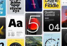
The Gio font family, crafted by the talented trio Emil Karl Bertell, Erik Jarl Bertell, and Teo Tuominen of Fenotype, stands as a testament to the fusion of robust geometric features with subtle intricacies. It epitomizes sophistication and modernity in typography, offering a versatile range of options for designers seeking both style and functionality.
With two widths and seven styles each, Gio boasts a distinctive wedge-serif design characterized by its generous x-height and straight terminals. This careful balance between geometric robustness and refined details results in an ensemble that exudes elegance, making it a perfect choice for captivating presentations and captivating audiences.

Whether gracing the pages of magazines, commanding attention in headlines, lending its charm to logos, or enhancing any form of advertisement, Gio brings forth a sense of sophistication and contemporary flair. Its consistent proportions ensure a harmonious visual experience across various applications, making it a go-to choice for designers aiming to make a bold statement while maintaining readability and aesthetic appeal.
Gio emerges as a versatile tool, capable of elevating any design project with its modern sensibilities and timeless appeal. It embodies the essence of refined craftsmanship, offering a seamless blend of form and function that resonates with the discerning eye of designers and typographers alike.
Feel free to find other recommended typefaces for different creative needs on WE AND THE COLOR.


