Freshways Takes a Leap Forward with White Bear’s Visionary Rebrand
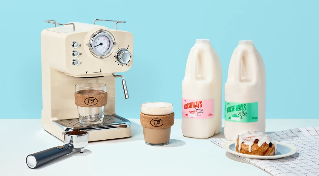
White Bear, the acclaimed creative agency based in London, completed a striking rebrand for Freshways, the UK’s leading independent dairy supplier. This collaboration aimed to breathe new life into a brand that, while widely used, lacked strong public recognition. Freshways had built a reputation for speed and quality but needed a memorable visual identity to match. White Bear’s solution was a bold and energetic transformation that positioned Freshways as an agile and dependable market leader.

The Task: Reinventing an Industry Staple
White Bear faced a unique challenge: Freshways was already a mainstay in cafes, shops, and homes, yet the brand was often overlooked. The goal was to create an identity that would elevate the brand’s visibility and reflect its core attributes—speedy delivery and exceptional service.
Kelly Mackenzie, Creative Director at White Bear, emphasized the need for a character-driven concept. “Our goal was to give Freshways a memorable identity and a personality that goes beyond just dairy,” Mackenzie stated. This insight led to the creation of a “superhero team” theme, symbolizing Freshways’ mission to keep milk flowing to shelves and rescue customers from shortages.
Core Concept: “Think Fresh, Act Fresh, Sell Fresh”
The revitalized identity hinged on the concept “Think Fresh, Act Fresh, Sell Fresh,” reinforcing Freshways as an agile, fast-moving supplier with a fresh approach. White Bear integrated this philosophy into every aspect of the rebrand, including logo design, color schemes, packaging, digital assets, and marketing materials.
The rebrand’s bold, vibrant color palette and striking typefaces were designed to mirror Freshways’ dynamic nature. The tone of voice was adjusted to be more relatable and modern, appealing directly to customers and partners alike.
Visual and Strategic Elements
White Bear’s comprehensive overhaul included:
- Logo Design: A sleek, modern logo that conveys movement and freshness.
- Color Palette: Bright, energizing colors that stand out on store shelves and in digital spaces.
- Typography: A strong typeface that speaks to the brand’s confidence and reliability.
- Digital Assets: Updated app designs and a revamped website that provide seamless user experiences.
- Packaging and Merchandise: Eye-catching designs that maintain brand consistency across products.
This meticulous approach ensured that every touchpoint communicated Freshways’ renewed identity. The result was a cohesive look and feel that speaks directly to the company’s values and mission.
The Impact of Bold Choices
Freshways’ decision to pursue an ambitious and unconventional concept highlighted its commitment to challenging industry norms. Kelly Mackenzie reflected on the collaboration, “Freshways really trusted us. They picked a very brave concept, were always positive, and we knew they were committed to growing quickly.”
White Bear’s history of working with high-profile FMCG brands such as Kopparberg and RedBull showcased its ability to craft impactful, recognizable identities. The agency’s work with Freshways proved no different, positioning the dairy supplier to not only stand out but to resonate deeply with customers.
Client-Centric Collaboration
A standout feature of this partnership was the collaborative spirit between Freshways and White Bear. Arun Nijjar, Marketing Director at Freshways, remarked on the transformative nature of the project, “Working with White Bear transformed not just our brand, but our business strategy. They didn’t just deliver creative work—they became true strategic partners who took the time to deeply understand our business challenges.”
This commitment to understanding Freshways’ needs enabled White Bear to translate customer insights into a creative output that aligns perfectly with audience expectations. The rebrand, therefore, not only improved Freshways’ aesthetic appeal but also reinforced its operational ethos of reliability and quick service.
Strategic Benefits and Future Outlook
The new brand identity equips Freshways with the tools to enhance communication with both customers and internal teams. The revitalized design also positions the company to expand its market reach and influence. White Bear’s bold approach ensures that Freshways is not just another dairy supplier but a brand that stands for speed, freshness, and customer-centric service.
About White Bear
White Bear has built its reputation as an agency that champions ambitious brands through distinctive and effective design. The team’s dedication to impactful creativity has earned them recognition, including the Small Agency of the Year 2022 and a Gold award at the 2024 Design Effectiveness Awards. Their collaborative process and strategic insight continue to set a high standard in the industry.
In this project, White Bear successfully reimagined Freshways’ identity, showcasing its ability to elevate brands and create meaningful connections with audiences. Freshways now stands as a testament to what can be achieved when creativity meets strategic thinking.
All images © by White Bear. Do not hesitate to find other creative work from around the globe in the Graphic Design, Branding, or Packaging Design sections on WE AND THE COLOR.
Subscribe to our newsletter!


