A sophisticated and unique airline brand identity developed by studio Alphabet for Extrajet.
A new airline named ‘Extrajet’ will launch in 2017 with a focus on European business travelers. Extrajet offers rare air links such as Leeds to Copenhagen and Antwerp twice a day. Alphabet, a Manchester, United Kingdom based studio was commissioned to develop a brand identity, which is as unique as the airline itself. Their dedicated design team has created a contemporary wordmark based on a clean sans serif font with the addition of a soft touch. Equipped with unique details and round edges, the wordmark aims to feel modern and friendly. Small angular cuts in the ‘x’ and ‘t’ letterforms refer to the shapes of Extrajet’s flagship aircraft, the Embraer 135 jet. Get more information below.
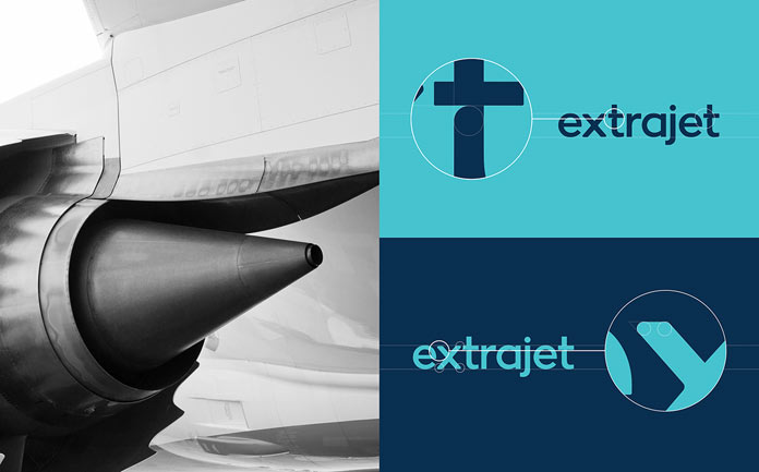
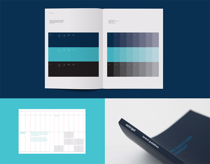
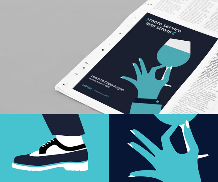
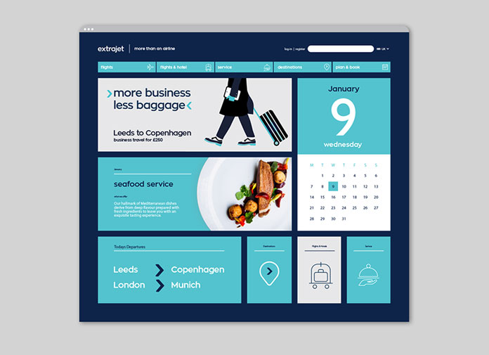
For the entire brand development it was particularly important that Extrajet is recognized as being a strictly business airline. Alphabet’s distinctive brand solution is mainly based on four key colors, consisting of white, black, sky blue and navy blue. A graphical device depicts a forward facing arrow referencing to Extrajet’s sophisticated service. The airline’s selected imagery is mainly based on close crops and details to emphasize the premium side of the brand. Below you can see a few examples of the sophisticated result. Feel free and discover more of Alphabet’s creative work on their website.











Gorgeous branding. Keep up the good work!