
American healthcare can feel like a maze, especially for mothers. Consequently, many find themselves managing appointments, records, and family health histories within fragmented systems. It is not surprising that nine out of ten women in the US resort to simple note-taking apps to track their family’s care. Into this gap steps Trellis, a revolutionary healthcare app designed for mothers. However, its initial branding did not fully capture its powerful mission. This led to a thoughtful rebrand by the design studio How&How, aiming to create a brand that matched the app’s profound capabilities. This is the story of how strategic branding transformed a promising tool into the mother of all healthcare apps.
The Challenge: A Powerful App with a Muted Voice
Before its rebrand, Trellis faced a classic challenge. The app was an intelligent, forward-thinking platform for mothers and future generations, yet it was perceived as just another temporary fix. The company felt it was selling itself short. Its purpose was not just to address immediate pregnancy and post-partum needs but to build a foundation for lifelong “Generational Health.” The original brand identity lacked the strength and clarity to communicate this deeper value. Therefore, it needed a new voice and visual language. The goal was to build a brand that could confidently back up the app’s revolutionary promises.
Developing a Living Blueprint: How&How’s Solution for Trellis
How&How, a branding agency, took on the task of reshaping the Trellis identity. Their approach was holistic, aiming to build a brand that felt both deeply human and technologically advanced. They started with the core function of the app: compiling decades of medical history into a single, seamless record. This “living blueprint” helps organize a user’s life and ensures that crucial health information can be passed down through the family.
A Foundation Built on Life
The new brand identity for Trellis is built on a flexible grid system. This structure provides a consistent yet adaptable framework for all brand assets. Furthermore, a key element is a library of natural, sunlit photography. These images celebrate life through pregnancy and beyond. They feature a diverse range of people, ages, and families, reflecting every stage of Generational Health. This approach grounds the high-tech app in the real, emotional experiences of its users.
The Human Touch: A Fingerprint and a Hidden ‘T’
To add a layer of personal connection, How&How introduced an illustrative fingerprint texture. This texture humanizes otherwise technical charts and data visualizations within the Trellis app. Moreover, it serves as a constant reminder of the individual user at the heart of the technology. Zooming in, this fingerprint-inspired design also reveals the key brand icon. A subtle ‘T’ is cleverly hidden within its ridges. This detail elegantly connects the user’s unique identity to the Trellis brand.
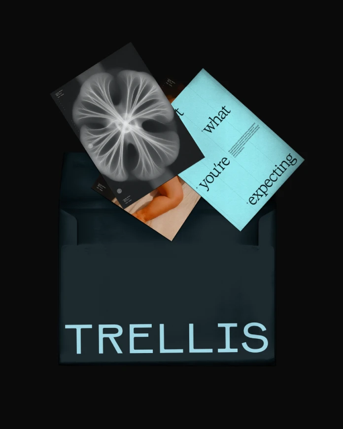
The Voice of the Midwife: A Bold New Tone
Perhaps the most distinctive element of the rebrand is the new verbal identity: “the Voice of the Midwife.” This concept was inspired by the bold, courageous, and reassuring manner of midwives. It delivers what mothers need to know with clarity and “zero varnish.” This direct and empathetic tone builds trust and makes complex medical information feel manageable. Consequently, it transforms the user experience from merely transactional to genuinely supportive. Can a healthcare app truly speak with such a human voice? Trellis proves that it can.

Why This Rebrand Matters for Women’s Health Tech
This is more than just a successful rebrand; it is a statement about the future of women’s health tech. The Trellis project demonstrates a profound understanding of its target audience. It acknowledges that mothers are often the primary healthcare managers for their families. They need tools that are not only powerful but also intuitive and empathetic. The branding by How&How successfully aligns the app’s external perception with its internal mission to support families and build a legacy of health.
By moving beyond generic tech aesthetics and crafting a narrative-driven brand, Trellis sets a new standard. The focus on “Generational Health” positions the app as a long-term partner rather than a short-term tool. This thoughtful approach to brand identity is crucial for earning trust in the sensitive and personal space of healthcare. It shows that the most effective technology is that which feels deeply human.
Any footage © How&How. Feel free to browse WE AND THE COLOR’s Graphic Design, Branding, and Web Design categories for more.
Subscribe to our newsletter!


