The visual identity designed by Palantis for Easy Copy, a printing solution conceived by Stéphane Le Sech, exemplifies the power of simplicity and geometric precision in brand design. Easy Copy is an innovative online platform that allows users to upload their documents and pick them up at partner print shops. To reflect the efficiency and convenience of this system, Palantis developed a streamlined and memorable visual identity.

Conceptual Foundation of the Visual Identity
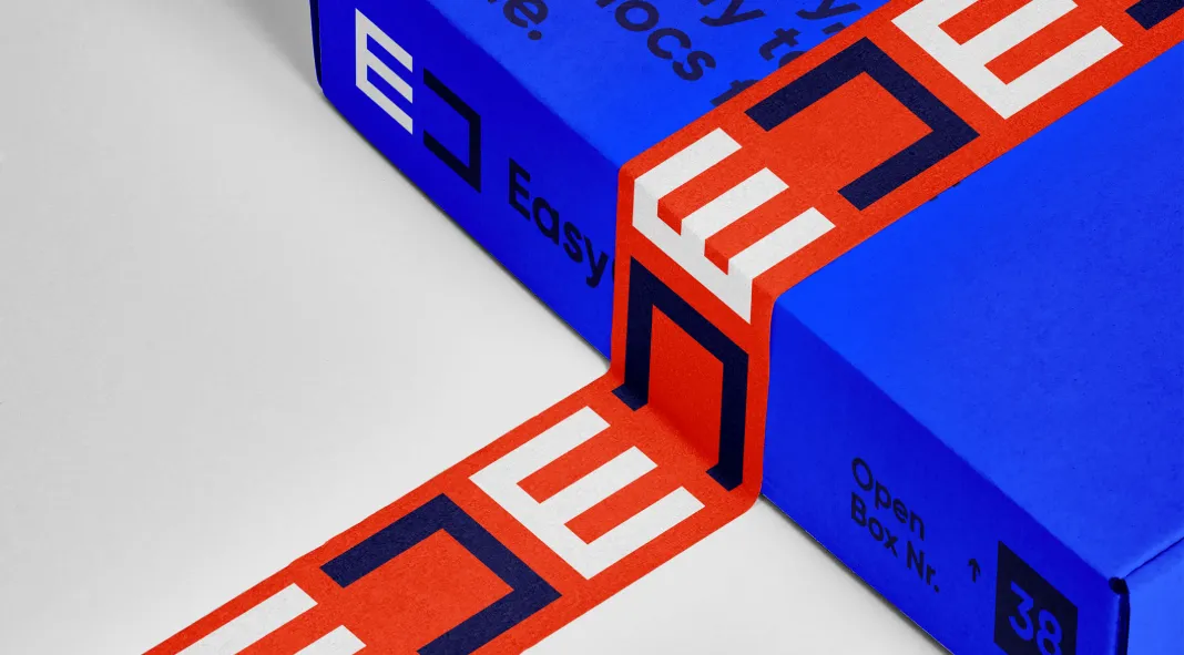
The collaboration between Palantis and Le Sech focused on the need for a strong, cohesive identity that could be easily adapted across various communication mediums. The studio was tasked with creating the logo and the entire graphic territory for the brand. The result is a minimalist yet striking visual language centered around a stylized logo that merges the letters “E” and “C.”
The decision to invert the “C” next to the “E” is not just a clever aesthetic choice; it is a visual reflection of Easy Copy’s core service—copying and printing. This inversion introduces a sense of symmetry that mirrors the duplicative nature of the solution, giving the logo depth and conceptual alignment with the brand’s promise.
Geometric Precision as the Cornerstone
Geometric forms play a fundamental role in Easy Copy’s visual identity. The logo itself, composed of sleek, intersecting lines, forms the central element from which all other branding materials are derived. This structured approach translates into an identity that is versatile yet consistent, and effortlessly adaptable across both digital and physical platforms.
Beyond the logo, Palantis expands the brand’s visual language by incorporating geometric patterns and compositions. These designs are carefully crafted to maintain visual harmony, reinforcing Easy Copy’s commitment to precision and functionality in its services. The use of simple geometric shapes lends a sense of modernity and clarity to the identity, aligning with the brand’s tech-forward ethos.
Color Strategy: Bright and Bold
One of the most compelling aspects of this identity is Palantis’ use of a bright color spectrum. The choice of vivid hues immediately catches the eye, creating a dynamic visual impact. This color palette is not only engaging but also serves a practical purpose—enhancing brand recognition and memorability. The sharp contrast between the geometric forms and the vibrant colors elevates the identity, making it visually arresting without overwhelming the viewer.
Impact on Brand Communication
The decision to center the identity around a simple, geometric logo underscores the brand’s focus on functionality and ease of use. The visual symmetry created by the inverted “C” is a metaphor for the copying process, while the bright colors inject a sense of energy and modernity into the brand’s image. This combination allows Easy Copy to stand out in a crowded market, where clear and efficient communication is essential for success.
Palantis has successfully created a visual identity that not only embodies the core values of Easy Copy but also enhances its presence across multiple touchpoints. From the digital interface to print materials, the identity maintains a sense of unity and purpose, ensuring that the brand is immediately recognizable.
The visual identity developed by Palantis for Easy Copy is a testament to the studio’s ability to craft thoughtful, strategically-driven designs. Through the use of simple geometric forms and a vibrant color palette, Palantis has created a bold, memorable identity that aligns with Easy Copy’s mission of providing efficient and accessible printing solutions. The logo’s stylized interplay of the letters “E” and “C” reflects the brand’s core service, while the geometric patterns and bright colors enhance its modern and approachable aesthetic. This visual identity not only communicates the brand’s values but also ensures it remains distinct and impactful across diverse platforms.
With this identity, Easy Copy is well-positioned to resonate with users and establish itself as a leader in the online printing industry.
- Art Director & CEO: Alexis Boudal
- Studio: Palantis, Nantes, France
Palantis, with its small team of passionate creatives and strategists, continues to push boundaries by delivering visually sharp and conceptually aligned designs, perfect for start-ups and new ventures seeking innovative branding solutions.
All images © by Palantis. Feel free to find other trending graphic design and branding projects on WE AND THE COLOR.

