This post contains affiliate links. We may earn a commission if you click on them and make a purchase. It’s at no extra cost to you and helps us run this site. Thanks for your support!
Typography is a cornerstone of design, shaping the way people perceive messages and ideas. From sleek sans-serifs to elegant serifs, typefaces are more than just letters on a screen or page—they’re carriers of culture, innovation, and history. Yet, one aspect often overlooked is the origin of their names. These names aren’t arbitrary; they reflect the spirit of the times, the ambitions of their creators, or the practical needs they were meant to serve.
Have you ever wondered why Helvetica is called Helvetica or what inspired the name Futura? For designers, knowing the stories behind these names adds a layer of meaning to their work. It’s like discovering a secret ingredient in a recipe you’ve loved for years. Let’s unravel some of the fascinating tales behind the names of iconic typefaces and see how they shape the way we view typography today.
Helvetica: Simplicity in a Name
Helvetica is arguably the most recognized typeface in the world. Its name reflects its Swiss origins—Switzerland’s Latin name is “Helvetia.” Originally named Neue Haas Grotesk when Max Miedinger and Eduard Hoffmann designed it in 1957, the typeface needed a global-friendly identity to succeed internationally. Renaming it to Helvetica was a strategic move that embodied its clean, neutral style.
The name is as functional as the typeface itself. It evokes precision and simplicity, much like Swiss design principles. This typographic staple has since graced everything from subway signs to corporate branding.
Futura: A Typeface for Tomorrow
Designed by Paul Renner in 1927, Futura was created during an era of artistic revolution. Its geometric structure and sans-serif style aligned with the Bauhaus movement’s philosophy of “form follows function.” But why the name “Futura”?
Renner envisioned it as the future of typography. It was modern, clean, and ideal for the machine age. The name perfectly encapsulates its forward-looking design, making it a favorite for cutting-edge brands and even space missions—yes, it’s on the Moon!
Garamond: A Legacy Etched in Letters
Garamond is more than a typeface; it’s a tribute. Named after Claude Garamond, a 16th-century French type designer, this serif font has stood the test of time. Known for its elegance and readability, Garamond was first crafted for books and has since become synonymous with literary refinement.
Unlike other typefaces, its name reflects the creator rather than an abstract concept. It’s a nod to Garamond’s enduring influence in typography, a reminder of craftsmanship in a digital age.
Times New Roman: News Fit for Print
This classic serif typeface was commissioned by The Times of London in 1931. Stanley Morison, working with Victor Lardent, designed it to improve readability and conserve space in print. The name “Times New Roman” directly links the typeface to its purpose.
It was the “new” font for The Times, replacing an older, less efficient typeface. Its widespread adoption beyond newspapers solidified its place as a universal standard for print and digital documents.
Baskerville: A Designer’s Personal Mark
Baskerville is as much about the man as the type. John Baskerville, an 18th-century English printer, created the font as part of his pursuit of typographic perfection. He wanted to improve readability and aesthetic appeal in printed works.
Unlike Helvetica or Futura, Baskerville carries the designer’s name, reflecting the deeply personal connection between its creator and his work. The typeface’s refined, elegant style mirrors Baskerville’s vision of sophistication.
Names Carry Stories
Typefaces are not just tools for communication; they are windows into the minds of their creators. Each name reflects a purpose, a vision, or a legacy. For designers, understanding these stories enriches their appreciation for typography. Next time you choose a typeface, think about the story behind its name. You might find it inspires your design just as much as the font itself.
Want more “did you know” articles like this? Stay tuned for more fascinating insights from the design world!
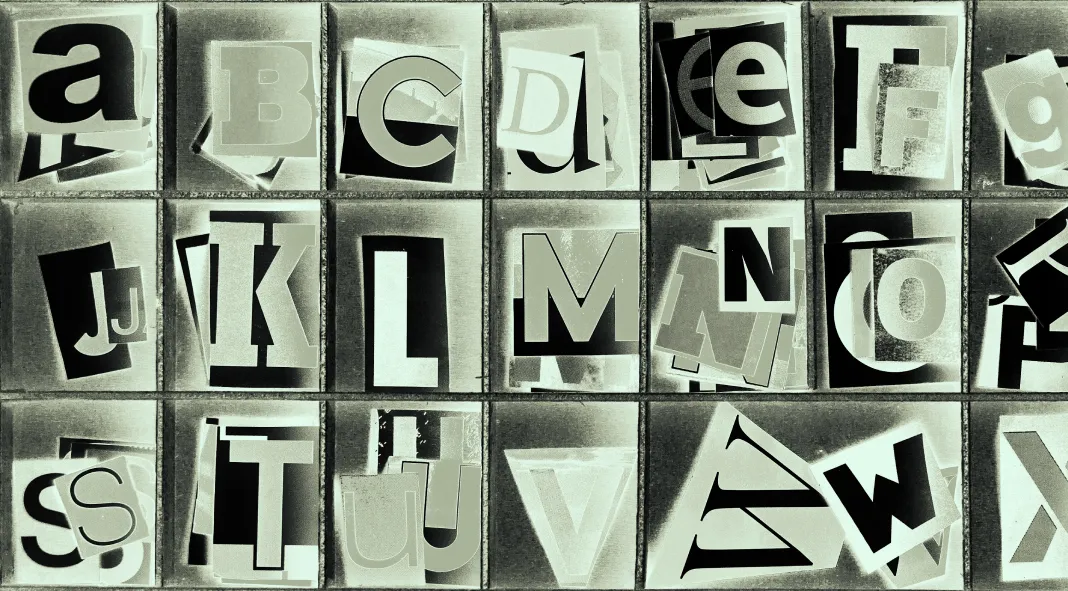
Feel free to find professional typefaces on WE AND THE COLOR or read about the best fonts according to current typography trends for 2025. Header image by Charles Taylor (via Adobe Stock).
Subscribe to our newsletter!

