A minimalist brand identity created by agency Anti for Dark Architects.
Oslo, Norway based agency Anti was asked to develop a modern brand identity for Dark Architects. Anti has created a visual vocabulary based on the idea of how light and darkness defines form. The result is an extremely minimalist design, which graphically and typographically plays with the brand name. Anti’s minimalist solution offers a vibrant and living profile. You can find further information about the architectural firm below the first image of the article.

The architectural firm specializes in a variety of fields ranging from design and planning to landscape architecture. They are mainly hired for large scale urban projects as well as diverse commercial and residential industry. Their goal is to design highly innovative and sustainable solutions. Working in close collaboration with their clients, Dark Architects is one of Norway’s fastest growing architectural firms.
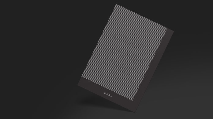
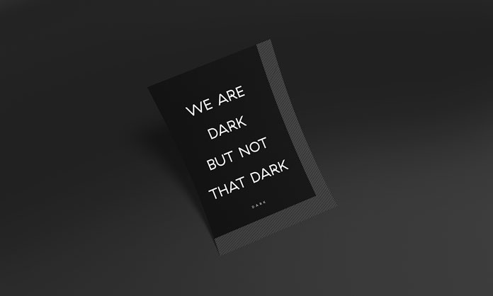
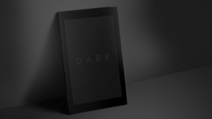
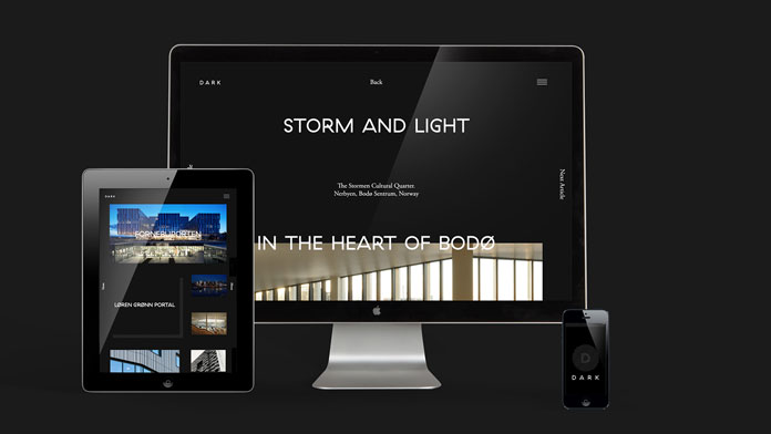
The whole brand identity is based on the striking contrast of simple black and white. Using diagonal white lines on a black background, Anti has developed a vivid but yet minimalist visual experience. The graphic work included a brand concept, a range of printed collateral, and a new responsive website. Check out the examples below or discover more of Anti’s impressive work on their website.

Are you looking for more similar content? Do not hesitate and check out our Graphic Design and Branding categories to find more inspiring work! Both sections are equipped with a selected collection of remarkable design solutions from all over the world.

