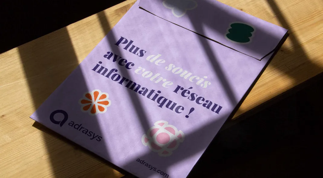
In 2018, Adrasys, a company specializing in network systems, IT asset management, and security solutions, embarked on a journey to redefine its brand identity. Recognizing the need to align its visual representation with its evolved structure and market position, Adrasys enlisted the expertise of Palantis, a creative agency based in Nantes, France. Under the direction of Alexis Boudal, Art Director and CEO of Palantis, the project aimed to create a cohesive and compelling visual identity that reflects the company’s core values and forward-thinking approach.

Project Overview
Adrasys has experienced significant growth and development since its inception. This evolution necessitated a rethinking of its brand identity to better communicate its expanded capabilities and professional maturity. Palantis, known for its passionate and experienced team, was the perfect partner for this task. The agency specializes in building brands for start-ups and new ventures, leveraging a strategic blend of creativity and business acumen.
Strategic Brand Rationalization
The project began with a comprehensive analysis of Adrasys’ services and market positioning. Palantis proposed a rationalization of services, aiming to streamline and clarify the company’s offerings. This foundational step ensured that the new visual identity would be not only aesthetically pleasing but also strategically aligned with Adrasys’ business goals.
Symbolic and Typographic Innovation
Central to the new identity was the creation of a unique system of symbols. These symbols were designed to represent the various facets of Adrasys’ services and to create a visual language that could be easily recognized and remembered. Complementing these symbols was a carefully selected color scheme, chosen to evoke a sense of reliability, security, and innovation.
The typographic strategy played a crucial role in the rebranding effort. Palantis introduced a new display font that added a distinctive character to Adrasys’ visual communications. This was paired with Raleway, a geometric sans-serif font known for its clean lines and modern appeal. The combination of these two fonts allowed for versatile and impactful design possibilities, highlighting key messages and ensuring clarity across all media.
Color Palette and Visual Consistency
The chosen color palette was composed of deep, complementary hues. These colors were selected not only for their aesthetic appeal but also for their ability to convey the brand’s values of trustworthiness and technological sophistication. The palette provided a wide range of design options while maintaining a consistent and recognizable visual base.
The collaboration between Adrasys and Palantis resulted in a refreshed brand identity that effectively communicates the company’s expertise and dynamic nature. By integrating symbolic design, innovative typography, and a strategic color scheme, Palantis succeeded in creating a visual identity that is both distinctive and aligned with Adrasys’ mission.
Palantis continues to be a vital partner for start-ups and growing businesses, offering tailored branding solutions that drive success. Their work with Adrasys stands as a testament to their ability to blend creativity with strategic insight, producing results that resonate in the competitive landscape of IT and network systems.
Project Credits
Art Director & CEO: Alexis Boudal
Agency: Palantis, Nantes, France
Expertise: Branding, Visual Identity, Strategic Brand Development
All images © by Palantis. For more information about Palantis and their portfolio of successful branding projects, visit their website or contact them directly.
Subscribe to our newsletter!

