Graphic design and brand development by LMNOP Creative for CARPENTER + MASON.
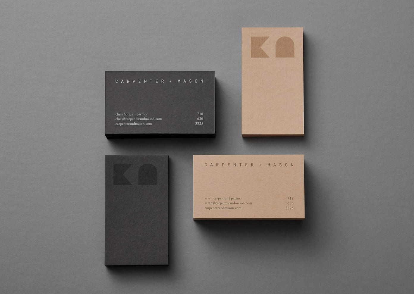
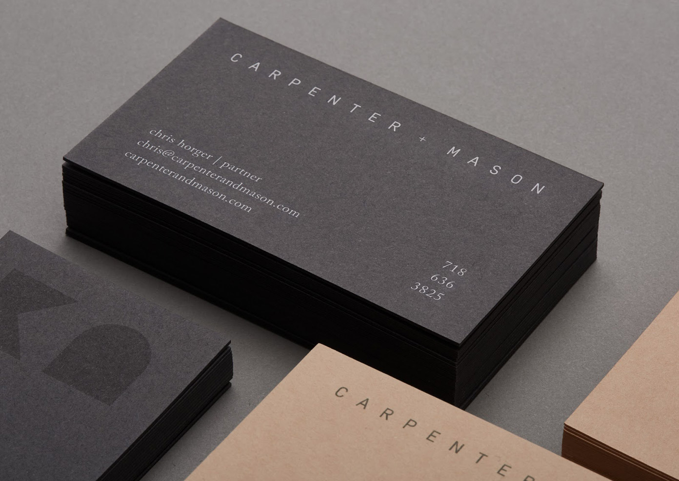
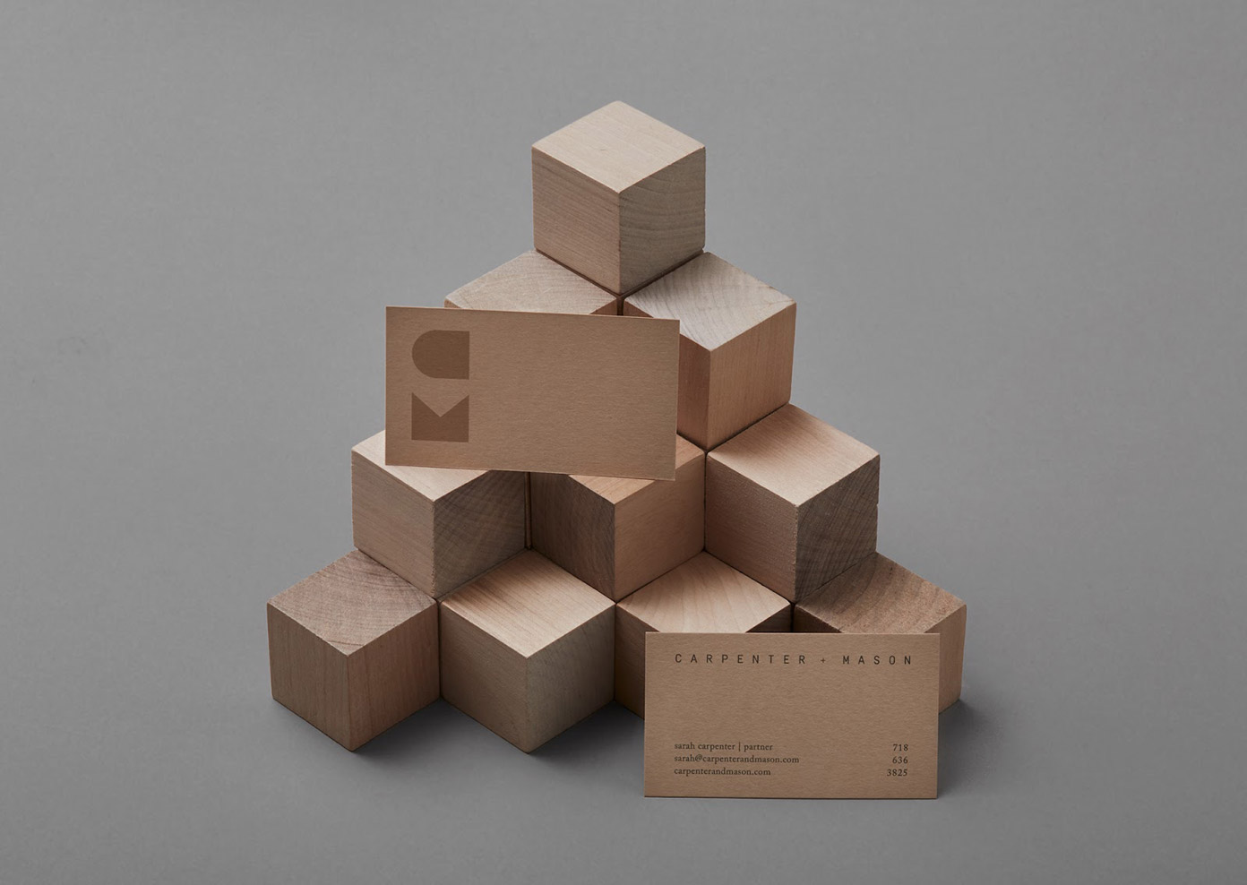
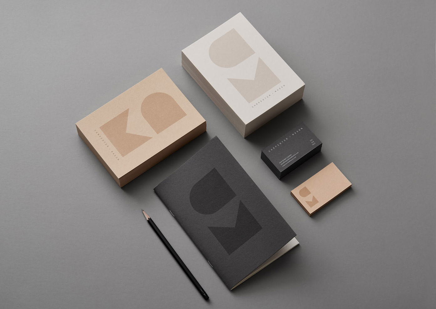
The team of LMNOP Creative was asked to help with a new brand identity for CARPENTER + MASON, an interior design and architecture company focusing on clean, thoughtful spaces. Inspired by the geometric character of their work, the team of LMNOP Creative came up with a brand mark which is a combination of angular shapes forming the letters ‘C’ and ‘M’. The brand mark is paired with a minimalist logo and muted tones for a refined look and feel. A few images can be found below. For more, please visit LMNOP’s website.

All images © by LMNOP Creative. Have a look at our popular Graphic Design and Branding categories to find more inspiring work. In addition, you can find countless design resources in our Templates section or check out our Fonts section to discover some trending typefaces. WE AND THE COLOR is the online magazine for creative professionals from around the globe.


