This post contains affiliate links. We may earn a commission if you click on them and make a purchase. It’s at no extra cost to you and helps us run this site. Thanks for your support!
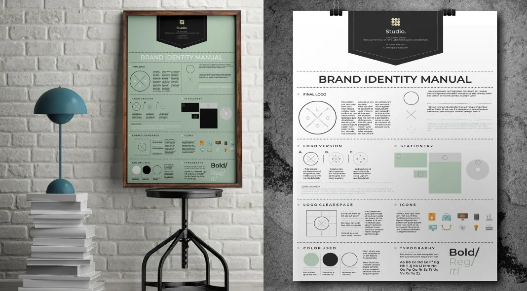
Bizz District Studio‘s brand guidelines poster is a striking example of contemporary graphic design, demonstrating aesthetic sensibility and functional utility. This poster layout, created specifically for Adobe InDesign at a sizable 24 x 36 inches, balances design principles with practical implementation. Designed in CMYK mode for print-ready execution, its versatility is evident in the dual color options provided, allowing for customization to align with diverse brand identities.
Please note that for customizing this template you need Adobe InDesign. You can get the latest version from the Adobe Creative Cloud website—take a look here.
Essential Guidelines for a Cohesive and Impactful Brand Identity
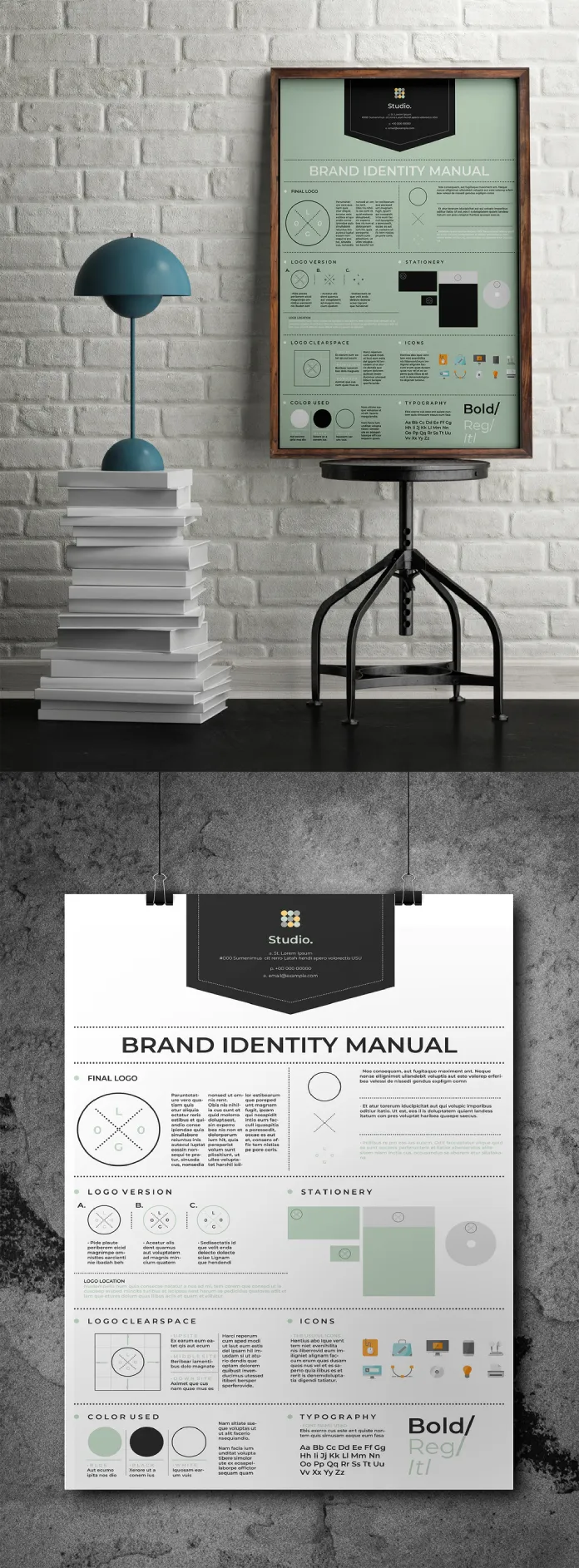
Visually, the poster is compartmentalized into clearly defined sections, emphasizing essential components of a brand identity manual. The top section prominently features the brand’s final logo alongside alternative versions, clear space guidelines, and other logo-related specifications. The use of a modern sans-serif typeface, combined with ample white space, ensures the content remains legible and easy to navigate, even from a distance, a crucial factor given the poster’s large format. The large typography employed for headings, like “BRAND IDENTITY MANUAL,” creates an effective visual hierarchy, drawing the viewer’s attention to core aspects first, followed by finer details.
Each section is thoughtfully organized to guide the reader through the foundational elements of a brand identity, from logo versions to color palettes and typography. The inclusion of icons adds an illustrative layer to the poster, which serves not only to maintain engagement but also to break up the text-heavy segments visually. These icons are minimalist, echoing the clean design language used throughout, reinforcing the poster’s modern and corporate aesthetic.
In terms of color use, the poster excels in its simplicity and effectiveness. The limited color palette, dominated by cool green, black, and grey tones, conveys professionalism without overwhelming the viewer. The light, mint-green background in one of the provided options softens the otherwise industrial feel of the layout, offering an understated elegance. This careful balance of muted colors against stark typography and grid-like structure evokes clarity and precision—ideal for a brand seeking to project reliability and sophistication.
The design’s grid system is particularly notable, providing a clear, structured layout that divides the information in a way that feels both cohesive and orderly. It reflects the underlying philosophy of functional design—ensuring that every element has a purpose and is positioned to maximize comprehension and usability. The typography choices, with regular and bold styles, give the text enough contrast while maintaining harmony with the overall minimalist aesthetic.
One minor critique could be that, while the layout is meticulously structured, it leans heavily towards a corporate visual style, which may limit its appeal for brands with a more playful or creative identity. However, this is perhaps mitigated by the poster’s customizability in terms of logos, graphics, images, and text, allowing for some adaptability.
Overall, the brand guidelines poster from Bizz District Studio is a well-executed design that offers a refined template for brand communication. Its adherence to clarity, functionality, and modern design principles makes it an exemplary tool for businesses looking to present their brand elements in a professional and accessible format. It reflects a high level of craftsmanship and attention to detail, making it not only a practical asset for brand management but also a visual statement piece in itself.
All images © by Bizz District Studio. Feel free to find other recommended graphic design templates on WE AND THE COLOR.

