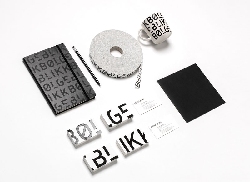
BØLGEBLIKK, a corporate identity based on simple black and white with bold letters.
Oslo, Norway based agency Tank Design has created this modern and minimalist corporate identity for BØLGEBLIKK. The Norwegian architectural firm, former known as Ottar Arkitekter, asked for a complete rebranding including naming, corporate identity and a new website.
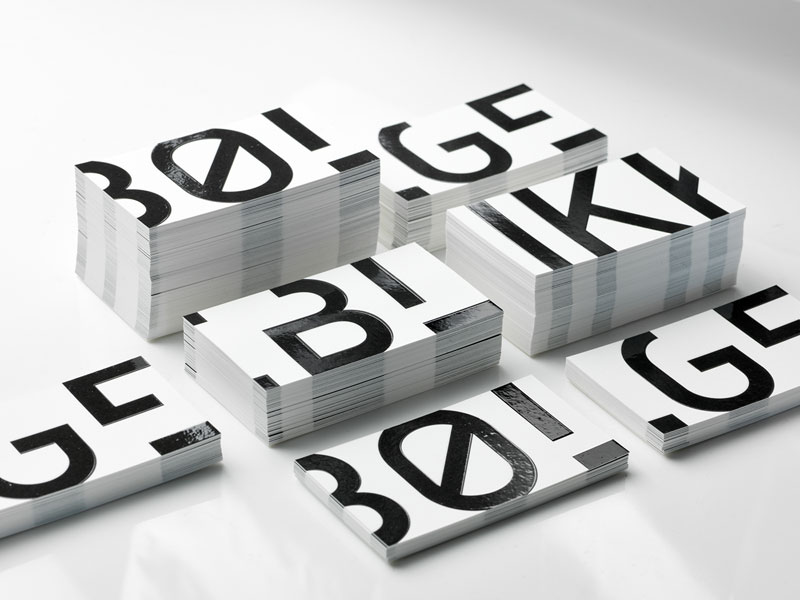
Tank Design’s goal was to create a corporate identity that expresses quality and professionalism in a modern and simple manner. Furthermore, they wanted to develop a design that visualizes the clean aesthetics of BØLGEBLIKK’s monumental buildings. The result conveys an innovative and modern expression.
Bølgeblikk (eng. corrugated iron) has been chosen as an intriguing and challenging name. The name has a strong association to solid materials that offer features such as stability and durability. If you divide the name into the Norwegian words “Bølge” (wave) and “Blikk” (glance), you get 2 more meanings that convey a contrast between movement and stillness, hard and soft, organic and constructed.
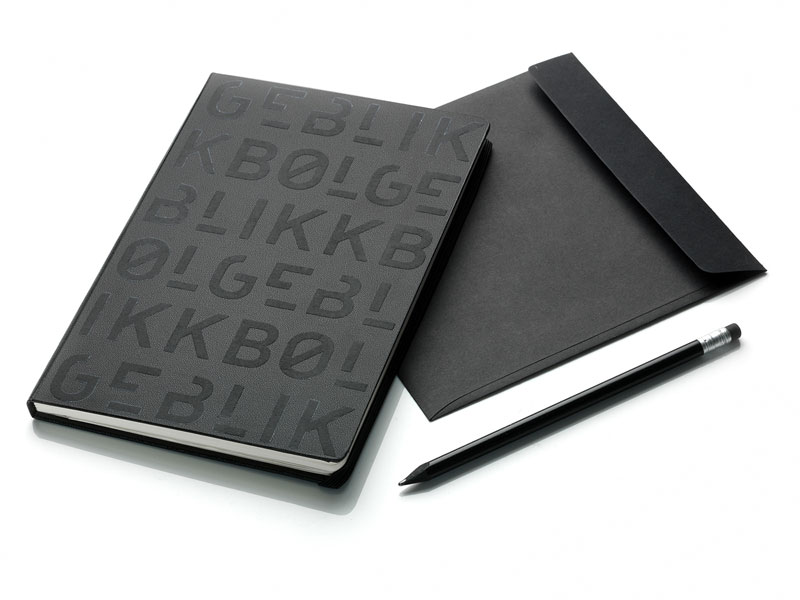
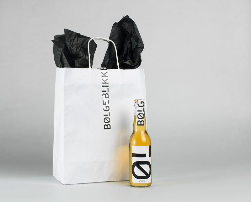
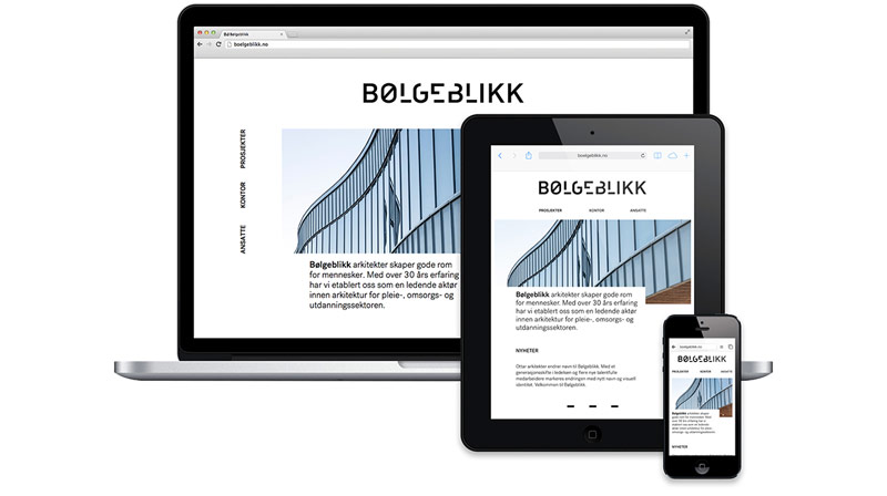
Agency Tank Design developed a typographic language that complements perfectly the meanings of the brand name. BØLGEBLIKK’s corporate identity is mainly characterized by a simple black and white color scheme with strong letters, which have been slightly deconstructed. This creates interesting spaces and contrasts between the letters. The project included the development of numerous printed products as well as a new responsive webite. Check it out below! For more of Tank Design’s creative work, feel free and visit their website.
