
This post contains affiliate links. We may earn a commission if you click on them and make a purchase. It’s at no extra cost to you and helps us run this site. Thanks for your support!
This overprint Photoshop effect from Pixelbuddha Studio makes most retro filters look lazy because it gets one detail right. Two flat inks collide, and the collision turns near-black where the shapes cross. Printers have relied on that happy accident for generations. Pixelbuddha Studio packed it into a 4500 x 3000 pixel Photoshop mockup on Adobe Stock, and the preview sells the idea in one glance.
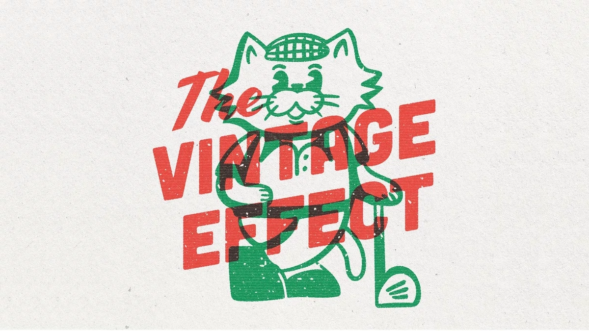
Look at the cat. A green line-art golfer in a flat cap stands behind red italic lettering that reads “The Vintage Effect.” Where the red letters cross the green outlines, the image goes dark. A drop shadow cannot fake that. A sepia tint cannot either.
Please note that this mockup requires Adobe Photoshop to be installed on your computer. The latest version can be downloaded from the Adobe Creative Cloud website. An active Creative Cloud subscription is required. Visit this link.
What Is an Overprint Photoshop Effect?
An overprint Photoshop effect is a digital simulation of one ink printing over another, so the overlapping area darkens instead of hiding the layer below. In real production, screen printing and risograph presses create this result because each color runs as its own pass. Photoshop imitates the process with blend modes, grain, and a paper texture. A good overprint Photoshop effect mockup bundles those decisions, so you skip the rebuild every time a client sends a new logo.
I use a simple test and call it the Two-Ink Rule. A design reads as printed when it shows exactly two flat colors plus one dark third tone where they meet. Add a third clean hue, and the illusion weakens fast, because real two-color jobs have only two plates. How many of your last five “vintage” designs would pass that test?

Why the Ink Collision Matters More Than the Grain
Grain gets the credit, but overlap does the work. Most retro mockups add speckle and a paper tone. The preview does too, with white flecks inside the red letters and a warm, off-white sheet behind everything. Fine. Plenty of tools manage that.
Overlap is rarer. In the cat artwork, the golfer’s body cuts across the middle of the word VINTAGE and the left half of EFFECT, and every crossing turns dark. The darkest patch sits near the bottom left, where the green shoe meets the red E. That patch gives the image its weight. It also tells your brain that two separate plates produced the print, even though you never see a single gradient. I think this is the smartest decision in the whole preview, and it is the reason this overprint Photoshop effect looks believable at thumbnail size.
What Happens Without the Dark Overlap?
Flatten the same art into plain red and green, and it turns into a sticker. Add the dark overlap, and it becomes a poster. The shapes stay identical. Only the credibility changes.
How the Overprint Photoshop Effect Works in the Preview
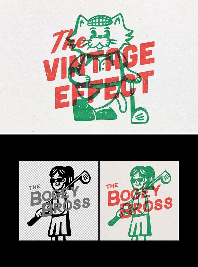
Adobe Stock lists the file as a Photoshop mockup by Pixelbuddha Studio. The preview shows a before panel and an after panel. The before panel holds black line art and gray lettering on a transparent checkerboard. The after panel shows the same artwork in green and red on warm paper.
The mapping looks simple. Black linework becomes green. Gray type becomes red. The sample reads “The Bogey Bross” and shows a woman in sunglasses with a golf club over her shoulder. The dark overlap appears again where her hand and the club cross the lettering, so the effect holds up on a second, very different drawing.
How to Prepare Artwork for a Vintage Overprint Effect Mockup
Open the file’s own instructions first, since the layer setup decides the details. Then follow this order.
- Export your art on a transparent background.
- Keep the main linework pure black, so it stays easy to separate.
- Set secondary elements, such as type, in mid-gray, as the preview does.
- Place both groups into the mockup’s designated layers.
- Zoom to 100 percent and inspect every overlap in the overprint Photoshop effect.
- Export at the native 4500 x 3000 pixels.
Who Should Use This Overprint Photoshop Effect?
Designers who pitch logos to breweries and golf clubs get the fastest payoff. A tomato red and a kelly green already suggest a neighborhood business with a loyal crowd. The mascot style in the preview suits that audience. Poster artists benefit too, because the effect hides the fact that they worked entirely on screen.
Would your next client notice the difference between a real risograph proof and this retro overprint effect? On a phone, probably not. On a print table, yes.
Where This Overprint Photoshop Effect Falls Short
Real two-color prints drift. Plates move by a fraction of a millimeter, and the edges show it. The preview looks cleaner, with tidy registration everywhere. Some designers will love that. I would nudge one layer by a pixel or two to add a little honest error.
The preview also shows only red and green. Check whether the file lets you change the inks. If it does not, every client gets the same Christmas palette, and nobody wants a Christmas palette in July.
License terms matter as well. Adobe Stock sells the file under its own license, so read it before client work. Check the listing for current pricing.
Overprint Photoshop Effect at a Glance
| Attribute | Detail |
|---|---|
| Product | Vintage Overprint Effect Mockup |
| Creator | Pixelbuddha Studio |
| Source | Adobe Stock (template no. 1680631763) |
| Format | Photoshop mockup |
| Resolution | 4500 x 3000 pixels |
| Inks in the preview | Two (red and green) |
| Overlap tone | Near-black where inks cross |
| Look | Risograph and screen print on off-white paper |
| Best for | Logos, mascots, posters, merchandise concepts |
| Watch out for | Perfect registration and a fixed palette in the preview |
| Core idea | The Two-Ink Rule, two flat colors plus one dark overlap |
Common Questions About the Overprint Photoshop Effect
What is an overprint Photoshop effect?
It is a digital imitation of overprinting. One color sits on top of another, and the overlap turns darker instead of covering the layer underneath.
Who created the Vintage Overprint Effect Mockup?
Pixelbuddha Studio created it, and Adobe Stock distributes it as a Photoshop mockup.
Does an overprint Photoshop effect replace a real risograph print?
No. It copies the look, but it does not copy plate drift, ink density changes, or paper absorption. Use it for concepts and digital work.
Can I use this vintage overprint effect for logo presentations?
Yes, the mascot style in the preview suits logo concepts. Read the Adobe Stock license first, since it governs client use.
How do I get a risograph effect in Photoshop?
Separate your art into two flat color groups, blend them so the overlap darkens, and add paper grain. A ready-made mockup handles those three steps in one file.
What resolution does the mockup use?
The file measures 4500 x 3000 pixels. At 300 pixels per inch, that equals a 15 x 10 inch print.
Browse WE AND THE COLOR’s Graphic Design, Illustration, and Templates categories for more.
Subscribe to our newsletter!