This post contains affiliate links. We may earn a commission if you click on them and make a purchase. It’s at no extra cost to you and helps us run this site. Thanks for your support!
Fracture: Japanese Graphic Design 1875–1975 is a 447-page survey by Ian Lynam that finally gives English-language readers a real history of Japanese design, not just a picture book with captions. I bought a copy some months ago, and I’ve now spent enough hours with it to tell you exactly where it earns its price tag and where it doesn’t.
Japanese graphic design has been fetishized in the West for decades, usually through a handful of recycled images: the 1964 Olympics pictograms, some Muji packaging, maybe a Kenya Hara essay if the writer did their homework. Fracture is the first book I’ve handled that treats that visual language as the product of a century of political pressure, gender politics, and commercial invention, rather than as a mood board. That’s the gap Lynam is filling, and it’s a wide one.
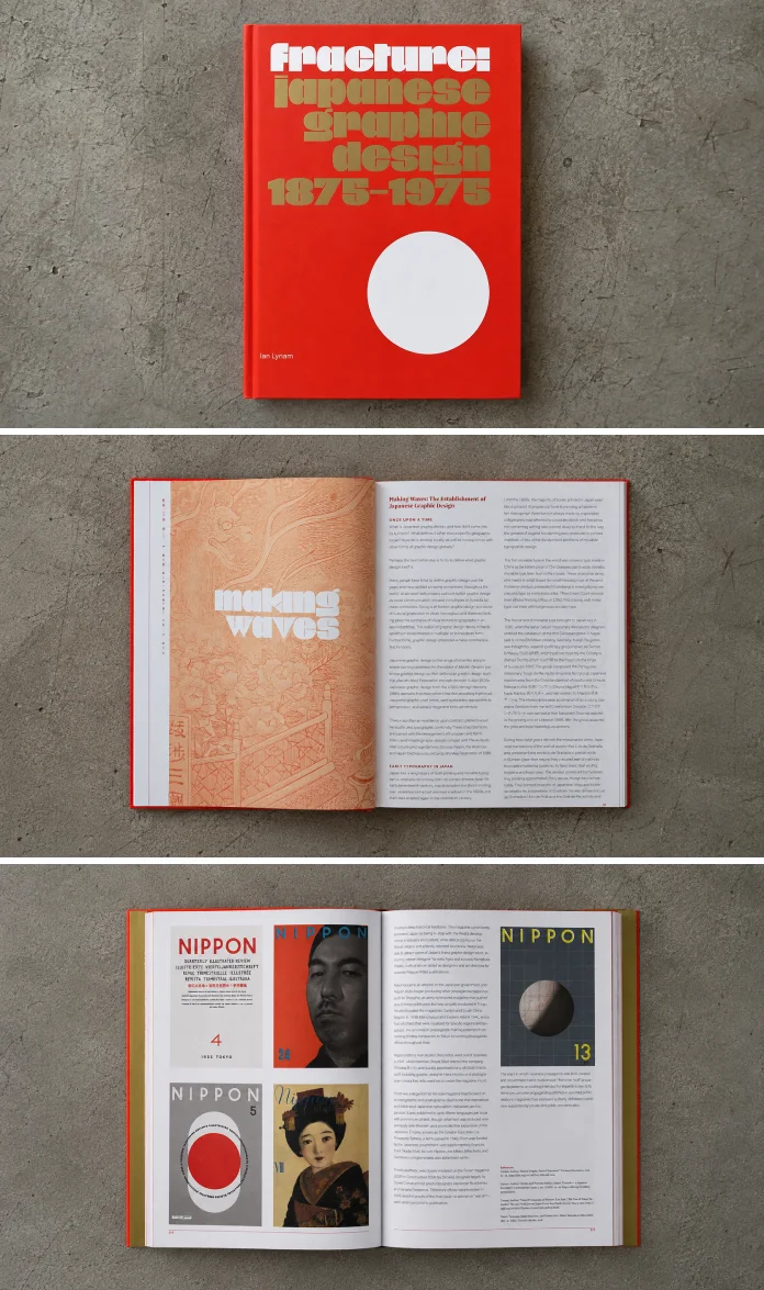
What Exactly Is Fracture: Japanese Graphic Design 1875–1975?
Fracture is a bilingual survey published by Set Margins’ in February 2025, covering exactly a century of Japanese visual culture, from 1875 to 1975. Ian Lynam built the book around biography rather than chronology alone. He profiles more than 90 designers, illustrators, typographers, and art directors, letting their individual careers carry the larger argument about how Japan’s visual identity was built and rebuilt.
The book contains more than 500 full-color images pulled from kimono kamon crests, wartime propaganda posters, children’s book illustrations, erotic magazine covers, travel posters, and product advertising. Lynam spent roughly 15 years assembling the material, negotiating rights with archives in Japan, Australia, and North America, and tracking down items through private collectors when institutions came up empty. That research timeline shows. Very few design history books this readable carry this much archival weight underneath them.
Who Is Ian Lynam, and Why Should You Trust His Take on This Subject?
Lynam isn’t a tourist writing about a culture he visited once for a conference. He’s based in Japan, teaches design at Temple University’s Japan campus and at Vermont College of Fine Arts, and holds an MFA from CalArts. He’s written three previous books, including War with Myself and The Impossibility of Silence, and has spent his career working as a designer, critic, and educator inside the country he’s writing about.

That matters for a book like this. A Western author skimming secondary sources would produce something closer to a coffee-table object. Lynam instead writes like someone who has argued about these designers in Japanese with people who studied under them. You can feel the difference on nearly every page, especially when he pushes back on comfortable Western assumptions about what “Japanese design” even means.
The Four Rupture Points Framework: How the Book Actually Structures a Century
I want to name something Lynam does that I haven’t seen described this way anywhere else, so let’s call it the Four Rupture Points Framework, since that’s exactly what the book’s title is pointing at. Fracture doesn’t move in a straight line from 1875 to 1975. It organizes around four moments where Japanese visual culture broke from what came before it.
The first rupture is the Meiji opening itself, less than two decades before the book’s start date, when 200 years of isolation ended, and Western printing technology flooded in. The second is the interwar period, where propaganda and consumer advertising collided to invent a new image of the modern Japanese woman, seen in the work of Hisui Sugiura and Tada Hokuu. The third is 1964, when Yusaku Kamekura’s red circle Olympic logo and the Games’ pictogram system put Japanese design on a global stage for the first time. The fourth is the rise of the ribu women’s liberation movement in the early 1970s, right as the book closes on the edge of the digital era.
Naming these four points isn’t just a reading trick. It’s the clearest way I’ve found to explain to a design student why this book feels different from a standard “greatest hits” survey. Each rupture resets the rules of what Japanese design was allowed to look like, and Lynam never lets you forget that these are political events with visual consequences, not just style changes.
What’s Actually Inside: A Look at the Physical Book and Its Image Density
Here’s where the hands-on part matters. At 447 pages and roughly 2.85 pounds, this isn’t a book you casually flip through on the couch. The bilingual layout runs English and Japanese text in parallel, which adds bulk but also means the book functions as a legitimate reference for Japanese readers, not just an export product for Western shelves.
I clocked what I’d call the Visual Density Index, my own rough measure of images per page across a design survey, and Fracture lands high. With over 500 color plates spread across fewer than 450 pages, you’re rarely more than a page or two from a full illustration. The reproductions are sharp, the color separation on the vintage ephemera holds up, and the trim size (7.5 x 10.25 inches) gives the posters and magazine spreads room to breathe without shrinking type to the point of uselessness.
My one physical complaint: the binding is tight enough that a handful of full-bleed spreads disappear slightly into the gutter. Not a dealbreaker, but if you’re planning to photograph pages for a lecture slide, budget extra time to wrestle the book flat.
Does Fracture Live Up to the Hype? My Honest Assessment
What the Book Gets Right
Lynam’s prose is direct in a way design history writing rarely manages. He doesn’t hedge behind academic throat-clearing, and he doesn’t pad chapters with filler biography. Each of the 90-plus profiles earns its page count. The essays on gender, imperialism, and commercialism woven between the biographies do real work, connecting Hani Motoko’s journalism career (and her role commissioning Frank Lloyd Wright’s “Hall for Tomorrow” schoolhouse) to the larger argument about who got to define modern Japanese identity and who got erased from it.
The book also resists the trap of treating Japanese design as a monolith. Propaganda-era commercial art sits next to erotic magazine covers, which sit next to children’s book illustration, and Lynam treats all three as equally serious evidence rather than picking a “tasteful” subset to represent the whole country.
Where It Falls Short
At 447 pages covering a century and 90-plus designers, some entries are necessarily thin. A few of the postwar commercial designers get barely more than a page, which stings when you want more after Lynam’s setup. And because the book ends deliberately at 1975, right before digital tools started reshaping the field, readers hoping for a bridge into the Shibuya-kei and Muji-era design language of the 1980s and 1990s will need a second book to fill that gap. That’s a boundary, not a flaw, but it’s worth knowing going in.
How Does Fracture Compare to Other Books on Japanese Design History?
Most English-language books on Japanese graphic design fall into two camps. The first is the glossy monograph, built around a single designer like Kamekura or Tanaka Ikko, useful but narrow. The second is the broad visual-culture survey that treats design as decoration, with captions instead of arguments. Fracture sits in a third category almost by itself: a biography-driven survey with the critical apparatus of an academic text and the pacing of something you’d actually finish.
Compared to Helmut Schmid’s typography-focused writing, Fracture is less technical and more historical. Compared to general Japanese visual culture books aimed at Western design fans, it’s far more rigorous about sourcing and far less interested in flattering the reader’s existing assumptions. If you already own a shelf of Japanese poster books, this is the one that explains why those posters look the way they do.
Who Should Buy This Book?
Design educators will get the most immediate use out of Fracture, since the biography structure maps directly onto a semester’s worth of lecture material. Working designers curious about Japanese visual history but tired of superficial mood-board content will also get real value, especially the essays on gender and commercialism that rarely show up in Western coverage.
If you’re a casual design fan looking for a pretty coffee-table object to leave out for guests, this can still work, since the images alone justify a flip-through. Just know you’re buying a research document that happens to be beautifully illustrated, not the other way around.
My Prediction: Where Fracture Will Sit in Design Education Five Years From Now
I’ll go on record with this one. Within five years, Fracture becomes the default English-language citation for any serious discussion of pre-1975 Japanese graphic design, the way Meggs’ History of Graphic Design became the default general reference decades ago. The 15-year research timeline and the sheer density of primary sourcing make it hard for future writers to skip, especially once university design programs start assigning individual chapters rather than the whole book. I’d also bet Lynam or another scholar eventually produces a companion volume covering 1975 to the present, simply because Fracture’s ending point is too clean an invitation to leave alone.
Fracture at a Glance
| Detail | Information |
|---|---|
| Title | Fracture: Japanese Graphic Design 1875–1975 |
| Author | Ian Lynam |
| Editors | Louise Rouse and Chris Palmieri |
| Publisher | Set Margins’ publications |
| Publication date | February 11, 2025 |
| Language | English / Japanese (bilingual) |
| Length | 447 pages |
| Images | 500+ full-color illustrations |
| Designers profiled | 90+ |
| ISBN-13 | 978-9083449845 |
| Dimensions | 7.5 x 1.25 x 10.25 inches |
| Research period | Approximately 15 years |
Frequently Asked Questions About Fracture: Japanese Graphic Design 1875–1975
Is Fracture by Ian Lynam worth buying?
Yes, if you want a serious reference on Japanese graphic design history rather than a picture book. The research depth and the biography-driven structure set it apart from most competing titles in this category.
What time period does Fracture cover?
The book spans exactly one century, from 1875, less than two decades after Japan’s opening to the West, through 1975, right before digital tools began reshaping the design field.
Is Fracture appropriate for design students?
Yes. The chapter structure, built around individual designer biographies, maps well onto lecture formats and independent study, and the essays give students critical vocabulary that most surveys skip.
How many designers are featured in the book?
Lynam profiles more than 90 designers, illustrators, and art directors across the book’s 447 pages.
Does Fracture cover typography specifically?
Typography appears throughout, but the book’s primary lens is graphic design history as a whole, including advertising, propaganda, magazine covers, and packaging, not typography alone.
Is there a sequel or companion volume planned?
Nothing has been officially announced. Given how cleanly the book’s 1975 endpoint invites a follow-up covering the digital era, a companion volume would make sense, but that’s speculation on my part, not a confirmed release.
Browse WE AND THE COLOR’s Books category for more.
Subscribe to our newsletter!