
This post contains affiliate links. We may earn a commission if you click on them and make a purchase. It’s at no extra cost to you and helps us run this site. Thanks for your support!
A titan of the branding world, Ian Ritchie, has stepped away from the global agency he co-founded to pursue a lifelong passion. After shaping the identities of household names for decades, he now channels that vast experience into the art of typography. Consequently, the result is IR Lüthold Sans, a striking new typeface family developed for the London Type Foundry. It is a masterful blend of rigid German engineering and expressive modern character. This new release signals a significant moment for designers seeking fonts with both a strong voice and versatile functionality.
This article explores the story, design philosophy, and practical applications of the IR Lüthold Sans family. We will examine how a career spent building global brands informed the creation of a typeface designed to build compelling narratives. Let’s look at what makes this new font family so noteworthy.
Who is Ian Ritchie? A Legacy Beyond Branding
Before crafting type, Ian Ritchie crafted brands. As a co-founder of the global agency Jones Knowles Ritchie (JKR) in 1990, he was instrumental in shaping the visual identities of some of the world’s most recognizable companies. JKR’s client roster includes giants like Burger King, Paramount, Stella Artois, and Walmart, a testament to a deep understanding of how design drives business.
However, in 2019, Ritchie retired from the agency’s creative helm. This move was not an end but a beginning. It offered him the time to focus on his primary passion for typography and letterforms. The creation of IR Lüthold Sans represents the fulfillment of a lifetime ambition. It is a project born from decades of experience observing how letters work in the real world.
The IR Lüthold Sans Typeface: A Study in Contrasts
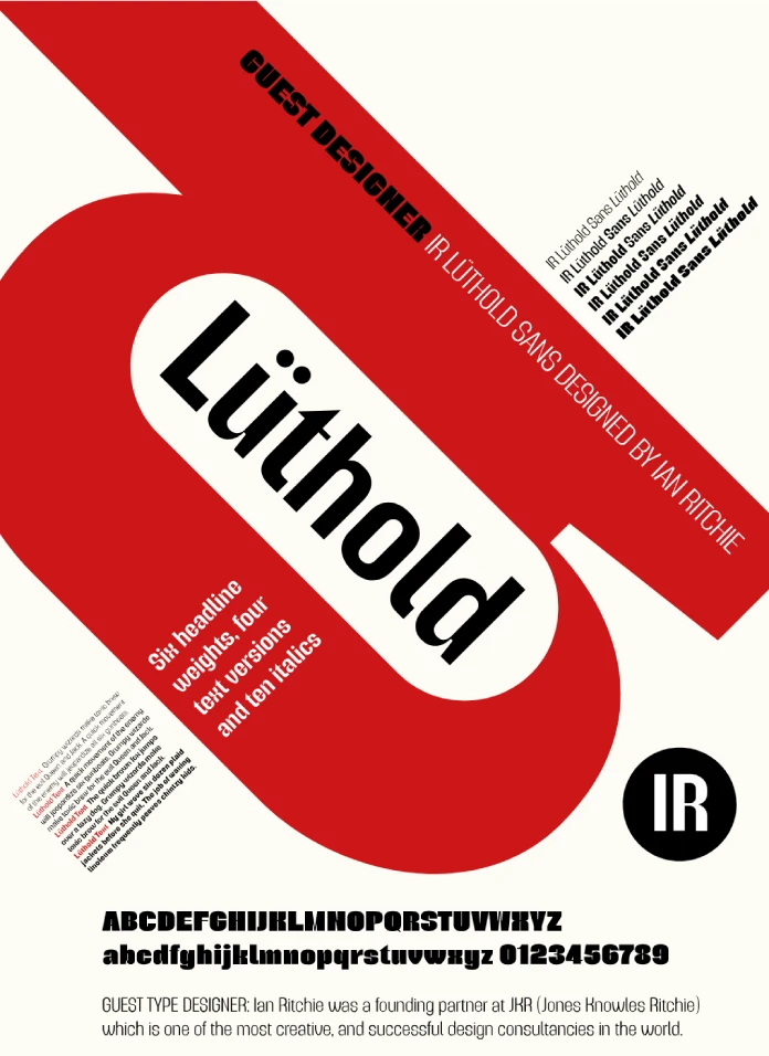
IR Lüthold Sans is a typeface built on a fascinating duality. It finds its structure in pure functionalism. Yet, it discovers its personality in deliberate, artful details. This combination makes the IR Lüthold Sans typeface a uniquely compelling choice for designers.

The German Engineering: Inspiration from DIN 1451
The typeface’s primary inspiration comes from DIN 1451. This isn’t just any font; it’s a piece of German industrial history. Defined by the German standards body (Deutsches Institut für Normung) in 1931, DIN 1451 was created for ultimate legibility and ease of reproduction in technical and administrative applications. In fact, it is the typeface seen across Germany on road signs and railway systems.
This foundation gives IR Lüthold Sans its authoritative, clear, and geometric structure. It feels engineered and reliable. But Ritchie’s design doesn’t simply replicate the past; it builds upon it.
The Human Touch: Finding Character in Form
Where DIN 1451 is purely functional, IR Lüthold Sans is full of character. This personality comes from several distinct features, most notably its pronounced ink traps. Originally, ink traps were tiny notches cut into the corners of letters to prevent ink from pooling and blurring the character’s shape during printing, especially on lower-quality paper.
Today, with high-definition printing and digital screens, ink traps are less a technical necessity and more an aesthetic choice. In IR Lüthold Sans, these “traps” are a prominent stylistic element. They give the letterforms a sharp, distinctive look and a dynamic rhythm. Combined with high-contrast elements on spines and crossbars, these features lend the typeface a real personality that is both confident and refined.
One Family, Two Personalities: Display vs. Text
Understanding that a single font cannot solve every design problem, the family was developed in two distinct versions. This creates a versatile typographic system. Therefore, designers can maintain a consistent voice from bold headlines to fine print.
IR Lüthold Sans: The Bold Headliner
The primary IR Lüthold Sans is a condensed display typeface. Its purpose is to grab attention. The family includes 12 styles, with six weights ranging from a delicate ExtraLight to a powerful Black, each with a corresponding italic. This extensive range provides the versatility needed for impactful branding, editorial headlines, and any application where the type needs to make a statement. Its condensed nature also allows for strong, space-efficient typographic compositions.
IR Lüthold Sans Text: The Workhorse for Readability
For body copy, a separate family, IR Lüthold Sans Text, was created. Readability in small sizes requires different design considerations. Consequently, the Text version features a medium width and lower contrast strokes. These adjustments create a more even color and texture on the page, ensuring a comfortable reading experience for longer passages of text. While it offers fewer styles, with Bold as its heaviest weight, it is perfectly optimized for clarity and function.
The Collaboration with London Type Foundry
This project was a collaboration with the London Type Foundry, a design studio founded in 2017. The foundry’s mission is to create high-quality typefaces inspired by the creativity and cultural diversity of London. Ian Ritchie worked closely with Paul Harpin of London Type to draw and perfect the final letterforms. The result is a typeface that feels both globally relevant and rooted in a specific creative culture. Both the IR Lüthold Sans and IR Lüthold Sans Text families were launched exclusively on the foundry’s brand-new website in late 2025.
Our Thoughts: Why IR Lüthold Sans Matters
So, what is the real significance of this new typeface? IR Lüthold Sans successfully bridges the gap between geometric, functional sans-serifs and more expressive, character-driven fonts. It offers the stability and clarity of a DIN-style font without its potential coldness. Furthermore, the clever use of ink traps and high-contrast details infuses it with a contemporary edge that feels both sophisticated and approachable.
This release reflects a broader trend in typography. Designers today are searching for tools that offer both personality and practicality. We want fonts that can anchor a brand’s identity while performing flawlessly across all media. Ultimately, IR Lüthold Sans delivers on both fronts. How could a typeface with such a clear voice and thoughtful construction elevate a brand you know? The possibilities are truly exciting.
All images © London Type Foundry. Feel free to find other trending typefaces here at WE AND THE COLOR or check out our selection of the 100 coolest fonts for designers in 2026.
Subscribe to our newsletter!


