
This post contains affiliate links. We may earn a commission if you click on them and make a purchase. It’s at no extra cost to you and helps us run this site. Thanks for your support!
The Peach Sangria Font Duo Blends Retro Charm with Modern Elegance, Creating a Timeless Typographic Harmony.
A design isn’t just what you see; it’s how it makes you feel. The right typography can transport an audience to a different era, evoke a specific emotion, or simply make a message resonate more deeply. In the vast world of typefaces, the Peach Sangria font duo, created by Sam Parrett of Set Sail Studios, emerges as a masterful blend of nostalgic warmth and contemporary chic. This font pairing is more than just a set of characters. Instead, it’s a design tool that empowers creatives to tell compelling visual stories.
You can download the font duo for a very low budget from these sites:
The resurgence of retro-inspired design is not merely a fleeting trend. It’s a testament to the enduring appeal of aesthetics from the past. We’re seeing a collective yearning for authenticity in a digitally saturated world. Consequently, vintage-style fonts answer that call with their expressive and often handcrafted feel. The Peach Sangria font duo perfectly captures this sentiment, offering a sophisticated yet approachable typographic solution.
You can download the font duo for a very low budget from these sites:
Who is the Mastermind Behind the Font?
Before delving into the intricacies of this stunning font duo, it’s essential to understand the creative force behind it. Sam Parrett, the founder of Set Sail Studios, is a UK-based designer with a passion for crafting unique, eye-catching fonts. His journey into typography began after a successful career in the music industry. There, he honed his skills in creating expressive, hand-lettered forms. This background is evident in the dynamic and often handmade quality of his work. Parrett’s design philosophy revolves around breaking away from generic letterforms and injecting personality into every typeface he creates.

Deconstructing the Peach Sangria Font Duo
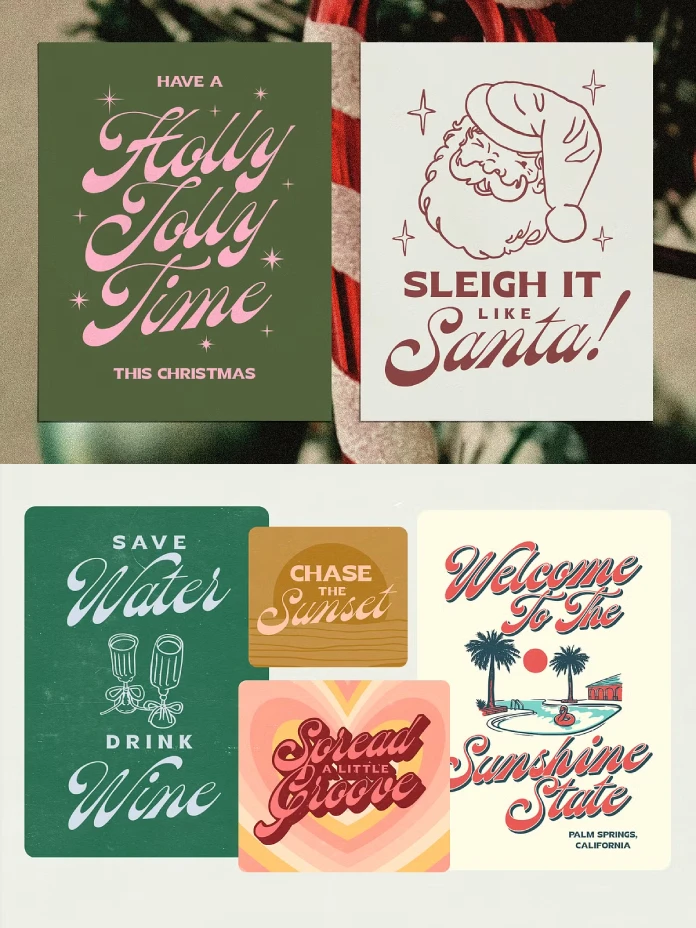
What makes the Peach Sangria font duo so special? It’s the thoughtful combination of two distinct yet harmonious fonts. This pairing eliminates the often-challenging task of finding complementary typefaces. Therefore, it provides a ready-made solution for stunning typography.
The Star of the Show: Peach Sangria Script
The heart of this duo is the Peach Sangria Script. It is a flowing, bottom-heavy script that exudes a timeless, classic feel. Its elegant curves and connected letterforms are reminiscent of vintage hand-lettering. This adds a touch of sophistication to any design. The “bottom-heavy” characteristic gives it a grounded and substantial presence. This beautiful script font includes a full set of uppercase and lowercase characters, numerals, and punctuation. Additionally, it offers stylistic alternates for a more customized and natural look.
The Perfect Partner: Peach Sangria Serif
Complementing the script is the Peach Sangria Serif. This is a chunky, poster-ready font that provides a strong and stable counterpart. This all-caps serif font is bold and impactful. As a result, it is ideal for headlines, logos, and other display purposes. Its clean lines and solid structure offer a beautiful contrast to the fluid grace of the script. This creates a balanced and visually appealing typographic hierarchy.
Why This Font Duo Works So Well
The magic of the Peach Sangria font duo lies in its masterful execution of font pairing principles. Combining a script font with a serif font is a classic technique. It helps achieve a dynamic and engaging design. The contrast between the ornate style of the script and the structured nature of the serif creates visual interest. It also helps to guide the reader’s eye effectively.
Think of it as a conversation between two distinct personalities. The script is the expressive and eloquent speaker. Meanwhile, the serif is the confident and clear respondent. Together, they create a dialogue that is both captivating and easy to follow. This harmonious relationship makes the Peach Sangria font duo an incredibly effective tool.
How to Use the Peach Sangria Font Duo
The versatility of the Peach Sangria font duo makes it a valuable asset for a wide range of design projects. How can you use this font for your next project? Here are just a few ideas to spark your creativity:
- Branding and Logos: Create memorable logos that convey craftsmanship and authenticity. The combination of the script and serif is perfect for businesses in the creative, hospitality, and lifestyle sectors.
- Social Media Graphics: Craft eye-catching posts for Instagram and Pinterest. The bold serif is excellent for grabbing attention. Subsequently, the script can be used for a personal touch in quotes or descriptions.
- Invitations and Stationery: Design elegant and charming wedding invitations, greeting cards, and other stationery. The romantic feel of the script adds a touch of warmth and personality.
- Packaging and Merchandise: Give your products a boutique and artisanal feel. Use packaging that features this beautiful font duo. It’s perfect for everything from coffee bags to cosmetic labels.
- Website Headers and Display Text: Make a strong first impression with a website header that uses the Peach Sangria font duo. The bold serif is highly legible for headlines, while the script can add flair to subheadings.
The broad language support, including English, French, Spanish, German, and many more, further enhances its usability for a global audience.
A Personal Reflection on a Modern Classic
In a design landscape often dominated by minimalism, the Peach Sangria font duo is a breath of fresh air. It’s a reminder that typography can be both beautiful and functional. What I personally find most compelling about this duo is its ability to feel both vintage and incredibly current. It doesn’t just replicate a past style; it reinterprets it for a modern audience. Sam Parrett has created a tool that allows designers to infuse their work with a sense of humanity and artistry. This quality is increasingly valuable in our digital age. This font duo doesn’t just form words; it crafts an experience.
You can download the font duo for a very low budget from these sites:
Feel free to find other recommended typefaces on WE AND THE COLOR or check out our handpicked selection of 100 cool fonts for graphic designers in 2026.
Subscribe to our newsletter!


