
This post contains affiliate links. We may earn a commission if you click on them and make a purchase. It’s at no extra cost to you and helps us run this site. Thanks for your support!
Discover the Glyphic Sans Typeface: A Human Voice in a Geometric World
A typeface must often choose a side. It can be geometric and precise, or it can be humanist and warm. The Glyphic Sans font family, however, argues that this doesn’t have to be a choice. It presents a compelling third option. This typeface stands at the intersection of technology and humanity. Consequently, it offers a solution for brands that need to communicate with both clarity and character. For industries like fintech, banking, and tech, where trust is paramount, Glyphic Sans provides a visual language that feels both innovative and deeply reliable. It moves beyond sterile perfection, introducing a subtle warmth that connects with people.
This font is not an accident. Instead, it is a deliberate and thoughtful creation. It understands the modern need for a typeface that performs flawlessly on screens. Yet, it never forgets the human being on the other side of that screen. Its balanced design makes it a truly contemporary and essential tool for today’s designers.
Deconstructing the Character of Glyphic Sans
What gives a typeface its soul? Is it the mathematical precision of its lines or the subtle imperfections that give it life? For Glyphic Sans, the answer is both. It builds its identity on a foundation of clean geometry. Then, it layers in humanistic details that transform it from a mere tool into a powerful communication partner.
A Foundation of Clean Geometry
The core structure of Glyphic Sans is undeniably geometric. Its proportions are balanced and modern. This creates an immediate sense of order and professionalism. The clean lines and consistent letterforms ensure high legibility across all digital platforms. Therefore, it is a natural fit for user interfaces and complex data displays. This geometric precision communicates competence and technological prowess. It tells the user that the brand is efficient, secure, and forward-thinking.
Whispers of Humanism
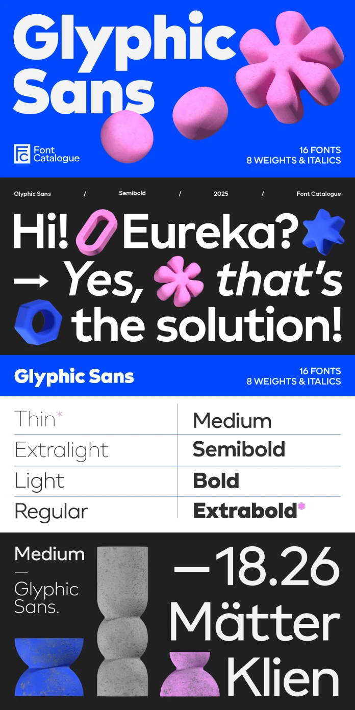
Where Glyphic Sans truly distinguishes itself is in its subtle departures from rigid geometry. Look closely, and you will find elegant, humanistic touches. The extended strokes and graceful diagonals on characters like the ‘K’, ‘Q’, ‘y’, and ‘k’ are perfect examples. These details soften the font’s overall impression. They add a touch of personality that prevents it from feeling cold or impersonal. This is where the font’s true authority comes from—it has confidence without arrogance and elegance without affectation.

The Strategic Advantage for Modern Brands
Choosing a font is a strategic business decision. The right typeface can build trust, convey values, and create a lasting impression. Glyphic Sans offers a distinct advantage for brands that need to navigate the complexities of the modern digital landscape. Its unique blend of traits makes it a powerful asset.
The Go-To Typeface for Tech and Fintech
Why has Glyphic Sans become such a compelling choice for the technology and finance sectors? These industries must project unwavering security and constant innovation. The font’s solid, geometric base provides a sense of stability and trust. Meanwhile, its humanistic details signal a brand that is approachable and user-focused. This duality allows companies to appear both authoritative and accessible. Ultimately, this balance helps build strong customer relationships based on confidence.
Versatility Beyond the Logo
While it excels in creating memorable wordmarks, the font’s utility extends far beyond logos. The family includes eight distinct weights, from a delicate Thin to a commanding Black. This extensive range gives you, the designer, complete control over visual hierarchy. The heavier weights create impactful headlines that demand attention. The middle weights are optimized for readability in long-form text. The lighter weights, in contrast, are perfect for secondary information like captions and metadata. This adaptability ensures a consistent and professional brand expression across all materials.
A Practical Guide to Designing with Glyphic Sans
A great typeface is like a finely tuned instrument. To get the best results, you need to understand how to use it effectively. How can you integrate Glyphic Sans into your designs to maximize its impact?
Establishing a Clear Hierarchy
Effective design depends on a clear visual hierarchy. Glyphic Sans makes this easy.
- Headlines: Use the Black or ExtraBold weights for your main headlines. Their strong presence will anchor your design and draw the reader in immediately.
- Subheadings: The Bold or Medium weights work perfectly for subheadings. They create a clear distinction from the body text without overpowering it.
- Body Text: For longer passages, the Regular weight offers excellent readability. It maintains a comfortable rhythm that makes reading effortless.
Finding the Perfect Typographic Partner
Glyphic Sans is a strong performer on its own. However, it also pairs wonderfully with other typefaces. For a sophisticated and classic combination, try pairing it with a serif font. The contrast between the clean, modern lines of Glyphic Sans and the traditional elegance of a serif can be incredibly effective. Look for a serif with compatible x-heights and proportions to ensure the two fonts feel like they belong together.
As a designer, I find myself drawn to typefaces that tell a story. Glyphic Sans tells a story of balance. It speaks of a world where technology and humanity are not in opposition but in harmony. Furthermore, it has a quiet confidence that I find incredibly appealing, and it doesn’t need to shout to be heard. Its clarity and thoughtful details speak volumes. This makes it not just a font, but a perspective.
Feel free to find other trending typefaces here at WE AND THE COLOR or browse our handpicked selection of the 100 coolest fonts for 2026.
Subscribe to our newsletter!


