This post contains affiliate links. We may earn a commission if you click on them and make a purchase. It’s at no extra cost to you and helps us run this site. Thanks for your support!
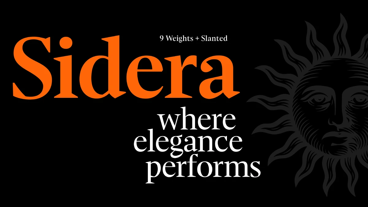
Sidera is the Elegant Serif Defining Modern Editorial Design
Certain typefaces emerge with a distinct and memorable voice. The Sidera font family, a refined creation by the Resistenza type foundry, is one such example. It commands immediate attention through its sophisticated, high-contrast serif design. Therefore, it makes a powerful statement in today’s editorial and branding worlds. This is not merely another serif font. Instead, it stands as a meticulously crafted tool for designers. They can use it to blend classical beauty with a sharp, contemporary edge.
The relevance of a typeface like Sidera is particularly strong right now. Both digital and print media increasingly seek to convey authenticity and superior quality. Consequently, the choice of font becomes a critical element of a brand’s identity. A clear trend toward expressive serifs that tell a story is on the rise. The Sidera font family, with its strong editorial voice, fits this movement perfectly. This article explores the nuanced details of Sidera. We will examine its design, its best applications, and why it has become a go-to choice for designers who aim for sophistication and lasting impact.
Deconstructing the Elegance: What Defines the Sidera Font Family?
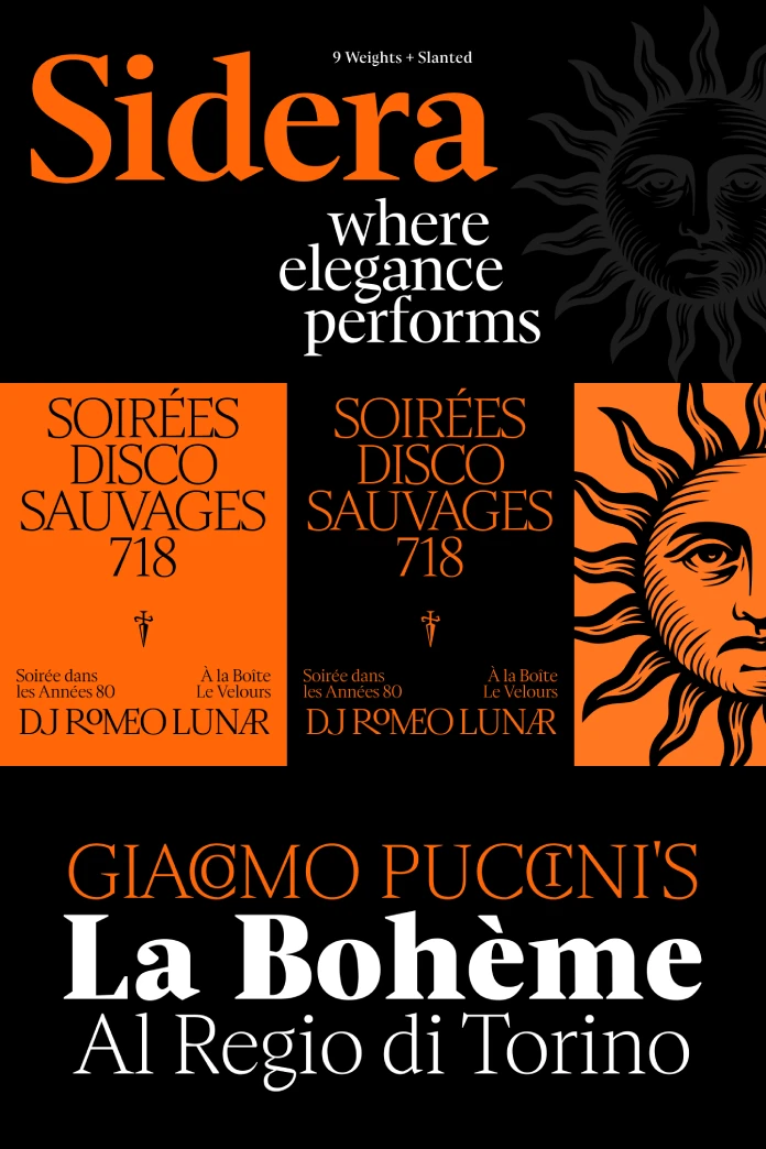
At its heart, Sidera is a high-contrast serif typeface. This means a significant difference exists between the thick and thin strokes within each letterform. This specific characteristic immediately lends an air of drama and elegance. However, what truly sets Sidera apart are its intricate details. These details draw inspiration from transitional serifs and traditional calligraphic forms.
Key Design Characteristics
Sidera’s personality comes from several unique features. Firstly, it employs sharp wedge serifs. Unlike the rounded serifs of older styles, Sidera’s serifs are sharp and decisive. This particular detail gives the font a crisp and modern feel. Secondly, it features flared terminals. The ends of strokes without serifs flare out subtly. This calligraphic touch adds a dynamic sense of movement and grace. Finally, the font showcases a dynamic contrast. The interplay between thick and thin strokes creates a beautiful visual rhythm. This rhythm is both engaging and highly readable, especially in larger display sizes.
The complete Sidera font family is remarkably extensive. It offers nine expressive weights, from a delicate Thin to a commanding Black. Moreover, each weight includes a corresponding italic version. This versatility is undoubtedly one of its greatest strengths. The lighter weights exude a refined grace, perfect for body text in luxury publications. In contrast, the heavier styles provide a bold, impactful presence. They are ideal for headlines and powerful branding statements.
The “Why”: Sidera’s Role in Contemporary Design
So, why has the Sidera font family resonated so strongly within the design community? The answer lies in its unique ability to meet several key demands of modern design aesthetics. What makes a font feel so right for this moment?
A Voice for Luxury and Sophistication
Luxury branding often relies on typography to convey a sense of heritage and exclusivity. Serif fonts, in particular, are associated with tradition and elegance. Sidera, with its high contrast and refined details, aligns perfectly with this visual language. You can see its influence in high-end packaging, fashion magazines, and cultural publications. In these contexts, a sophisticated tone is absolutely paramount. It speaks a language of quality without saying a word.
Meeting the Demand for Expressive Editorial Fonts
The world of editorial design is clearly moving away from purely functional, minimalist typography. Today, there is a growing desire for fonts with character and a strong narrative voice. The Sidera font family provides this in abundance. Its elegant yet assertive nature makes it an excellent choice for magazine headlines. It also works beautifully in cultural journals and any context where typography needs to make a statement. It achieves this without overpowering the actual content.
Bridging Classic and Contemporary
One of Sidera’s most compelling attributes is its ability to feel both classic and completely modern. It draws clear inspiration from transitional serifs, which historically bridged old-style and modern typefaces. However, Sidera interprets these influences through a contemporary lens. This quality makes it incredibly versatile. As a result, it is suitable for a brand that wants to honor its heritage while signaling its relevance in the present day.
The “How”: Practical Applications and Styling with Sidera
Understanding the font’s design and its purpose is one thing. But how can designers effectively use the Sidera font family in their own projects? Applying it thoughtfully is key to unlocking its full potential.
Best-Use Scenarios for the Sidera Font Family
This font truly shines in several specific areas. Its natural habitat is magazine and editorial design. Here, you can use the bolder weights for impactful headlines. The lighter weights work well for subheadings and pull quotes. Next, consider it for branding and logotypes. Sidera’s distinctive character makes it a strong candidate for memorable brand identities. This is especially true for businesses in the luxury, fashion, or cultural sectors. It is also an excellent choice for luxury packaging. Sidera can elevate the perceived value of a product through its elegant application.
Font Pairing and Harmonization
When pairing other fonts with the Sidera font family, the goal is to either complement its elegance or create a dynamic contrast. For a modern and clean look, you can pair Sidera with a geometric or humanist sans-serif. This classic combination is a reliable choice for establishing a clear visual hierarchy. For a more decorative touch, a delicate script font can work beautifully with Sidera. This pairing is perfect for invitation design or branding for artisanal products. Finally, do not underestimate the power of using different weights from the Sidera family itself. The contrast between Sidera Thin and Sidera Black can be incredibly striking.
A Personal View: Why Sidera Stands Out
From a design critic’s perspective, the Sidera font family is a welcome and significant addition to the typographic world. It successfully navigates the fine line between being expressive and being functional. In a digital space often saturated with generic sans-serifs, Sidera is a breath of fresh air. It reminds us of the power of a well-crafted serif to convey emotion and to tell a story. Its calligraphic roots give it a human touch that is often missing in more geometric designs.
The thoughtful inclusion of old-style figures and ornamental flourishes further enhances its versatility. These features allow designers to add another layer of refinement to their work. Resistenza has created not just a font, but a comprehensive typographic toolkit. Ultimately, the Sidera font family is a testament to the enduring power of serif typography. It shows the ability of classic forms to adapt and thrive in the modern design era. For any designer seeking to create work that is both elegant and impactful, Sidera is a choice worth serious consideration.
Check out other amazing typefaces here at WE AND THE COLOR, or take a look at our selection of the 100 coolest fonts for 2026.
Subscribe to our newsletter!

