
This post contains affiliate links. We may earn a commission if you click on them and make a purchase. It’s at no extra cost to you and helps us run this site. Thanks for your support!
As we stride into 2026, the fonts that define our visual landscape are becoming more dynamic, expressive, and technologically adept than ever before. This is a direct response to a design world grappling with AI co-creation, immersive digital experiences, and a renewed craving for authenticity. For the professional designer, staying ahead of this curve is not optional. The coolest fonts are no longer just typographic tools, but strategic assets that infuse brand identities with personality and power. This curated exploration of the top 100 best fonts for 2026 is your essential guide to navigating this new typographic era, ensuring your work remains not just relevant but revolutionary.
The conversation around type is evolving. We are moving past the rigid minimalism that dominated the last decade, entering a period of expressive modernism. Here, familiar classics are being reimagined with contemporary nuances, and new typefaces are born with digital-first functionalities like variable axes and kinetic potential. This shift demands a more discerning eye from designers. What makes a font one of the “coolest fonts” in 2026? It’s a blend of aesthetic distinction, functional superiority, and cultural resonance.
This comprehensive list delves into the professional typefaces that will shape branding, web design, and editorial projects in the coming year. We will explore what makes them significant, why they are gaining traction, and how you can leverage them to create work that captivates and communicates with clarity.
The New Workhorses: Sans Serifs with Soul
The reign of the sterile, anonymous sans serif is over. While clarity and minimalism remain paramount, the best sans serif fonts of 2026 are injected with warmth, character, and distinctive details. They are versatile workhorses that don’t sacrifice personality for utility.
Neo-Grotesque Revival
These fonts honor the Swiss tradition of objectivity but feature subtle, humanistic touches that make them feel approachable and utterly contemporary. They are the backbone of modern corporate identity and UI design.

- Söhne (Klim Type Foundry): Kris Sowersby’s masterful take on Akzidenz-Grotesk, filtered through a modern lens. It’s the confident, stylish voice for brands that want to convey trust without being stuffy.
- GT America (Grilli Type): A brilliant bridge between 19th-century American Gothics and European Neo-Grotesks. Its vast family of 84 styles makes it one of the most versatile tools for complex design systems.
- Suisse Int’l (Swiss Typefaces): The quintessential digital Swiss Grotesk, embodying the modernist principles of the International Typographic Style for today’s screens.
- Aeonik (CoType Foundry): A neo-grotesque with geometric foundations, Aeonik achieves mechanical precision while feeling warm and approachable. It has become a favorite for global tech brands.
- Helvetica Now (Monotype): A significant update to a classic. Every character has been redrawn and re-spaced, making it perform beautifully in digital environments.
- Inter (Rasmus Andersson): An open-source powerhouse designed specifically for user interfaces. Its tall x-height and exceptional legibility at all sizes make it a go-to for screen-based design.
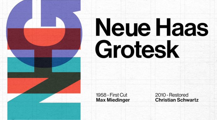
- Neue Haas Grotesk (Linotype): Not to be confused with Helvetica, this is the original design from which Helvetica was derived. Its restoration offers a warmer, more nuanced alternative.
- Resist Sans (Groteskly Yours): A free-spirited neo-grotesque that balances a minimalist look with distinctive, tentative letterforms for a touch of revolt.
- SK-Modernist (Sean Kane): A clean, minimalist font inspired by the Avant-Garde movement, perfect for digital media where simplicity is key.
- Geist (Vercel): A minimalist sans-serif beloved by the coding and design community for its superb clarity in digital projects and UI design.
Geometric & Humanist Hybrids
These typefaces blend the clean, circular forms of geometric sans with the warmth and readability of humanist designs, resulting in fonts that are both friendly and professional.
- Graphik (Commercial Type): Christian Schwartz’s “emphatically vanilla” workhorse is a designer favorite for its pure, geometric simplicity and wide range of weights.
- GT Walsheim (Grilli Type): Inspired by 1930s Swiss poster lettering, this geometric sans is friendly and warm, making it ideal for branding that aims to be approachable.
- Aperçu (Colophon Foundry): A synthesis of classic realist typefaces like Johnston and Gill Sans, Aperçu feels both familiar and distinctly contemporary.
- Pangram Sans Rounded (Pangram Pangram Foundry): The playful, approachable sibling of the powerful Pangram Sans, this font shines in bolder weights and brings a fun energy to designs.
- Plus Jakarta Sans (Tokotype): A versatile, contemporary sans with a wide range of weights, suitable for everything from apps to packaging.
- DM Sans (Colophon Foundry for Google): A low-contrast geometric sans optimized for screen readability, making it a top choice for web and mobile UI.
- Space Grotesk (Florian Karsten): A geometric sans with a futuristic, monospace-inspired vibe, perfect for tech branding and edgy editorial work.
- Moucha (Vibrant Types): A geometric sans-serif offering both vintage and modern axes, providing broad language support for global brands.
- Mansfield (Umitype): A versatile geometric sans inspired by 20th-century icons like Futura, embodying clean, modern aesthetics.
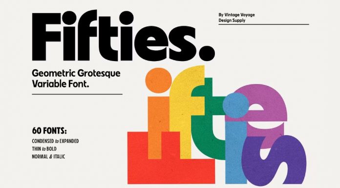
- VVDS Fifties (Vintage Voyage Design): The font family is a sleek, mid-century–inspired sans that fuses geometric precision with a humanistic touch, evoking vintage modernism with clean, adaptable versatility.
The Return of the Serif: Timeless Elegance, Modern Edge
Serif fonts are experiencing a major renaissance. No longer just for print, the best serif fonts of 2026 are designed with screen-first applications in mind. They balance timeless elegance with contemporary flair, making them perfect for brands that want to convey authority, heritage, and sophistication.
Editorial & Text Serifs
These fonts are engineered for readability in long-form text, both on-screen and in print. They feature graceful curves and sturdy construction.
- GT Alpina (Grilli Type): A proud workhorse serif that delights in expressive historical details, balancing utility with vibrant personality.
- Lyon Text (Commercial Type): Drawing from Renaissance mastery while maintaining contemporary relevance, this font balances elegance with functional anonymity, a top choice for publications.
- Merriweather (Sorkin Type): A serif designed for exceptional screen readability, it has become a staple for web and editorial design.
- Lora (Cyreal): A well-balanced serif with calligraphic roots, suitable for both body text and elegant headlines.
- Libre Baskerville (Google Fonts): A web-friendly serif with a classic, literary feel, ideal for long-form content that needs to feel authoritative.
- PT Serif (ParaType): A versatile serif with a modern touch, designed to work seamlessly across print and digital platforms.
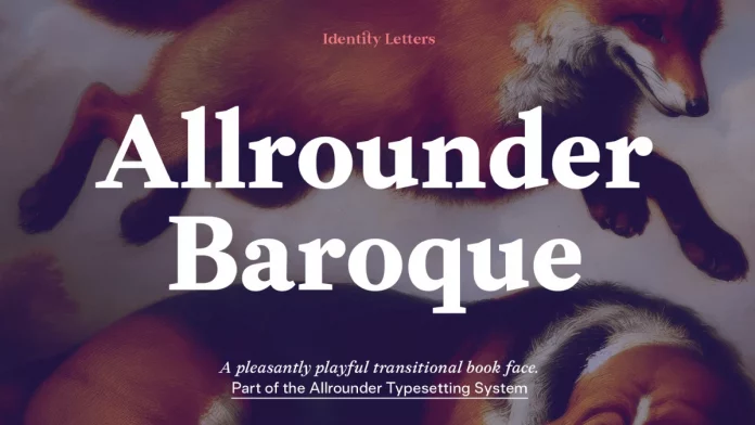
- Allrounder Baroque (Identity Letters): A transitional/baroque serif that combines historical elegance with modern versatility — it’s structured and readable yet carries a refined, dynamic character.
- Sabon (Linotype): A classic old-style serif known for its harmony and readability, reimagined for the digital age.
- Canela (Commercial Type): A typeface that defies easy categorization, blending serif and sans-serif qualities into a display font of exquisite elegance.
- Bookman Old Style (Monotype): A classic, sturdy serif that brings a sense of heritage and trustworthiness to professional communications.
Display Serifs with High Contrast
Perfect for headlines, logos, and short bursts of text, these serifs are all about making a statement. They feature dramatic contrast between thick and thin strokes.
- Playfair Display (Claus Eggers Sørensen): A classic high-contrast serif perfect for elegant headlines and luxury branding.
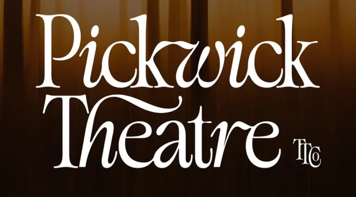
- TAN Pickwick (TanType): An elegant display serif that fuses elongated, graceful serifs with subtle modern flourishes to strike a balance between classic sophistication and contemporary character.
- Stanley (Jérémie Gauthier): An elegant display font that combines rounded and rectangular forms for a unique and sophisticated design edge.
- Elanor (Dirtyline Studio): A modern serif with retro vibes and experimental touches, ideal for standout branding projects that need a unique voice.
- Sayke (ROHH): A contemporary Didone with sparkling ball terminals and stunning italics, perfect for high-fashion editorial design.
- Elfkin Editorial (SilverStag Type Foundry): A refined, high-contrast serif with expressive italics and abundant alternates and ligatures that combine elegance and versatility in editorial and branding contexts.
- Auge (Fontfabric): A wedged serif inspired by the micro world, bringing subtle sophistication and a unique rhythm to print design.
- Ephoris (Slide Shoot): A versatile retro-inspired serif typeface that blends vintage elegance with modern readability, available in 16 weights with italics and stylish ligatures.
- Casta (Dirtyline Studio): A sophisticated and classic serif that is perfect for branding, logos, and any design that requires a touch of class.
- Ponte (Silktype): A high-contrast serif display typeface with elegant, smooth serifs and refined ligatures that blend modern sophistication with classic structure.
Expressive & Experimental: The Future of Typography
This category is where designers are pushing the boundaries of what type can be. Driven by technology and a desire for unique expression, these fonts are bold, artistic, and often unconventional. They are perfect for brands looking to disrupt and capture attention.
Variable & Kinetic Fonts
Variable fonts are no longer a novelty; they are an industry standard. This single font file contains a multitude of styles, allowing for infinite adjustments in weight, width, and slant, which is revolutionary for responsive design and creative expression.
- GT Flexa (Grilli Type): A typeface built on the principle of variable fonts. Its 112-style system is a masterclass in flexibility and performance.
- Druk (Commercial Type): A study in typographic extremes. Deliberately conceived without normal widths or lighter weights, it offers bold expressive possibilities, especially in its condensed and wide styles.
- Sharp Grotesk (Sharp Type): With 12 weights and seven widths across Roman and Italic styles, this superfamily balances modernist rigor with hand-drawn imperfection.
- Anybody (ETCetera Type Co): A friendly and approachable sans-serif that works well in both display and text sizes, with extensive variable axes.
- Pennypacker (CJ Type): A modern industrial grotesk with strong character and versatility, rooted in the Neue Moderne tradition yet refined for contemporary use.
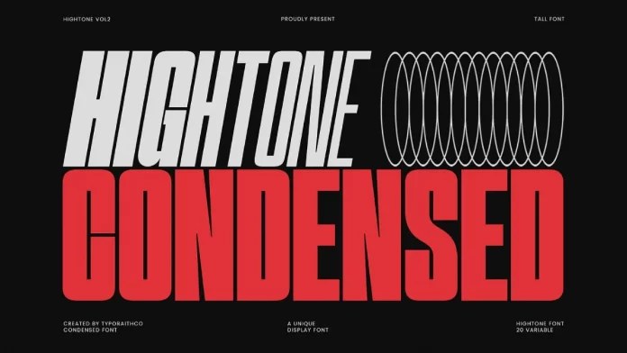
- Hightone (Typoraith Co): A modern, condensed sans-serif type system combining tall, narrow letterforms with a wide variable-weight axis (from Thin to Black), designed for high-impact headlines, branding, and versatile typographic control.
- Malinton (Azzam Ridhamalik): A playful and versatile display sans with variable technology and unique emoticon alternates, perfect for social media and logos.
- Tausend (Fontwerk): A modern, German-grotesque variable system blending strong, confident character (with small apertures, angular curves, and subtly top-heavy forms) across multiple styles to support expressive yet coherent typographic systems.
- Roboto Flex (Font Bureau): The variable version of the classic Roboto, offering an incredible range of expression for UI and web design.
- NaN Hyena (NaN): An expressive variable font that pushes the boundaries of sans-serif design with its aggressive, angular forms.
Modern Gothic & Display
Typography in 2026 is trending towards being bold and striking. Modern gothic fonts, with their mix of historical elegance and contemporary structure, are redefining logo design and branding.
- Project Blackbird (Kulturë Type): A free grotesk font with unique glyphs and a strong personality, perfect for adding a memorable touch to logos and editorial layouts.
- DX Rigraf (Dirtyline Studio): A modern sans-serif with strong monospace influences, excellent for tech branding and edgy web design.
- Neue Metana (Dirtyline Studio): A minimalist design inspired by hype and urban culture, made to be versatile across lifestyle and trend-focused branding.
- Regar (Nirmana Visual): A modern and eye-catching display font designed for bold statements and high visual impact in branding and posters.
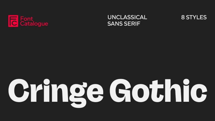
- Cringe Gothic (Font Catalogue): A grotesque sans serif infused with intentional awkwardness and expressive distortions—its quirky, off-beat forms create a typographic voice that feels playfully uneasy yet confident.
- Neue Power (Power Type): A contemporary sans-serif display family with 6 weights, perfect for various design needs requiring a strong, grotesque style.
- THUNDER (Rajesh Rajput): A condensed typeface with high contrast and 36 styles, designed for powerful headlines and logos.
- Monument Extended (Pangram Pangram Foundry): A massive and modular font made to command attention, often seen in brutalist and maximalist design.
- Cooper Black (Adobe Originals): This groovy, bold serif from the 70s is making a huge comeback, bringing a sense of fun and nostalgia to modern branding.
- TT Commons Classic (TypeType): A modern revival of typographic essentials, this universal grotesque is a reliable choice for any project.
Organic & Handcrafted
In a digital world, the craving for a human touch is strong. Organic and handwritten fonts add warmth, personality, and authenticity, creating an emotional connection with the audience.
- Vacances Poster Club (Ayya Studio): A versatile, hand-drawn vintage font collection offering multiple complementary styles plus illustrative elements to evoke nostalgic European charm.
- Best Frenemy (Struvictory.art): A dynamic display typeface combining bold, hand-written uppercase sans serif with a playful, flowing lowercase script to create a striking contrast and modern personality.
- Margo and Marcel (Komet & Flicker): A friendly, hand-drawn retro all-caps display font with intentional imperfections and custom connecting ligatures that give it a warm, organic, artisanal character.
- Wild Tale (Stable): A playful, hand-drawn font duo combining a chunky, all-caps vintage sans with a loose, whimsical script to evoke charm and visual contrast.
- Villa al Mare (AnMark): A graceful vintage script font with elegant swashes, alternating uppercase forms, and a relaxed, handcrafted character that evokes sunlit Mediterranean style.
- Peachy Rebels (Creacy Studio): A retro font duo pairing a bold, rounded, vintage-inspired sans serif with a lively, fluid script—“Peachy Rebels” balances assertiveness and personality in one cohesive set.
- Limoncello Recipe (PeachCreme): A warm, intimate handwritten script that channels the charm of old recipe cards, complete with natural at-handwriting quirks, expressive swashes, and subtle irregularities.
- Gimme Extra Bold (BilberryCreates): A bold, groovy 1980s-inspired sans serif with strong weight and personality that commands attention while retaining clean forms.
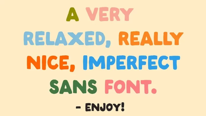
- Imperfect (Studio Funshop by Kelli): A casually drawn sans serif with hand-lettered irregularities and alternate characters that give it a warm, human, “authentic handwriting” aesthetic.
- Augustine (Bruised Goods): A vintage monospaced font duo inspired by historic St. Augustine, blending typewriter-style uniformity with handcrafted character.
Specialized & Functional: Fonts That Solve Problems
Beyond aesthetics, the coolest fonts are often the ones that solve specific design challenges, from enhancing readability on-screen to offering extensive language support for global products.
Slab Serifs & Monospaced
Slab serifs offer a blend of serif authority and sans-serif clarity. Monospaced fonts, once relegated to coding, are now a stylistic choice for conveying a tech-forward, utilitarian aesthetic.
- Bitter (Sol Matas): A slab serif specifically designed for comfortable reading on digital screens.
- Roboto Slab (Christian Robertson): The slab serif counterpart to Roboto, this font is a popular choice for creating clear hierarchies in UI design when paired with its sans-serif sibling.
- ITC Lubalin Graph (ITC): A classic boxy slab serif with a low profile that remains a favorite for graphic-heavy design projects.
- Antarctican (Dunwich Type Founders): A professional font family with a standout monospaced version, excellent for branding and digital applications that need a technical feel.
- Diatype (Dinamo Typefaces): A warm yet sharp grotesque optimized for screen reading, capturing Swiss neo-grotesque tradition for contemporary digital needs.
- Fedra Sans (Typotheque): A humanized sans-serif that works equally well on paper and screen, with unique characteristics that can be toggled for different levels of personality.
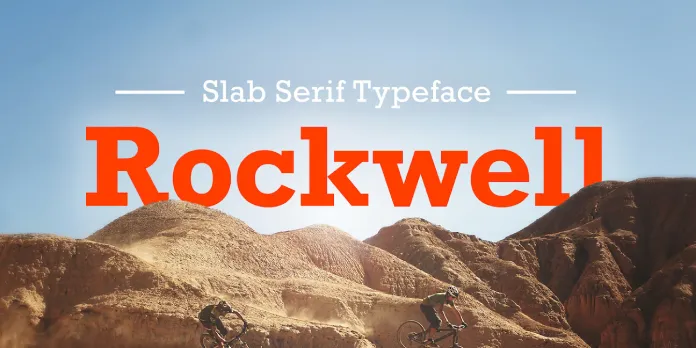
- Rockwell (Monotype): A classic slab serif with a geometric structure, conveying strength and stability.
- Archer (Hoefler&Co.): An approachable yet authoritative slab serif, known for its friendly ball terminals and wide range of weights.
- Fira Code (The Mozilla Foundation): A monospaced font with programming ligatures, beloved by developers and increasingly used by designers for its clean, technical aesthetic.
- Source Code Pro (Paul D. Hunt): An open-source monospaced font designed for coding environments, valued for its clarity and legibility.
The Final 20: Emerging Classics and Niche Stars
Rounding out our list are fonts that are either poised to become future classics or serve specific niche purposes with exceptional skill. This is where you find the hidden gems that can set your work apart.
- Newake (Indieground Design): A versatile sans-serif with a dynamic and modern feel, perfect for sports branding and tech startups.
- Lightshift (SilverStag Type Foundry): A bold, characterful display font family that fuses geometric sans structure with fluid, retro-inspired flourishes and includes multiple styles (regular, rounded, outline, etc.) plus alternate glyphs for expressive versatility.
- Saint Regus (Sonar Hubermann): A display typeface that combines modern and classic elements for a luxurious and sophisticated feel.
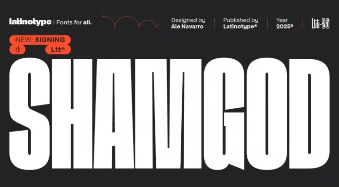
- Shamgod (Latinotype): A compressed, high-energy grotesque sans serif with sharp diagonal cuts and aggressive tension that channels urban and sporty attitude.
- La Luxes (Set Sail Studios): A refined, elegant serif font family that combines classic transitional proportions with luxurious details, ligatures, and a full range of weights for high-end typographic versatility.
- Futura (Linotype): The timeless geometric sans-serif continues to be a professional staple for its combination of elegance and functionality.
- Gotham (Hoefler&Co.): A geometric sans-serif with a broad, American voice, known for its straightforward and authoritative tone.
- Garamond (URW Type Foundry): A family of classic old-style serif typefaces known for their grace and readability in print, with modern versions optimized for digital.
- Baskerville PT (Paratype): A modern revival of the classic transitional serif typeface, combining elegant stroke contrast, refined serifs, and open counters to suit both body text and display settings.
- Bodoni (Linotype): The quintessential modern serif, defined by its dramatic contrast between thick and thin strokes, perfect for high-fashion and luxury.
- Gilroy (Radomir Tinkov): A modern geometric sans serif with 20 styles, extensive language support, and rich OpenType features.
- Frutiger (Linotype): A humanist sans-serif known for its clarity and readability, especially at a distance, making it a favorite for signage and wayfinding.
- Trajan (Adobe Originals): An elegant serif font based on Roman square capitals, perfect for conveying a sense of history, authority, and grandeur.
- FF Mark (FontFont): A versatile geometric sans-serif that covers a huge range of weights and styles, embodying the spirit of German geometry for the 21st century.
- Maison Neue (Milieu Grotesque): A clean, neo-grotesque sans serif offering a neutral, versatile aesthetic grounded in early 20th-century modernist principles.
- Herokid (W Type Foundry): A dynamic grotesque sans-serif family inspired by Helvetica, Impact, and Univers, offering extreme width variation (from ultra-condensed to expanded) and a bold, flexible personality.
- Times New Roman (Monotype): The traditional serif workhorse remains a standard for formal and academic documents due to its proven readability and professional polish.
- Avenir Next (Linotype): A versatile geometric sans serif by Frutiger & Kobayashi, offering wide weights and excellent legibility.
- Neue Plak (Monotype): A robust mechanical-grotesque revival of Paul Renner’s Plak, blending industrial geometry with quirky, expressive details across many widths and weights.
- Pragmatica Next (ParaType): A super-flexible sans serif family with 122 styles across widths, weights, and slants, built for broad typographic adaptability.
Navigating the typographic landscape of 2026 is an exercise in intentionality. The 100 coolest fonts showcased here are more than just a fleeting trend report; they represent a fundamental shift in how we approach visual communication. The clear takeaway is that personality has become paramount. Whether through the soulful nuances of a neo-grotesque, the elegant authority of a modern serif, or the boundless potential of a variable font, the goal is no longer just to be legible, but to be memorable.
The distinction between workhorse and display typography continues to blur. The best fonts today are expected to perform flawlessly across a vast ecosystem of applications, from a massive billboard to the smallest UI element on a smartwatch. This demand for versatility, coupled with a desire for unique character, is what drives the innovation we see from the world’s leading type foundries. As designers, our role is to be discerning curators, selecting typefaces not just for how they look, but for what they do. How do they behave responsively? What emotional response do they evoke? How do they position a brand within its cultural context?
Ultimately, this list is a starting point, not a conclusion. The most exciting typographic discoveries are often made through experimentation and a deep understanding of the project’s core message. Use these selections as a guide to inform your choices, challenge your conventions, and find the perfect voice for your next project. The power of typography lies in its ability to give words a soul, and in 2026, those souls are more expressive, dynamic, and compelling than ever. Your challenge is to harness them.
Header image: Helvetica Now from Monotype. Hungry for more? If so, feel free to browse WE AND THE COLOR’s Fonts category to find both timeless and trending typefaces for different creative needs.
Subscribe to our newsletter!


