
This post contains affiliate links. We may earn a commission if you click on them and make a purchase. It’s at no extra cost to you and helps us run this site. Thanks for your support!
Elevate Your Design Game: Exploring the Essential Typeface Collection for Every Graphic Designer
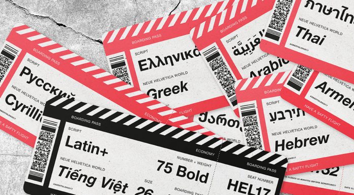
Fonts are essential tools for graphic designers, as they can convey different messages, emotions, and styles with their shapes, sizes, and weights. Choosing the right font for a project can make a huge difference in the final result. But with thousands of fonts available, how do you know which ones are the best?
In this post, we will introduce you to 10 fonts that every graphic designer should have in their arsenal. These fonts are versatile, timeless, and widely used in various fields and media. They are also easy to read, elegant, and professional. Let’s take a look at them:
Helvetica
Helvetica is a classic sans serif font that was created in 1957 by Max Miedinger and Eduard Hoffmann in Switzerland. It is one of the most popular and widely used fonts in the world, as it is simple, clean, and neutral. Helvetica can be used for almost any purpose, from logos and headlines to body text and signage. It is also a favorite of many famous brands, such as Apple, BMW, Lufthansa, and NASA.
Garamond

Garamond is a serif font that dates back to the 16th century when it was designed by Claude Garamond in France. It is one of the oldest and most elegant fonts in history, as it has a high readability and a refined style. Garamond is often used for books, magazines, and newspapers, as it gives a classic and sophisticated touch to the text. It is also suitable for logos and branding, as it conveys a sense of tradition and quality.
Futura

Futura is a geometric sans serif font that was designed by Paul Renner in 1927 in Germany. It is one of the first modernist typefaces inspired by the Bauhaus movement, which aimed to create functional and rational forms. Futura has a futuristic and minimalist look, with sharp angles and circles. It is ideal for posters, flyers, and advertisements, as it attracts attention and creates contrast. It is also used by many iconic brands, such as Volkswagen, IKEA, and Calvin Klein.

Times New Roman

Times New Roman is a serif font that was created in 1931 by Stanley Morison and Victor Lardent for The Times newspaper in London. It is one of the most common and widely used fonts in the world, as it is standard for many applications and documents. Times New Roman is a versatile and reliable font, as it can be used for both formal and informal purposes. It is also easy to read and print, as it has a balanced and harmonious design.
Acumin
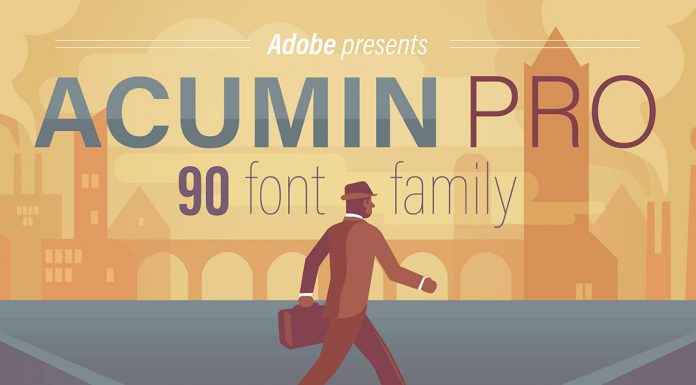
Acumin is a sans-serif font that was designed by Robert Slimbach in 2015 for Adobe. It is a modern and versatile font, with a large range of weights and widths. Acumin can adapt to different contexts and needs, from headlines and captions to body text and tables. It is also a great choice for web design and digital media, as it has a clear and crisp appearance on screens.
Bodoni

Bodoni is a serif font that was designed by Giambattista Bodoni in the late 18th century in Italy. It is a classic and elegant font, with a high contrast between thick and thin strokes. Bodoni is often used for fashion magazines, logos, and invitations, as it gives a luxurious and refined impression. It is also suitable for headlines and display text, as it has a strong visual impact.
Baskerville

Baskerville is a serif font that was designed by John Baskerville in the mid-18th century in England. It is a transitional font that bridges the gap between old-style and modern fonts, with more contrast and sharper serifs. Baskerville is a beautiful and graceful font, with high readability and a smooth texture. It is perfect for books, journals, and academic papers, as it conveys a sense of authority and credibility.
Univers

Univers is a sans serif font that was designed by Adrian Frutiger in 1957 in Switzerland. It is one of the first fonts to have a systematic family of variants, with different weights, widths, and styles. Univers is a neutral and functional font, with a clear and consistent design. It can be used for any purpose, from signage and corporate identity to web design and mobile apps.
Gill Sans

Gill Sans is a sans serif font that was designed by Eric Gill in 1928 in England. It is a humanist font that is inspired by the classic Roman letterforms, with a touch of British style. Gill Sans is a friendly and warm font, with a balanced and harmonious design. It is often used for logos, posters, and children’s books, as it creates a sense of familiarity and charm.
Avenir

Avenir is a sans serif font that was designed by Adrian Frutiger in 1988 in France. It is a geometric font that is based on the idea of creating a harmonious and organic shape. Avenir has a modern and elegant look, with a subtle contrast and a smooth curve. It is suitable for headlines, logos, and web design, as it expresses a sense of innovation and vision.
These are the 10 fonts that every graphic designer should have in their collection. They are versatile, timeless, and widely used in various fields and media. They are also easy to read, elegant, and professional. By using these fonts, you can create stunning and effective designs for your projects. Feel free to browse through the Fonts section on WE AND THE COLOR to find more trending typefaces.
Subscribe to our newsletter!


