A Fresh Take on Brand and Packaging Design for Health-Conscious Diners
Consumer choices are more and more defined by health and simplicity. Cocofarmer is a coconut dessert shop in Shanghai, that emerges as a refreshing haven for those seeking natural and authentic treats. Designed by the innovative minds at 123 Studio, this brand and packaging project captures the essence of a relaxed, nature-inspired lifestyle through creative typography and symbolic design elements. The design caters to the increasing desire for healthier, “burden-free” indulgences in the post-epidemic era. Below, we explore how 123 Studio crafted a memorable and striking brand identity that resonates with modern values and visual storytelling.
Health-Driven Identity for the Post-Epidemic Era
Cocofarmer’s identity stems from the rising cultural shift towards health-conscious, nature-focused choices. Following the pandemic, consumers have preferred natural ingredients that promote wellness and balance. This dessert shop, centered on the wholesomeness of coconut-based desserts, aims to convey an ethos of simplicity and purity, allowing customers to experience the restorative benefits of natural ingredients in a relaxing atmosphere. By embracing these values, Cocofarmer positions itself as more than just a dessert shop—it’s a sanctuary of natural indulgence in the bustling city of Shanghai.
Reinventing Chinese Characters: A Unique Visual Rhythm
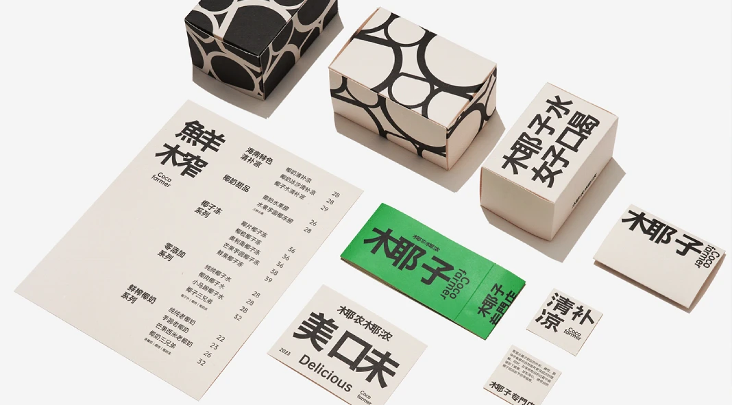
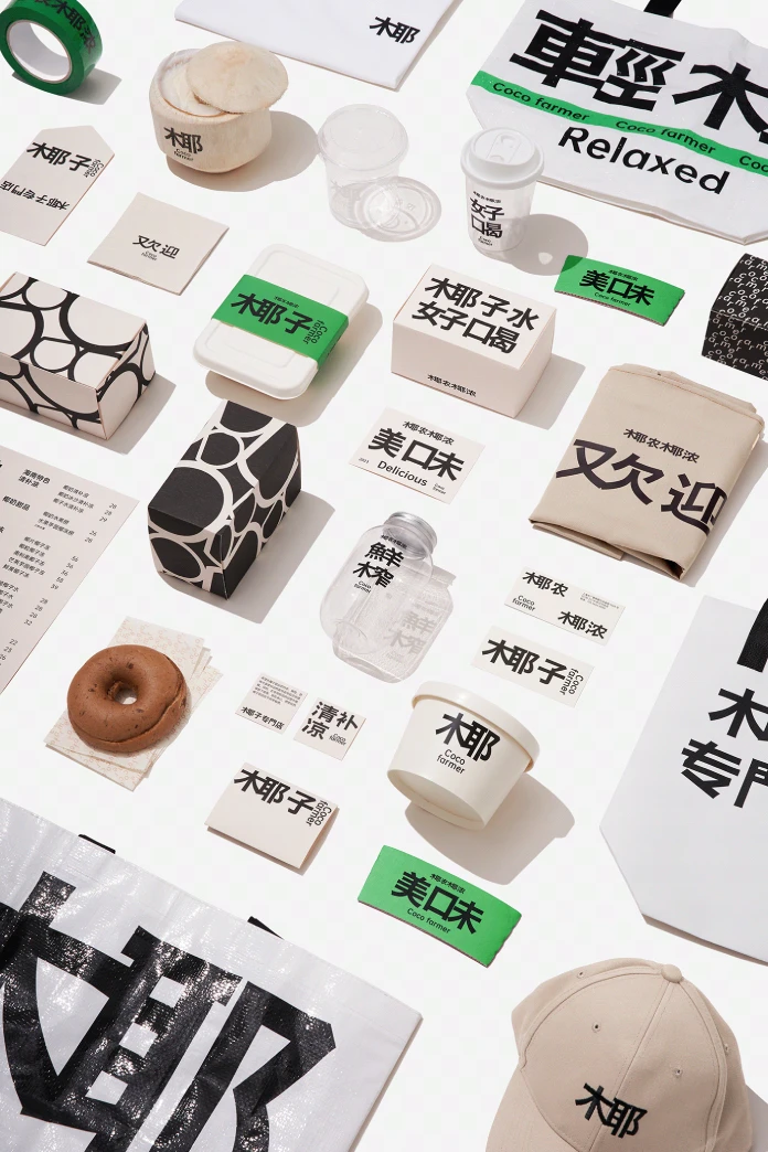
One of the most distinctive elements of Cocofarmer’s brand identity is its approach to typography. Within the context of modern Chinese online culture, where language and visual communication often merge, 123 Studio utilized an innovative method of splitting Chinese characters. Breaking down left-right structured characters into two separate components creates a visually captivating rhythm that feels simultaneously familiar and refreshing. This deliberate “visual fragmentation” echoes the brand’s philosophy of staying connected to tradition while infusing it with a contemporary twist. The result is a typography style that feels intuitive and dynamic, embodying both the simplicity and depth of the Cocofarmer brand.
Minimalism Meets Nature: Visualizing Coconut on Water
123 Studio’s design doesn’t stop at typography. The brand’s visual language extends into a minimalist yet evocative representation of coconut on water. By integrating patterns that mimic the gentle interaction of coconuts floating and intersecting on the surface of water, the design evokes a sense of coolness and tranquility. The minimalist pattern is not only aesthetically pleasing but also deeply symbolic, subtly hinting at the core ingredient—coconut—that defines Cocofarmer’s products. This approach reflects 123 Studio’s careful balance of form and function, where visual elements carry weight in both meaning and mood, enhancing the sensory experience of the brand.
Clean Aesthetics with a Modern Appeal
The entire design aesthetic for Cocofarmer is guided by a clean, uncluttered approach. From the typography to the minimalist iconography, each element in the design works together to highlight a refined, contemporary brand identity. By reducing design elements to only those that are essential, 123 Studio encapsulates the feeling of simplicity and ease that aligns with the public’s post-epidemic pursuit of “burden-free” dining. This minimalism makes the Cocofarmer brand stand out while enhancing its appeal to health-conscious diners seeking straightforward, wholesome experiences.
Creating an Authentic Connection with Consumers
Through thoughtful design choices, 123 Studio succeeded in building a brand that feels both inviting and genuine. The relaxed yet sophisticated visual style invites customers to experience a slice of nature within the urban landscape, offering a retreat where health and enjoyment meet seamlessly. Cocofarmer’s branding stands as an example of how design can create emotional resonance, enabling the brand to connect deeply with its audience.
Conclusion: A Design that Resonates with the Modern Conscious Consumer
Cocofarmer’s brand and packaging, crafted by 123 Studio, captures the spirit of a healthier, more balanced lifestyle, beautifully combining tradition with contemporary design language. By leveraging minimalist elements and innovative typography, the brand conveys a narrative of purity and freshness that speaks to the needs of today’s health-aware consumers. This design project is a masterclass in branding for wellness-oriented businesses, showing how a visual identity can become a powerful tool for communicating values and attracting an audience seeking authenticity. Cocofarmer’s brand not only tells a story but invites everyone to experience it—one coconut dessert at a time.
All images © by 123 Studio. Check out other inspiring graphic design, branding, and packaging design projects from around the globe on WE AND THE COLOR.
Subscribe to our newsletter!

