
This post contains affiliate links. We may earn a commission if you click on them and make a purchase. It’s at no extra cost to you and helps us run this site. Thanks for your support!
A creative professional’s portfolio is their single most important asset. It communicates skill, vision, and professional identity in a way no resume ever could. The challenge, however, is finding a structure that elevates the work without overshadowing it. This is where a truly exceptional digital portfolio presentation template becomes essential. It provides a framework that is both invisible and impactful. This specific InDesign template achieves that delicate balance, offering a lesson in how strategic minimalism can make the boldest statement. It proves that confidence doesn’t always need to be shouted.
Please note that this professional graphic design template requires Adobe InDesign installed on your computer. Whether you use Mac or PC, the latest version is available on the Adobe Creative Cloud website—take a look here.
The Power of a Strong First Impression
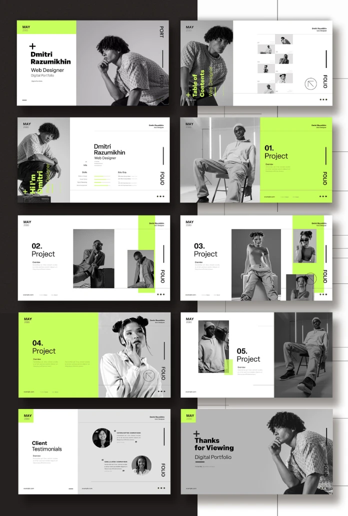
First impressions are forged in seconds. This template immediately establishes a sense of order and sophistication. Its foundation is a strong, asymmetrical grid. This choice creates a dynamic visual flow. Consequently, it guides the viewer’s attention deliberately from one element to the next. The generous use of white space is equally important. It allows each project and piece of information to breathe. This prevents the cluttered feeling that plagues so many other portfolios. What does this communicate to a potential client? It shows intentionality, precision, and an understanding of modern design principles before they even see your first project.
A Closer Look at the Design Elements
The genius of this design lies in its deceptively simple components. Each element is chosen with purpose. Together, they create a cohesive and powerful visual language. This isn’t just about looking good; it’s about communicating effectively.
Strategic Use of Color
The color palette is a masterstroke of restraint and impact. It relies almost entirely on a monochrome scheme of black, white, and gray. This classic combination ensures that your work—your photography, your designs, your case studies—remains the undisputed hero. However, the template then introduces a single, vibrant accent of lime green. This splash of color is used surgically. It highlights key information like project numbers, names, and calls to action. This creates a powerful visual hierarchy and an unforgettable brand accent.

Typography That Speaks Volumes
Typography is the voice of your written content. This template utilizes a clean, bold, sans-serif typeface. This choice reinforces the modern and minimalist aesthetic. Headlines are strong and clear, making the portfolio easy to scan. Body copy is legible and unpretentious. This typographic clarity ensures that your project descriptions and personal information are absorbed effortlessly. It communicates professionalism without trying too hard.
A Layout Built for Your Best Visuals
This digital portfolio presentation template is unapologetically image-centric. The layouts consistently prioritize large, impactful visuals. Whether it’s a full-bleed image on the cover or carefully placed project shots, the design understands that creative work must be seen. The structure elegantly frames your visuals, giving them the space and prominence they deserve. This shows a deep respect for the creative work being presented.
Why Adobe InDesign is the Right Tool for this Portfolio
This template, designed by Wavebreak Media, is built for Adobe InDesign. This is a crucial detail. InDesign offers unparalleled control over layout and typography, making it the industry standard for professional documents. The template is sized at 1920 x 1080 pixels, making it ideal for high-resolution screen presentations. With 10 pre-designed pages, it provides a complete, customizable narrative structure. You can easily drag and drop your own images and edit the text placeholders. InDesign’s style sheets also allow you to change the accent color or fonts globally with just a few clicks.
Making this Minimalist Portfolio Template Uniquely Yours
A great template is a starting point, not a final destination. The goal is to infuse this strong structure with your unique creative identity. How can you personalize this design?
First, consider the accent color. The lime green is energetic and bold, but does it represent you? Changing this one color can completely alter the template’s mood. A deep navy could feel more corporate and established. A warm terracotta might feel more artisanal and grounded.
Next, curate your projects with care. A minimalist layout demands high-quality content. Select only your strongest work that tells a cohesive story about your skills. Each project should feel like a deliberate choice.
Finally, while the default typography is excellent, feel free to experiment. A different sans-serif or even a carefully chosen serif for headings could better align with your personal brand. The key is to maintain the template’s core principles: clarity, hierarchy, and a respect for white space.
Ultimately, this digital portfolio presentation template is a powerful communication tool. It provides a sophisticated and modern framework that helps you present your work with confidence and clarity. It strips away the unnecessary noise, allowing your talent to take center stage.
Feel free to find other amazing design templates here at WE AND THE COLOR.
Subscribe to our newsletter!


