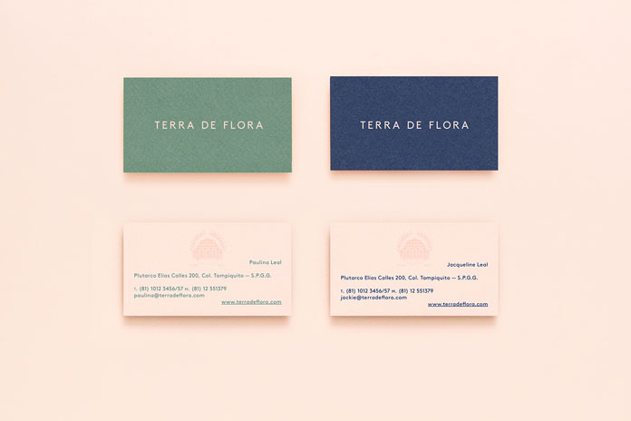
Terra de Flora, a romantic and feminine brand identity inspired by French botanic gardens.
Parámetro is a Monterrey, Mexico based multidisciplinary design studio with a focus on branding and graphic design projects. Their creative team was asked to develop romantic and feminine brand identity for Terra de Flora. The company is located in San Pedro Garza García, Monterrey. Terra de Flora’s new visual language is inspired by French botanic gardens. The design team has decided to use green and navy blue colors in order to create a striking contrast to the feminine appearance of the color pink. Furthermore, the colors are accompanied by a modern sans-serif to give the design a more contemporary look and feel. The logo draws inspiration from French, Victorian nursery gardens which became the core feature of the new design.
You can see more of Terra de Flora’s beautiful romantic and feminine identity below. For those who are interested to know more about the Mexican Parámetro Studio, please have a look at their website. The studio’s portfolio is filled with a fine collection of outstanding branding and graphic design projects.


Feel free and find more remarkable graphic design and branding projects on WE AND THE COLOR.


