This post contains affiliate links. We may earn a commission if you click on them and make a purchase. It’s at no extra cost to you and helps us run this site. Thanks for your support!
In the crisp air of Halloween, horror takes center stage across visual art and design. The spooky season brings a creative spark that ignites horror themes in everything from fine art to graphic design. Far from being just seasonal fun, this Halloween surge in macabre creativity speaks to a deeper artistic fascination. Why are artists and designers so drawn to the dark and eerie? The appeal is timely and timeless: horror offers a thrilling way to captivate audiences and explore the human psyche. It’s a cultural phenomenon that fuels creative expression across art forms. In this article, we delve into horror’s unique allure in art and design – examining what defines the macabre aesthetic, why it resonates with creators and viewers, and how it manifests in visual art, graphic design, and illustration. The goal is to offer fresh insights into horror as an artistic inspiration, especially apt on Halloween. The tone is professional yet personal, like a friendly design critic guiding you through the shadows. Let’s explore how horror and Halloween inspire art and design, answering the questions you might not even realize you had.
The Allure of Horror in Art and Design
Why are creatives drawn to horror? The allure of horror lies in its power to evoke intense emotion and curiosity. Fear is a raw emotion that, counterintuitively, many people enjoy in a controlled context. Psychologists note that experiencing fear through art can even be pleasurable. In other words, confronting terror on a canvas or screen provides a safe adrenaline rush. A haunting painting or chilling illustration leaves lingering questions in your mind. That unsettled feeling sticks with you – perhaps for hours or days – engaging you on a deeper level than something easily digestible. This lasting impact is exactly what many artists and designers seek: to make viewers feel and remember.
Moreover, horror as a theme lets creatives explore topics that might be taboo or intense if stated plainly. Beneath the jump-scares and creepy imagery, horror often carries meaningful subtext. Artists use the language of monsters and nightmares to comment on very real anxieties. A grotesque figure might symbolize societal fears or personal demons. Indeed, horror art frequently embeds symbolism or social commentary behind the scares. By exaggerating fears through fiction, creators can critique issues or express pain in a roundabout but powerful way. For example, depicting a monster can be a way to personify abstract threats – from environmental collapse to oppressive social norms – without being didactic. In this sense, horror provides a cathartic outlet. It externalizes inner darkness so we can grapple with it from a safe distance. As one design observer put it, horror can be a “cathartic expression” of fears that normally lurk in our subconscious.
Finally, horror attracts creatives because it challenges the imagination. Designing something truly scary or uncanny pushes an artist to new limits. It’s an exercise in provoking emotion: How do you make a viewer’s heart race with just an image? How do you hint at a threat without showing it outright? These challenges spur innovation in technique and concept. Many designers relish the opportunity to break rules and surprise audiences – horror is the perfect playground for that. There’s also a certain rebel spirit in embracing the macabre. Throughout history, artists who tackled dark subjects often stood out as bold experimenters. The tradition continues today, with horror-inspired creators earning passionate followings for their unique visions. In summary, the allure of horror in art and design comes from its emotional punch, rich subtext, and capacity to stretch creative boundaries. It’s art that scares us, yet we cannot look away.
Crafting the Macabre: Key Elements of a Horror Aesthetic
What makes an artwork or design feel like horror? There is a visual language to the macabre – a set of elements and techniques that signal creepiness to our brains. Artists and designers carefully orchestrate these elements to build atmosphere and evoke fear. Here are some key components of eerie design aesthetics:
- Dramatic Light and Shadow: High-contrast lighting is a classic tool of horror. Deep shadows create mystery and tension by hiding as much as they reveal. For instance, a single, dim light casting long shadows instantly sets a spooky mood. This chiaroscuro technique (bold contrasts of light and dark) has been used in horror art for centuries. Darkness swallows details, forcing your imagination to fill the void – often with things more terrifying than anything shown. By selectively illuminating a scene (say, a face lit only from above while the eyes fade into shadow), artists tap into the primal fear of the unknown. Darkness obscures certainty, and in that uncertainty, our minds conjure nightmares.
- Uncanny Imagery: The uncanny valley effect is another powerful device. Designers often make something look almost human but “off” in subtle ways to elicit unease. It might be a doll with too-real eyes, or a digital character with slightly distorted features. Our brains are wired to recognize fellow humans; when a figure is close but not quite right, it triggers a deep instinctual revulsion. Horror artists play with this by creating creatures or portraits that straddle the line between familiar and freakish. A smiling face with just a few too many teeth, or an animation that’s just a bit jerky, can be more disturbing than an outright monster. The uncanny makes us question reality – is something human, or inhuman pretending? That doubt is deeply unsettling.
- Macabre Motifs and Symbols: Certain visuals instantly evoke horror due to cultural associations. Skulls, ghosts, bats, spiders, blood, and graveyards – these motifs scream Halloween and horror. But effective horror design often puts a fresh twist on familiar symbols. For example, an artist might combine beauty and the grotesque by depicting a bouquet of flowers that, on closer look, are made of anatomical parts. Common symbols of death or evil (like skulls or snakes) can be stylized in new ways to renew their impact. Even color plays a symbolic role: black and red are classic horror colors (signifying darkness and blood), while sickly greens or ghostly blues can suggest the supernatural. In recent years, some creators have experimented with unexpected color palettes – like neon pinks or vibrant purples – applied to horror imagery, to amplify the strangeness. The key is choosing imagery and colors that provoke an instinctive reaction. Horror thrives on the visceral: rotten textures, jagged shapes, and gory details that make viewers recoil while also piquing curiosity.
- Distortion and Surprise: In the world of horror visuals, breaking the rules of reality is encouraged. Normal proportions and perspectives might be skewed to disorient the viewer. A hallway might stretch too long behind a figure, or a character’s reflection might show a different face. These distortions plant a subtle feeling that something is “wrong” even if you can’t immediately say what. Likewise, surprise elements are common – the detail you don’t notice at first, but that jumps out on closer look (like a hidden face in the shadows). Graphic designers incorporate this by hiding eerie Easter eggs in a layout or using typography that reveals a secondary message (imagine a seemingly innocent poster where the letters, when noticed, form the shape of a skull). Such surprises reward viewers for paying attention, while also delivering a jolt of fear once discovered.
- Emotional Storytelling: Finally, great horror art and design tells a story or suggests one, often without words. An illustration might capture a tense moment (“the moment before the attack”), compelling the viewer to mentally complete the story – often imagining a worse ending than the artist ever painted. This narrative aspect engages the audience actively. Horror imagery tends to leave things open-ended: it poses a question (“what lurks beyond that door?”) rather than giving a neat answer. By leaving some mystery, the artwork stays in your mind long after, as you wrestle with its implications. This unsettled feeling, as noted earlier, paves the way for an adrenaline rush. In design terms, it’s about creating an experience, not just a picture. A successful horror poster, for example, doesn’t just advertise a movie – it pulls you into a mood of suspense or dread with just one image. Every element, from layout to color to imagery, works towards that goal of storytelling through atmosphere.
In crafting the macabre, artists balance subtlety with shock value. Interestingly, horror visuals can be gory and grotesque or sublime and subtle. Not every creepy design is covered in blood – some of the most haunting pieces are quiet and suggestive. A famous example from art history is a simple painting of a skeleton smoking a cigarette: initially created as a tongue-in-cheek student work, today it feels oddly unsettling in its quiet depiction of death. This shows how context and viewer perception turn even subtle images into horror. On the other end, there are paintings like the 19th-century piece of a father devouring his child from myth – explicitly gruesome, leaving nothing to the imagination. Both approaches, the understated and the outrageous, have their place in horror art. The best designers know how to calibrate this: sometimes a whisper of terror (a faint shape in the dark) can be more powerful than a scream. By mastering these elements – light and shadow, the uncanny, symbolic motifs, creative distortion, and atmospheric storytelling – creators build a visual language of fear that is universally felt. Even without knowing the context, a well-crafted horror design sends a chill down your spine on a primal level.
Halloween as a Catalyst for Creative Horror
Every year, as October 31st approaches, the world collectively indulges in the spooky and strange. Halloween isn’t just a night of costumes and candy – it has evolved into a month-long creative festival of horror. For the art and design community, this season is a catalyst that prompts new works and bold experiments in the macabre. One could say Halloween’s spirit possesses the creative industries in October (and often, much earlier, as the season seems to start in September!).
The influence of Halloween on art and design is both cultural and commercial. Culturally, Halloween popularizes horror aesthetics in a way no other event does. During this time, what is usually niche or “alternative” becomes mainstream. Walk into any store in late October and you’ll see creepy graphics on packaging, from soda cans to store displays. Cities host pumpkin carving contests (a folk art turned design showcase) and haunted house installations. Social media fills up with artists sharing their Inktober sketches or daily horror-themed illustrations. In short, Halloween provides a prompt for creatives everywhere to dive into dark themes without hesitation. As one art studio blog noted, Halloween has become a cultural phenomenon that fuels creative expression across art forms. It’s a time when even people who don’t normally engage with horror get a little thrill from spooky visuals. This widespread enthusiasm gives artists and designers a receptive audience for their most fantastical dark ideas.
On the commercial side, Halloween is a goldmine for design and marketing. Brands big and small seize the season as an opportunity to stand out with playful fright. We see special edition products with haunting packaging designs, from chocolate bars in gothic wrappers to makeup palettes inspired by horror movie characters. Advertising campaigns turn decidedly spooky, often with impressive artistry. A well-executed Halloween ad isn’t just selling a product – it’s telling a mini horror story or building a clever visual pun (think of a car commercial styled like a horror movie trailer). Many companies now launch annual Halloween campaigns that blend dark, atmospheric visuals with a fun, adventurous tone. These seasonal designs have become anticipated by consumers, and some even go viral on social media for their creativity. For designers, this is a chance to flex skills: they get to use dramatic fonts dripping with “blood”, eerie color schemes, and ghostly imagery that would be too extreme for everyday branding. The constraints are looser – it’s Halloween, let’s have fun with fear. It’s telling that even corporate logos sometimes temporarily adopt cobwebs or eyeballs in October.
Importantly, Halloween’s influence extends beyond just looking scary – it’s about capturing a feeling of playfulness and catharsis. The holiday invites people to explore morbid themes in a lighthearted context. As discussed earlier, horror gives a safe framework to experience fear. Halloween supercharges that by wrapping it in festivity. The result is a burst of participatory creativity: people don’t just consume spooky design, they actively take part (carving their own jack-o’-lanterns, decorating their homes, DIY-ing costumes, sharing spooky fan art). In recent years, platforms like Instagram and TikTok have effectively become art galleries for Halloween creativity. Makeup artists, illustrators, and photographers – all showcase Halloween-themed work to delight and spook their followers. The spooky season has become an annual catalyst for artistic output, often yielding innovations that persist beyond October. Designers might experiment during Halloween and then integrate those bold ideas into their regular work afterward.
Another fascinating aspect is how Halloween fosters a blend of humor and horror in design. Because it’s a celebration, many creations temper their terror with a wink of comedy or camp. A poster might be creepy but also a bit cheeky, to entertain rather than traumatize. This balance makes the dark themes approachable to a wide audience. For example, a gory illustration might have an exaggerated, cartoonish style that makes you laugh even as you cringe. Or a spooky haunted house experience at an art festival might include absurd, whimsical elements to keep it fun. Halloween encourages that mix – it’s a time where we laugh at what scares us. For artists, that means creatively tempering fear with wit. The result can be wonderfully imaginative, as the absurdity opens new avenues: skeletons doing silly dances, ghosts wearing party hats – the possibilities are endless. In design terms, it yields visuals that are scary, yes, but also delightful in their own twisted way. This unique tone of Halloween-inspired art often resonates strongly with audiences, because it mirrors the emotional rollercoaster of the holiday: a shiver one moment, a chuckle the next.
In summary, Halloween plays a pivotal role in popularizing and advancing horror in art and design. It’s an annual celebration that legitimizes the macabre, giving creators free rein to unleash their darkest ideas. Whether through cultural excitement or commercial campaigns, Halloween injects energy and mainstream visibility into horror aesthetics. And importantly, it frames it all in a spirit of fun and community. Designers get to scare and be playful at the same time – a combination that proves immensely engaging. Many outstanding horror-themed designs owe their existence to the Halloween season, pushing their creators to go bigger and bolder. As October rolls on, the entire creative world seems to say: Bring on the nightmares – we’re ready to be inspired.
Horror Across Visual Art, Graphic Design, and Illustration
Horror’s influence can be found in almost every creative field, but it’s especially prominent in visual art, graphic design, and illustration. These disciplines overlap, yet each engages with horror in distinct ways. Let’s look at how the macabre manifests in each:
Visual Art: The Fine Art of Fear
In the realm of painting, sculpture, and gallery art, horror has a long and storied presence. Many renowned visual artists have explored dark themes, using the canvas to grapple with fear, death, and the uncanny. Historically, we can trace macabre art back centuries – from grotesque medieval carvings of demons to the nightmarish paintings of the Romantic era. Fine art often treats horror with a symbolic or philosophical lens. Rather than aiming for jump scares, a painting might present a disturbing allegory. For example, a 19th-century oil painting showing a mythological god devouring his child (a direct representation of a classical horror myth) forces viewers to face unfiltered brutality and ponder its meaning. In contrast, another artist might paint a quiet, unsettling scene – an empty room with a single open door and vague darkness beyond – evoking the anticipation of horror rather than the act.
What’s notable in visual art is how horror can be both explicit and subtle. Some artworks are outright horrifying (graphic violence or surreal monstrosities on full display). Others, however, use restraint to creep into your mind. A famous post-impressionist painter created a simple image of a skull with a cigarette – intended as a joke at the time, yet now regarded as having an eerie, morbid poetry. Similarly, many surrealist and symbolist artists filled their works with strange, uncomfortable imagery (think melting faces or eerie hybrids of human and machine) to provoke a sense of unease about the modern world. In galleries today, you might encounter installations that immerse you in a fearful scenario – like a darkened room with whispering voices – turning art viewing into a psychological experience. Fine artists often use horror to challenge viewers: confronting them with the fragility of life, the presence of evil, or the unknown depths of the subconscious. The art of H.R. Giger, for instance, with his biomechanical nightmares, influenced not just galleries but also film creature design. Even though we aren’t naming specific contemporary artists here, it’s clear that fine art provides fertile ground for horror’s most profound and provocative expressions. The lack of commercial constraint in gallery art means these creators can really push boundaries of shock and sublimity. The result is works that may leave museum-goers deeply unsettled, but also in awe of the emotions a static image can invoke.
Graphic Design: Branding the Spooky and the Sublime
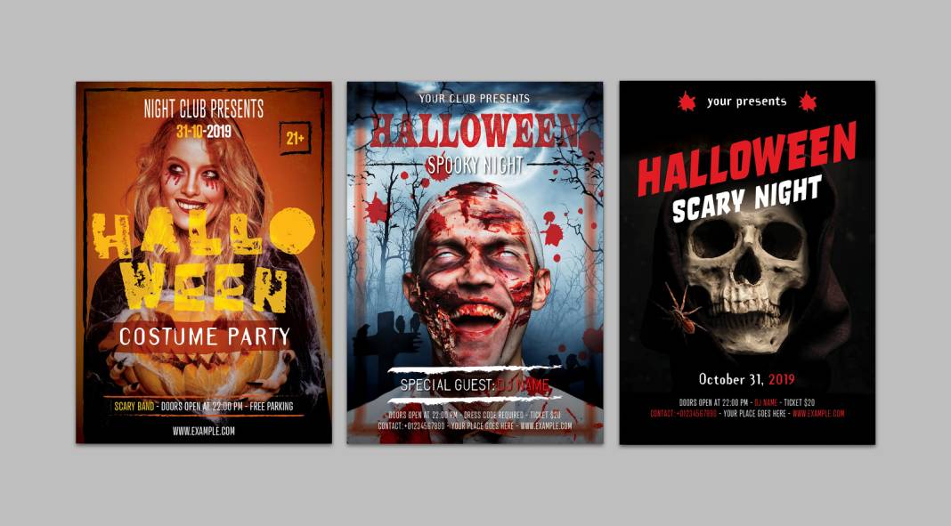
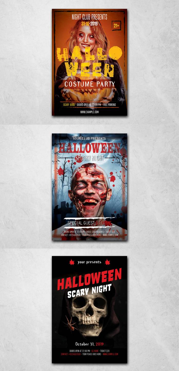
Graphic design brings horror into the public eye through media like posters, book covers, advertisements, and product packaging. Unlike fine art, graphic design typically has a communicative or marketing goal. But that doesn’t make it any less creative in its use of horror aesthetics – in fact, it often requires more cleverness to balance fright with clarity and brand messaging. One of the most iconic arenas for horror design is the horror movie poster. Generations of designers have distilled entire films into single chilling images that tantalize audiences. From bold typography clawed with scratches to minimalist, ominous silhouettes, horror film posters are a masterclass in visual storytelling. They use all the tricks: blood-red titles, faces frozen in screams, dark figures looming in negative space. A great horror poster both excites and scares the viewer, firing up trends in graphic design along the way. Collectors often treat these posters as art pieces in their own right, and many have influenced design beyond the movie realm (for example, the grungy, high-contrast style of The Exorcist poster or the clever simplicity of Jaws are repeatedly emulated in various designs).
Beyond cinema, graphic designers infuse horror into branding and advertising, especially around Halloween, as discussed. Seasonal brand campaigns allow designers to play with spooky imagery in logos, social media graphics, and ads. For instance, a coffee chain’s app icon might sport vampire fangs for the month, or a fashion brand might create lookbooks with a gothic vibe to coincide with Halloween. Designers working in packaging might adorn products with ghosts and cobwebs for limited editions. The challenge in graphic design is to maintain the brand’s identity while integrating horror elements. The best examples succeed by finding a thematic link – say, a candy brand using cute monsters in its Halloween ads, marrying the product’s playful tone with the holiday’s theme. Some brands go further, collaborating with artists to produce one-of-a-kind spooky designs for their products. For instance, a brewery might hire an illustrator known for macabre art to design limited beer labels for October, turning bottles into collectible art objects.
Graphic design also encompasses typography and layout, which play unsung roles in horror aesthetics. The choice of font can make a benign phrase look terrifying (imagine the word “welcome” written in dripping, ghoulish letters on a doormat). Designers often tweak typefaces or hand-letter titles to give a creepy personality – jagged edges, irregular strokes, or letters that subtly form a skull if you look closely. Layout composition can create tension too: heavy, oppressive spacing or frenetic collage can convey chaos and fear. Magazine spreads for a horror-themed feature might slant images at unsettling angles or slash text through imagery to create a sense of disarray. Even color theory in graphic design for horror is deliberate: designers might limit palettes to moody blues, blacks, and splashes of red, or use sickly yellow-green tints that evoke decay. All these choices work together to serve the message while ensuring the audience feels that delightful creep down their neck. In essence, graphic design takes horror out of the gallery and into everyday life – on covers, screens, and streets – translating the macabre into visually compelling messages that still hit that primal chord of fear.
Illustration and Digital Art: Drawing Nightmares to Life
Illustrators and digital artists perhaps have the most imaginative freedom in depicting horror. Illustration covers everything from book and game art to comics and concept art. Here, entire worlds of horror can be built from scratch. Illustrators often specialize in creating the creatures and characters that haunt our dreams – whether it’s for a graphic novel, a video game, or simply personal art shared online. One advantage illustrators have is the ability to render anything the mind conjures, no matter how fantastical. Want to depict a city of giant insectoid deities under a blood moon? An illustrator can do that in painstaking detail. In this field, horror frequently meets fantasy and science fiction, blending genres to create rich, otherworldly visuals. Take, for instance, the concept artists for video games or movies: they design zombies, aliens, ghosts, and ghouls, establishing the look and feel that will later be turned into on-screen magic. Their artwork must be both original and instantly terrifying. A lot of the iconic monsters in pop culture began as concept illustrations pinned on a studio wall. These artists draw from real-life anatomy, animal features, and pure abstract nightmares to come up with creatures that stick in our cultural memory.
Illustration also thrives in mediums like comics and graphic novels, where horror has a strong foothold. Through sequential art, illustrators not only design scary characters but also control pacing and suspense panel by panel. They might use close-ups of wide, staring eyes to build tension, or sudden, grotesque splash pages to deliver shocks. The illustrated page becomes a playground for visual storytelling in horror – much like storyboards, but as final art. Many indie comics and manga explore horror themes deeply, pushing the boundaries of what can be shown in print (twisted body horror, psychological surrealism, etc.). Because illustration doesn’t require the budget of a film or the permissions of a client, individual artists often create some of the most boundary-pushing horror art out there and share it directly with fans online. Platforms like DeviantArt or ArtStation host countless personal projects where artists visualize their darkest imaginings, often gaining cult followings. A quick search will reveal everything from terrifying re-imaginings of fairy tales to original creature designs that could populate entire nightmares.
Digital art tools have only amplified this, enabling hyper-detailed, atmospheric works. With digital painting software, artists layer glowing mist, flickering lights, and motion blur to make still images feel almost alive. Three-dimensional tools allow the creation of 3D horror illustrations, where lighting can be adjusted to cinematic effect. Some digital artists even produce short animated loops or AR filters with horror themes (for example, an Instagram filter that makes a demon appear over your face – popular around Halloween!). The rise of AI-generated art is also stepping into the horror arena, producing uncanny imagery that sometimes surprises even the creator with its weirdness. Of course, traditional illustration skills remain at the core: composition, line work, color usage – these fundamentals ensure that even the most digitally advanced horror art communicates viscerally.
In illustration, perhaps more than any other field, we see the full spectrum of horror’s tone. Some artists go for straight terror – images that could be covers of the scariest horror novel, designed purely to disturb. Others take a lighter touch, creating “creepy-cute” art (think adorable ghosts or cartoonish vampires suitable for children’s books or quirky merchandise). There is a thriving subculture of Halloween illustrators who produce vintage-inspired spooky art that is nostalgic rather than horrifying – for example, black cats and jack-o’-lantern scenes that feel like 1920s postcards. This shows how flexible horror themes can be in illustration: they can be adapted to different audiences and intents. Yet, even in the cutest iteration, there’s an acknowledgment of the macabre underpinning it. Illustrators often say they love horror because it allows them to visualize emotions and concepts that are otherwise hard to express. With a single drawing, they can make you confront what you fear, or conversely, help you laugh at it. In sum, illustrators and digital artists bring nightmares to life with remarkable creativity, ensuring that the visual narrative of horror continues to evolve and captivate new generations.
The Lasting Impact of the Macabre on Creativity
After exploring horror in various guises, one thing is clear: the macabre has a lasting impact on creative culture. Far from being a fringe fascination, horror in art and design is a wellspring of inspiration that recurs across eras and mediums. It endures because it speaks to something elemental in the human experience. Fear is universal – every culture has its ghosts, its legends of terror, its symbols of death. When artists tap into these, they tap into shared human emotions. A horror painting from 300 years ago can still send shivers down a viewer’s spine today. That staying power is notable. It suggests that horror art, at its best, isn’t just about momentary shock; it’s about grappling with timeless themes of mortality, morality, and the unknown.
There is also a paradoxical comfort in horror for audiences. As strange as that sounds, many people find relief and excitement in confronting fears through art. It’s a way to process anxiety and experience catharsis from a safe distance. As one article on Halloween art observed, these darker emotions can be experienced through a “safe and playful perspective,” allowing us to face what’s unsettling in a controlled way. We scream at a horror movie, then laugh because we know it’s not truly threatening. In a similar vein, standing before a macabre artwork can be profoundly thought-provoking and even liberating. It externalizes fears that might otherwise be buried inside us. This psychological dimension means horror-themed art often resonates more deeply than surface-level, pretty imagery. A spooky illustration might weirdly stay with you longer than a pleasant landscape, precisely because it stirred something primal. Over time, this drives a recognition that horror has value in art – it’s not just a gimmick, but a meaningful mode of expression.
From the creator’s perspective, engaging with horror can be transformative for one’s practice. Many artists report that creating scary or grotesque imagery helped them grow, technically and conceptually. It forces problem-solving (“How do I depict this monster realistically?”) and introspection (“Why does this image affect me, and how can I amplify that?”). The influence of horror tropes has even bled into mainstream design trends. For instance, the use of high-contrast palettes, dramatic shadows, and distressed textures – now common in various graphic styles – owes a debt to horror aesthetics that proved how attention-grabbing and emotive those elements can be. The popularity of things like gothic typography or skull motifs in fashion cycles also shows horror’s recurring cool factor. What was once subculture (like punk and metal album art with horror themes) becomes pop culture and then cycles back. In essence, horror keeps inspiring new creative directions.
Crucially, horror in art and design also reminds us of art’s role in reflecting society. In times of turmoil, dark art often flourishes as a commentary or coping mechanism. Artists hold up a mirror using monsters and nightmares to indirectly depict reality. For example, during periods of war or pandemic, one might notice more apocalyptic or zombie themes emerging in media – a way to deal with collective dread. Horror gives us a language to discuss the unspeakable. And by doing so, it often pushes conversations forward. A provocative horror-themed piece might spark debate on censorship, on the nature of violence, or on spiritual beliefs about evil. Thus, horror in creative fields isn’t just escapism; it can engage with big questions.
In concluding this exploration, we can appreciate that horror and Halloween have gifted art and design an enduring set of tools and metaphors. The haunting beauty of a well-crafted horror image can inspire awe alongside fear. We celebrate that on Halloween especially, but it lives year-round in the works of devoted artists and designers who find beauty in the macabre. As a reader and viewer, next time you encounter a creepy artwork or a chilling design, take a moment to really look. Beyond the initial fright, you might discover layers of meaning and craft. Horror art invites us to confront what we usually avoid, and in doing so, it enchants us with its originality and emotional power. It’s no surprise that such content often goes viral or becomes reference material – it speaks to us on a human level. In the end, horror in art and design endures because it reminds us that creativity isn’t all light; diving into the darkness can reveal new truths and spark inspiration like nothing else. And isn’t that thrillingly inspiring?
Happy Halloween, and may the creative spirits of horror continue to ignite your imagination!
Check out WE AND THE COLOR’s Art and Design section for more.
Subscribe to our newsletter!

