
Modern consumers are searching for more than just products; they seek brands that reflect their values and offer a genuine connection. This shift demands a new language of branding—one that speaks with authenticity and soul. The Amo’ya branding by Polish design agency motyw is a masterful example of this new language. It is a project that brilliantly navigates the intersection of technology and tenderness. For any creative professional questioning the role of artificial intelligence, Amo’ya provides a compelling case study. It shows how AI can serve, rather than supplant, human-centered design, creating something truly unique and emotionally resonant.
This exploration of the Amo’ya branding is not just about a finished product. It is about a process that challenges our assumptions about creativity. Motyw’s work prompts us to consider how designers can leverage powerful new tools. They can do this to tell more human stories. The project is a benchmark for the future, proving that innovation and heartfelt branding can, and should, coexist.
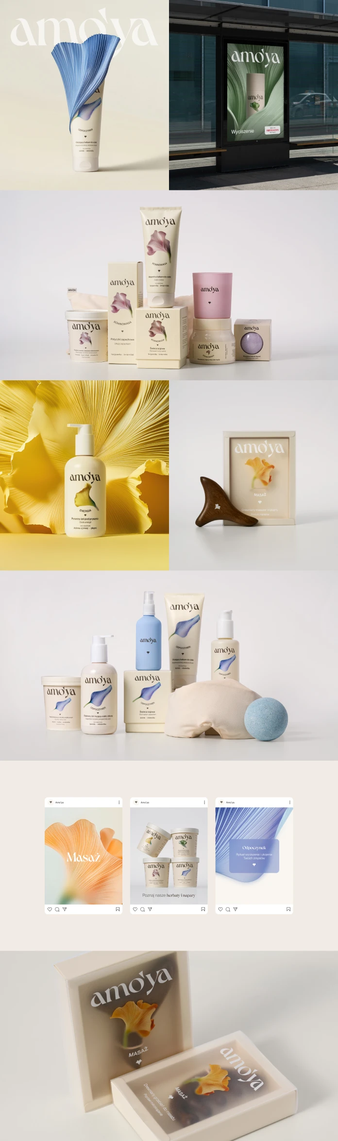
The Brand’s Core: A Philosophy of Intentional Self-Care
Before a single design element was created, Amo’ya was built on a powerful idea. The brand champions everyday gentleness and holistic care for the body and senses. This is not about quick fixes. Instead, Amo’ya is structured around “rituals.” These are curated product lines that encourage small, mindful steps toward well-being. This foundational philosophy informed every subsequent decision motyw made.
The challenge was translating this profound, yet quiet, concept into a visual identity. How do you design for a feeling? How do you package an experience of gentleness? Motyw’s solution was to build a comprehensive brand world. Every color, curve, and illustration works in concert to communicate Amo’ya’s core promise of mindful self-care. This strategic depth is what elevates the Amo’ya branding from merely beautiful to truly meaningful.
A Visual Language Crafted for Connection
The visual identity for Amo’ya is a delicate dance of carefully chosen elements. Each one reinforces the brand’s mission. Together, they create a cohesive experience that feels both luxurious and accessible. This system is a testament to the power of thoughtful, detail-oriented design.
The Voice of the Brand: The Dahlia Typeface
Typography gives a brand its voice, and motyw chose one that speaks with elegance and grace. The Dahlia typeface, with its Art Nouveau influences, provides a perfect blend of character and softness. Its letterforms are refined but not rigid. They subtly echo the natural, floral motifs central to the brand. This choice ensures the Amo’ya name itself conveys a sense of gentle sophistication. It sets the tone before the consumer even reads a word about the products.

A Symbol Rooted in Heart and Nature
The Amo’ya logotype is paired with a simple, elegant symbol. This mark cleverly merges the form of a heart with the shape of a flower. This duality is powerful. It visually represents the connection between self-love (the heart) and the natural ingredients and inspiration behind the products (the flower). Importantly, this symbol is strong enough to stand on its own. This gives the brand a versatile tool for patterns, social media icons, and other applications, ensuring consistent brand recognition.
A Cohesive System of Rituals
To differentiate its product lines, Amo’ya uses a smart system of unique colors and abstract floral illustrations. Each ritual has its own distinct visual signature. This makes the products easy to identify on a shelf or a website. This system does more than just organize the product portfolio. It transforms the packaging into a collection of beautiful, related objects. It encourages customers to explore the different rituals and build their own holistic self-care routines.
A New Creative Partnership: The Role of AI in the Amo’ya Branding
The most revolutionary aspect of the Amo’ya branding project is undoubtedly its use of artificial intelligence. Motyw employed AI tools to generate the stunning floral illustrations that define each ritual. This decision significantly accelerated the creative process. It allowed the team to explore a vast number of visual directions efficiently. However, this was not a case of a machine replacing a human artist.
Instead, it was a collaboration. The motyw design team acted as creative directors and curators. They guided the AI, providing prompts and parameters to align the output with the brand’s gentle ethos. They then carefully selected the most compelling illustrations from countless options. Finally, they integrated these AI-generated elements into the larger design system. This human touch was critical. It ensured the final visuals possessed the necessary warmth and artistic nuance. This process demonstrates a new, powerful workflow for designers. It positions AI as an extension of the creative mind, a tool for exploration and efficiency.
Personal Thoughts: Redefining Authenticity in Design
The Amo’ya branding resonates so deeply because it feels authentic, despite its technological origins. It challenges the notion that “authentic” must mean “handmade” or “human-only.” Motyw has shown that authenticity is about the clarity of the vision and the integrity of the execution. The use of AI did not dilute the brand’s message; it amplified it. It allowed for the creation of a rich, complex visual world that might have been prohibitively time-consuming otherwise.
This project suggests that the future of design is not about fearing technology. It is about mastering it. It is about learning to collaborate with these new tools to achieve creative goals that were once out of reach. Amo’ya is proof that a brand can be both innovative in its process and timeless in its emotional appeal.
Key Insights for Creative Professionals
The Amo’ya project by motyw offers clear, actionable lessons for the industry:
- Vision First, Tools Second: A powerful brand strategy must always be the starting point. Technology should be chosen to serve that vision.
- Curation is a Critical Skill: As generative tools become more common, the designer’s ability to select, refine, and contextualize becomes more valuable than ever.
- Build Flexible Systems: Create design systems with versatile assets, like the Amo’ya symbol, that can be adapted across all brand touchpoints.
- Embrace Intelligent Collaboration: View AI not as a competitor, but as a creative partner that can enhance your workflow and expand your capabilities.
In the end, the Amo’ya branding is a beautifully executed project that offers a hopeful glimpse into the future of design. It is a story of how a clear human vision, coupled with intelligent technology, can create a brand that is not only visually stunning but also deeply and authentically human.
All images © motyw. Feel free to find other inspiring graphic design and branding projects here at WE AND THE COLOR.
Subscribe to our newsletter!


