
Brand development by creative studio Foreign Policy Design for Roger&Sons.
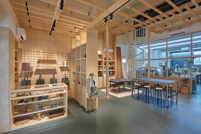
Roger&Sons is a family-run business with a blend of old and new where established carpenters work alongside younger woodworkers. They are experimenting with modern techniques and pushing the boundaries of woodworking craft.
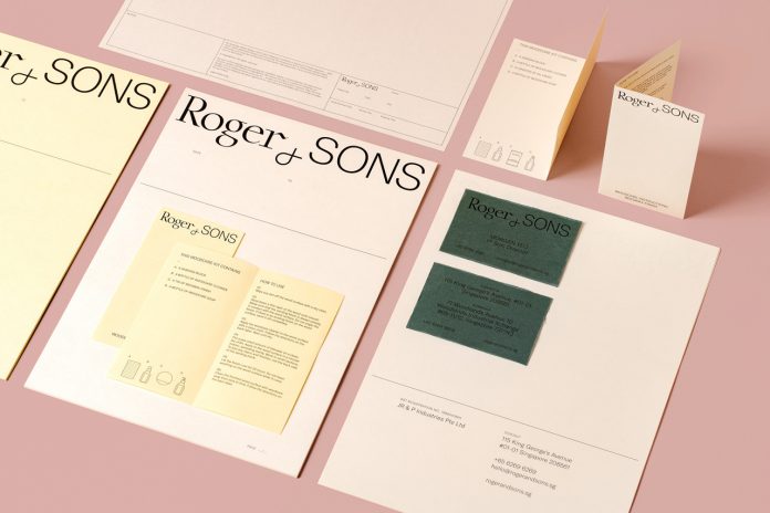
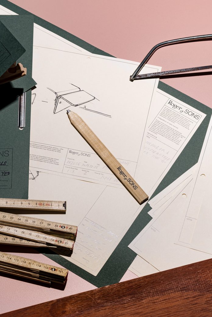
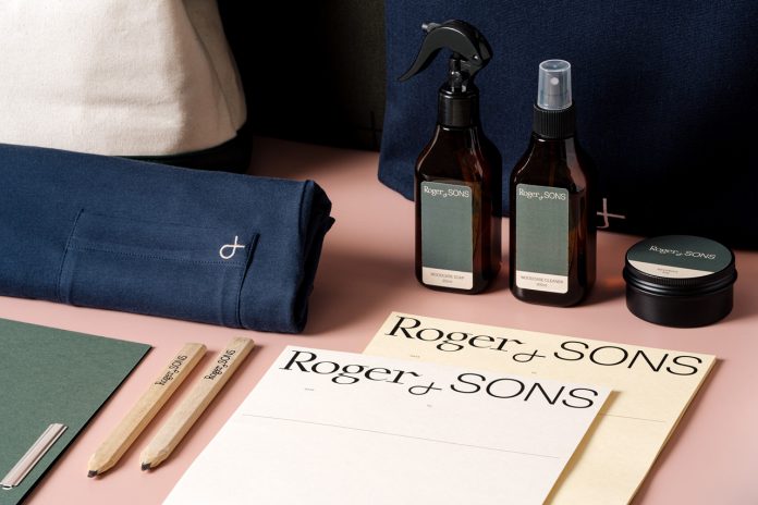
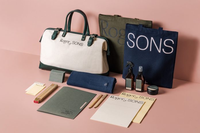
The team of Foreign Policy Design was asked to help with a new brand identity. The updated logo consists of a more simplified version of the ampersand, which is an important symbol of the family business. The combination of a serif and a sans serif font in the logo underscores the traditional craft of woodworking along with new techniques.
Below you can find a few images of the brand identity. For those who want to see more of Foreign Policy Design’s creative projects, please visit their website or follow them on Behance.
All images © Foreign Policy Design. Do not hesitate to check out other inspiring work in our Graphic Design and Branding categories.
Subscribe to our newsletter!


