
This post contains affiliate links. We may earn a commission if you click on them and make a purchase. It’s at no extra cost to you and helps us run this site. Thanks for your support!
Standard applications often fail because they lack visual hierarchy and character. This specific resume layout defies conventional expectations by adopting a distinct editorial aesthetic. RedGiant, the Adobe Stock contributor, crafted this design to treat a career history like a feature story rather than a data sheet. It immediately signals that the candidate understands branding, spacing, and modern typography. A hiring manager sees hundreds of documents daily. Therefore, a document that utilizes high-end design principles stops the scroll and demands attention. This article analyzes why this template works and how it elevates personal branding.
Please note that this professional graphic design template requires Adobe InDesign installed on your computer. Whether you use Mac or PC, the latest version is available on the Adobe Creative Cloud website—take a look here.
How Does a Grid-Based Design Alter the Effectiveness of a Resume Layout?
Most applicants clutter their pages with excessive text. This template breathes. It uses a strong, invisible grid system to organize information. The eye travels easily from the skills section to the experience timeline. Designers call this “white space.” It is not empty space. It is an active design element. Consequently, the reader feels relaxed rather than overwhelmed. A strong resume layout relies on this balance to guide the viewer.
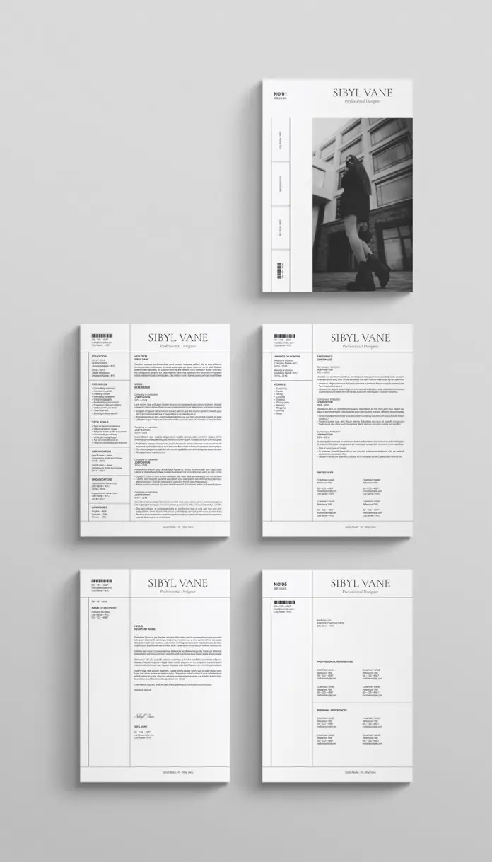
The template features a bold, sans-serif header. This establishes authority immediately. Furthermore, the alignment creates a sense of order. The design splits content into digestible columns. One column handles contact info and skills. The wider column manages the narrative of work experience. This structure mimics high-quality magazine layouts. Thus, the candidate appears sophisticated and organized before the recruiter reads a single word.
The Power of Visual Storytelling in Recruitment
Visuals process faster than text in the human brain. This resume layout includes a prominent placeholder for photography. A professional portrait humanizes the application. It creates a connection. However, this design choice requires high-quality imagery. A blurry selfie would ruin the aesthetic. The image placement on the cover page sets a tone of confidence.

RedGiant designed this template in two standard sizes, US Letter and A4. This ensures compatibility across different regions. It includes 5 fully customizable pages. Users can duplicate pages for longer work histories. The layout supports a portfolio approach. One page allows for a cover letter that matches the resume perfectly. Consistency builds trust. A cohesive visual identity across all five pages suggests attention to detail.
Why Adobe InDesign Outperforms Word Processors
Word processors struggle with complex design elements. In contrast, Adobe InDesign handles typography with precision. This template utilizes that power. Users can adjust kerning and leading easily. These subtle adjustments make the text look professional. A crisp resume layout depends on these typographic details.
The file comes ready for print. It uses CMYK color mode. However, it also looks stunning as a digital PDF. The placeholder text is merely a guide. People can add their own information easily in Adobe InDesign. The layers are organized. Consequently, customization becomes a straightforward process. Even those with basic software skills can manipulate the elements.
Strategic Use of Typography and Hierarchy
The choice of font plays a crucial role here. The template uses a classic serif font for headings. This evokes tradition and elegance. Simultaneously, it uses a clean sans-serif for body text. This ensures readability. The contrast between the two fonts adds visual interest. A monotonous resume layout bores the reader. This combination keeps them engaged.
Bullet points are kept to a minimum. The design encourages concise writing. Long paragraphs break the visual flow. Therefore, the user must curate their content carefully. This restriction actually improves the quality of the resume. It forces the writer to focus on achievements rather than duties.
Who Should Use This Editorial Style?
This layout is not for everyone. It suits creative professionals best. Graphic designers, fashion stylists, and architects will find it appropriate. Marketers and brand managers can also leverage this style. It demonstrates an eye for aesthetics. However, corporate finance roles might require something more conservative.
Choosing this resume layout is a strategic move. It says the candidate values presentation. It implies they deliver high-quality work. In a competitive market, design is a differentiator. The “Sibyl Vane” header in the example acts as a personal logo. It creates brand recognition.
Practical Customization Tips
Download the file and install the necessary fonts first. Open the file in Adobe InDesign. The structure is locked in layers for safety. Unlock the text layer to begin editing. Replace the placeholder image with a black and white portrait. This maintains the monochromatic scheme. Color can be added, but it might disrupt the minimalist vibe.
Keep the text alignment consistent. Do not overfill the text boxes. If the content is too long, edit the text. Do not shrink the font size below 9 points. Readability is paramount in any resume layout. Finally, export the file as an interactive PDF for email applications.
FAQ: Understanding the Template Specs
What software do I need to edit this template?
You need Adobe InDesign. It is not compatible with Microsoft Word or Google Docs.
Does the template include the photos shown in the preview?
No. The images are placeholders. You must supply your own professional photography.
Can I change the number of pages?
Yes. The template includes 5 layouts, but you can duplicate or delete pages within InDesign.
Is this resume layout suitable for Applicant Tracking Systems (ATS)?
PDFs from InDesign can be read by modern ATS. However, standard text-based Word documents are sometimes safer for very old systems.
Can I change the fonts?
Yes. You can swap the fonts for your own brand typefaces using the paragraph styles panel.
Does it come in different sizes?
Yes. The download includes both US Letter and A4 sizes.
Feel free to find other recommended design templates here at WE AND THE COLOR.
Subscribe to our newsletter!


