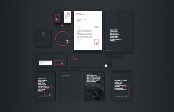
Branding, concept and design by Philipp Doms for research group Ponsai.
This branding project started as part of Philipp Doms‘ Bachelor thesis, which was based on the visual presentation of different concepts of flexible design. The young designer was asked to develop a flexible branding concept for research group Ponsai (Polarized Neutron Spin and Interferometry).
An extensive briefing was followed by some studies on the theme of quantum mechanics to get a glimpse into this topic. On closer inspection, it turned out that this is a topic that works very well for a flexible design. Employees of the research group change frequently and working with neutrons can be full of surprises.
In consultation with the client, Philipp Doms decided to use a bonsai as distinctive icon. These little trees can occur in many different forms and the name “Bonsai” is quite similar to the abbreviation “Ponsai”. The logo was developed with different possible variations and great recognition at the same time. In this way, we have a flexible appearance, which nevertheless provides a unique constant footing. The bonsai is surrounded by a red frame, which can be both flexible and solid.


