
Unrealized projects often carry a bittersweet charm. They reflect effort, creativity, and vision that don’t make it to the public eye but deserve appreciation nonetheless. Studio Sarna’s branding concept for Piąty Dom (The Fifth House) is one such gem—a thoughtful blend of astrology, mysticism, and cultural flair that captivates even as it stays tucked away as an “unrealized concept.”
This article takes a closer look at the branding journey and creative ingenuity behind Studio Sarna’s visual identity for Piąty Dom, exploring the elements that make it a remarkable work of art.
A Vision Rooted in Astrology
Piąty Dom, conceptualized by Michał, is a space inspired by astrology. In astrological terms, the Fifth House represents joy, pleasure, and a haven for our inner child. Michał’s vision for the brand was deeply personal and unique—he wanted the visual identity to channel this mystical yet playful energy, rooted in the symbolism of the stars.
Studio Sarna embraced this challenge with enthusiasm. The idea of combining astrological motifs with a fresh, independent cultural vibe felt like the perfect playground for creativity.
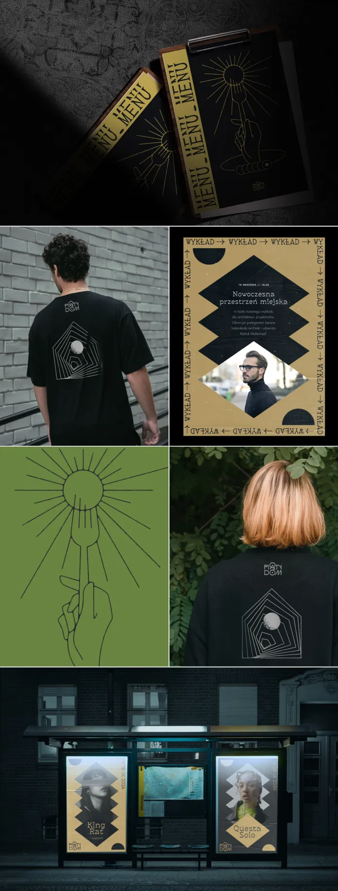
The Branding Concept: Mystical Minimalism
Studio Sarna’s approach to branding was an elegant balance between mysticism and minimalism. The logotype is clean and modern, yet it carries a slightly mysterious aura, hinting at the themes of astrology and tarot. The choice of typography, shapes, and colors reflects a delicate interplay between the cosmic and the grounded, the mystical and the familiar.
The designer’s intention was to make astrology feel accessible, yet keep a certain enigmatic charm intact. This wasn’t about creating something overtly commercial—it was about telling a story that resonated with the audience on a deeper level.

Visual Elements: A Blend of Symbolism and Subtlety
- Logotype:
The logotype carries a timeless quality. It’s understated but memorable, with subtle curves and details that evoke a celestial aesthetic without being overly literal. - Color Palette:
The colors are muted, leaning towards earthy tones with occasional celestial blues and deep purples. This palette evokes a sense of calm, introspection, and wonder—exactly the emotions tied to astrology and self-exploration. - Graphic Motifs:
Studio Sarna incorporated delicate graphic symbols inspired by horoscopes, star charts, and tarot cards. These are not overwhelming but act as gentle nods to the astrological theme, enhancing the brand’s narrative. - Mockups:
To bring the concept to life, Studio Sarna created mockups showing the branding applied to various touchpoints. From signage and menus to stationery and packaging, the identity feels cohesive and versatile.
The Unfortunate Twist
Despite the thoughtful design, Piąty Dom’s journey took an unexpected turn. After months of delays, the project returned with a new direction for its visual identity. This meant that Studio Sarna’s work never got the chance to shine in the real world.
However, rather than letting this concept fade away, the designer decided to share it as an “unrealized concept.” This decision not only celebrates the work but also demonstrates the designer’s pride in their creative process.
Why This Concept Deserves Recognition
Even as an unrealized project, the branding for Piąty Dom showcases the power of storytelling through design. Studio Sarna captured the essence of Michał’s vision and translated it into visuals that feel both personal and universal.
The project also serves as a reminder that creative work isn’t just about the final outcome—it’s about the ideas, effort, and passion poured into the process. Sharing these unrealized projects opens doors for inspiration and dialogue within the design community.
Studio Sarna’s branding concept for Piąty Dom may never see the light of day in its intended form, but it leaves an indelible mark as a testament to creativity and imagination. It’s a project that deserves to be celebrated, not just for what it could have been, but for what it is—a beautiful piece of design that tells a story and sparks joy.
For those who appreciate design that intertwines mysticism with minimalism, this concept is a reminder of the magic that happens when creativity meets meaning. Studio Sarna’s work continues to inspire, even from the drawer.
All images © by Studio Sarna. You can see more of Studio Sarna’s creative work on Behance. Feel free to find other stylish graphic design and branding projects on WE AND THE COLOR.
Subscribe to our newsletter!


