
Italian graphic designer Irene Salvadeo created a simple but unique visual identity for her own creative profession.
In the unprecedented year of 2020, Irene Salvadeo seized the opportunity to refine her curriculum and portfolio by designing a website that encapsulated her very essence. With elegant black-and-white designs emphasizing her dual Italian/English background, she created a simple yet captivating page that truly reflected herself.
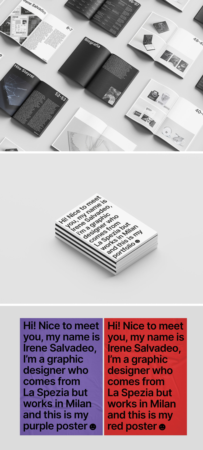
To further express her artistic vision, Irene used two non-colors solely for official works. Additionally, to communicate directly with the viewer and convey a lighter side of herself, she created everyday objects. Undoubtedly, this was an effective choice that resonated with people. Crafting her portfolio and curriculum with clean, sans serif fonts, non-color colors, simple sentences, and explanatory didactic tables to showcase the order she applies to all of her work; the repeated sentence on each page allows readers an interactive first-person experience. This order is deeply rooted in Irene’s creative, colorful, and vibrant spirit. Her enthusiasm for what she does has been with her throughout the years; creativity being her strongest asset that allows her to tackle every project with joy – as they say: “do what you love and you’ll never have to work a day in your life”. To make this website embody who she truly is, Irene opted for an interactive yet clean experience—playful but intuitive at the same time.
Below you can see a few images of Irene Salvadeo’s new personal identity. Please visit her website or check out Irene’s portfolio on Behance for more.
All images © by Irene Salvadeo. Do not hesitate to take a look at the Graphic Design and Branding sections on WE AND THE COLOR.
Subscribe to our newsletter!


