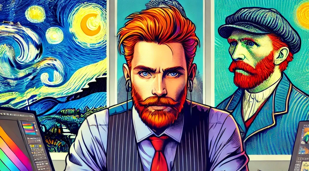
In graphic design, we’re always looking for fresh inspiration. But what if the biggest names in art history took a crack at modern design challenges like logos, UX/UI design, or social media branding? In this tongue-in-cheek exploration, we’ll imagine how iconic artists—from Van Gogh to Picasso—might approach branding in today’s digital age.
Let’s take a lighthearted journey into what graphic design might look like through the eyes of famous artists!
1. Vincent van Gogh’s Logos: A Swirl of Emotion and Brushstrokes
Imagine walking into a client meeting with Van Gogh as your logo designer. Instead of clean lines and vectors, you’d get a logo that’s an emotional whirlwind of thick brushstrokes, saturated yellows, and blues. Forget about crisp scalability; Van Gogh’s logos are more like paintings—each one more expressive than the last.
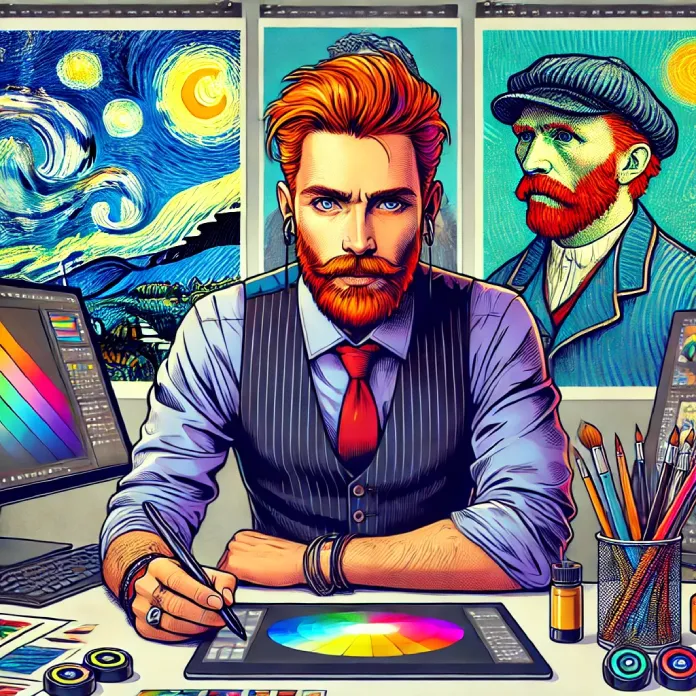
His logo for a coffee shop might feature an abstract cup with starry skies swirling around it. His tagline? “Drink with passion, feel with your soul.” Would the client be thrilled or confused? That’s up for debate.
But hey, Van Gogh never cared about conforming. His designs would speak to the feeling of a brand rather than the function.
2. Pablo Picasso’s Business Cards: A Cubist Chaos
If you thought modern business cards were minimalist and structured, wait until Picasso gets his hands on them. Instead of neat, centered text and symmetrical layouts, you’d have a fragmented collage of geometric shapes and disconnected elements.
Imagine your name scattered across various angles, your phone number tucked into the corner of a rhombus, and your website hidden in an abstract swirl. Picasso’s business cards might require a degree in art history to decipher, but they would certainly stand out at a networking event!
Clients might initially struggle to read the details, but Picasso would argue that his business card isn’t just about information—it’s about the experience.
3. Salvador Dalí’s UX/UI Design: Surreal and Slightly Confusing
If Salvador Dalí were a UX/UI designer today, you might be faced with a surrealist nightmare. Buttons that melt, clocks for loading icons, navigation that loops back on itself—Dalí’s design might have a dreamlike beauty, but it would be a usability disaster.
Imagine an e-commerce website where the shopping cart icon floats in mid-air, slowly warping as you scroll. A purchase confirmation screen could include a dripping clock, symbolizing how time is an illusion when you shop in his world.
Would users ever find the “Buy Now” button? Maybe not. But Dalí would certainly win some design awards for artistic creativity.
4. Claude Monet’s Web Design: Blurred and Beautiful
Imagine a website designed by Claude Monet. Soft, pastel hues would dominate, and the entire layout would feel like you’re peeking through a hazy window on a foggy day. Background images would blend into the foreground, with no sharp lines in sight.
Monet’s websites would be beautiful but impractical. Users might find themselves squinting at blurred images of nature, trying to figure out where to click. The text would blend so seamlessly into the background that reading product descriptions might become a game of hide-and-seek.
However, Monet’s designs would be perfect for those seeking a calming, meditative web browsing experience. If you’re selling tea, yoga classes, or anything relaxing, Monet might just be your man.
5. Banksy’s Social Media Campaigns: Guerilla Marketing for the Digital Age
Banksy, the elusive street artist, would take a very different approach to social media branding. Instead of flashy ads and product shots, he’d likely go for cryptic, viral campaigns that leave people guessing. Imagine a series of mysterious posts with subtle political commentary hidden in plain sight.
For a fashion brand, he might post a simple image of a hoodie hanging on a street corner, spray-painted with a provocative message. The caption? “Is this just fabric, or is it rebellion?” Within hours, the image goes viral, and everyone’s talking about your brand.
Banksy’s strategy would turn traditional social media marketing on its head, using ambiguity and intrigue to build a cult following.
6. Andy Warhol’s Product Packaging: Pop Art Meets Consumerism
Who could do product packaging better than Andy Warhol? If you think modern-day packaging is colorful, wait until you see Warhol’s take. He’d transform mundane objects into bold, pop-art icons. Imagine a soup can turned into a luxury perfume bottle—complete with neon colors and repetitive prints.
Warhol’s packaging would blur the lines between art and consumer goods. Customers wouldn’t just be buying a product—they’d be purchasing a statement piece. His designs would make even the most ordinary items feel like they belong in a gallery.
For Warhol, every product is a canvas, and his packaging would make sure your brand is as iconic as a Campbell’s soup can.
When Art Meets Modern Design
While this article is a fun and fictional take on how famous artists would approach modern graphic design, there’s a valuable takeaway here: Art history is a rich source of inspiration. Whether you’re creating logos, packaging, or websites, thinking outside the box—like Van Gogh, Picasso, or Dalí—can lead to designs that break boundaries and resonate emotionally with audiences.
So, the next time you hit a creative block, ask yourself: What would Van Gogh do? The answer might just spark your next design breakthrough.
Feel free to browse through WE AND THE COLOR’s Art and Graphic Design sections for more inspiring content.

