Logo Redesign.
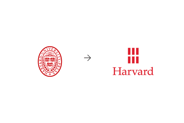
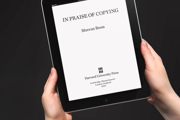
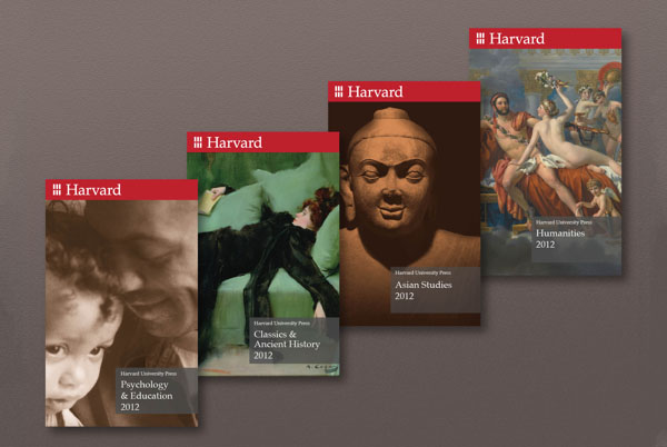
The renowned brand design firm Chermayeff & Geismar & Haviv created the logo redesign for the Harvard University Press identity. The re-imagined ‘H’ is formed by six rectangles, which represents the variety of books. The logo is reminiscent of a window too. Chermayeff & Geismar & Haviv combined this clear and straight geometric shape with a classic serif typeface. The result is a balanced mix of traditional and modern design. The new visual identity works great for both traditional print media and non-print media such as eBooks.





This is a great example of a simple logo redesign that works well across both digital and print mediums. Thanks for sharing!
I like the simplicity and applications but I think the mark/symbol is a bit too simple. Its so simple that it cant really be used on its own and still be recognisable. Need something else.. Nice to see someone simplifying instead of adding complexity though. So many companied are turning their logos into ridiculous 3D-gradient explosions… Heres a few examples: http://print24.com/blog/2013/07/30-examples-of-logo-re-designs/