
The sauce aisle in your local supermarket presents a familiar scene. It’s a wall of uniform bottles and jars. Most product packaging uses standard shapes, with labels that often blur together. This makes choosing a sauce less of an exciting discovery and more of a routine task. You scan the shelves, looking for a name or a color you recognize. But what if the package itself could tell you everything you need to know about the flavor inside? What if its very shape could communicate spice, sweetness, or tang? This is the very challenge that the Guay packaging design project, masterfully conceived by Inna Efimova, set out to solve.
Inna Efimova, a freelance brand identity and packaging designer based in Barcelona, saw an opportunity to disrupt this monotony. She didn’t just design a label; she imagined a complete sensory experience. Her work on Guay, from the brand name to the final physical form, is a remarkable case study in how creative packaging ideas can transform a product from a simple commodity into an object of desire. This is a story about how to make flavor visible.
What’s in a Name? The Essence of Guay
Before a single drop of sauce was conceptualized, the brand needed a soul. Efimova chose the name “Guay,” a popular Spanish word that translates to “cool,” “great,” or “awesome.” The name itself is a promise. It suggests something fresh, vibrant, and effortlessly enjoyable. It perfectly captures the spirit of a brand that wants to bring a little bit of joy and personality to your meals. It’s a simple, memorable name that resonates with a lively and balanced character, setting the stage for the innovative design to follow.
The Core Question: Can Packaging Embody Flavor?
Think about how you experience different tastes. What does “spicy” feel like? It might feel sharp, energetic, almost prickly. How about “sweet”? It’s often smooth, soft, and flowing. This translation of sensation into form is the genius behind the Guay packaging design.
The central idea was to move beyond simply printing a picture of a chili or a lemon on a label. Instead, the project aimed to create unique product shapes that are a direct physical representation of the taste profile. The result is a lineup of sauces where the packaging is the description. You don’t just read about the flavor; you see it and feel it in your hands before you even open the container.
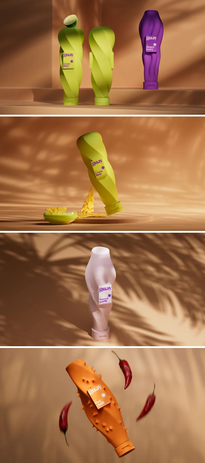
A Symphony of Senses: The Four Flavors and Their Expressive Forms
Guay’s initial launch features four distinct flavors, and each one is a masterclass in how packaging design that tells a story can create an immediate connection with a consumer. The Guay packaging design for each flavor is unique.

- Crazy Lemon: Imagine the zesty, electric tang of fresh lemon. The packaging for this flavor captures that energy perfectly. Its form is twisted and dynamic, with lively curls and bends that visually scream “citrus!” It feels unpredictable and exciting, just like the taste.
- Sweet Garlic: This flavor is all about smooth, creamy comfort. Consequently, its packaging reflects this with gentle, flowing lines and soft curves. The shape is calm and pleasing, suggesting a mild and comforting flavor experience without any harshness.
- Honey Berry: How do you visualize the rich, slow drip of honey or the lusciousness of berries? The Honey Berry package does it with forms that look like sweet, thick liquid in motion. The gentle swirls and streams on the container evoke a natural, flowing sweetness that is immediately understood.
- Hot Chili: There’s no mistaking this one. The packaging for Hot Chilli is defined by sharp, pointed, and aggressive forms. It looks fiery and bold, instantly preparing your senses for a powerful kick of spice. The design is an honest and direct warning of the heat contained within.
This thoughtful approach ensures that the brand communicates on a deeper, more intuitive level. It’s a complete sensory experience, bridging the gap between sight and taste.
The Art of Imperfection: Naturally Unique Shapes
A key principle of the Guay packaging design is the deliberate avoidance of perfect symmetry. Nature isn’t perfect, and authentic flavors have character. Each package’s shape is organically sculpted to feel alive and natural, subtly hinting at the personality of the sauce it holds. This makes the product feel less manufactured and more artisanal.
However, to maintain brand cohesion, one element remains consistent across the range. A clean, rectangular panel is integrated into the center of each unique shape. This panel serves two critical functions. First, it provides a clear, dedicated space for the Guay logo and essential product information, ensuring legibility and brand recognition. Second, its sharp, geometric form creates a dynamic contrast with the organic shapes, symbolizing the fresh, captured moment of flavor.
Breaking Through the Noise on the Shelf
Now, let’s go back to that crowded sauce aisle. While other brands rely on loud colors or busy graphics on a standard bottle, Guay stands apart effortlessly. Its bold, monochrome colors combined with its distinctive forms make it instantly recognizable. This is a powerful example of how packaging influences consumer choice. You no longer have to squint at labels; you can spot your favorite flavor from across the aisle just by its silhouette. This not only builds brand loyalty but also simplifies the shopping experience, making it more intuitive and enjoyable. The unique sauce packaging becomes a beacon of creativity in a sea of sameness.
Simplicity in Practice: The User Experience
Beyond its stunning looks, Guay is designed for convenience. The sauces are offered in a single, well-proportioned package, ideal for one or two uses. This thoughtful portioning minimizes waste and ensures freshness. The design is simple: just open, pour, and elevate your meal with a burst of flavor. There are no complicated caps or messy jars. It’s a direct and satisfying experience from shelf to plate.
Ultimately, the Guay packaging design by Inna Efimova, brought to life with 3D art by Vladimir Kuznetsov, is more than just a pretty container. It’s a new perspective on what product packaging can achieve. It proves that with enough creativity, a package can do more than just hold a product—it can express its very essence.
Credits:
Designer, Art Director – Inna Efimova
3D Artist – Vladimir Kuznetsov
Contact Information:
Inna Efimova Website: https://efimovai.com
Instagram: @innagalactica
Vladimir Kuznetsov Instagram: @vladimir_kuznetsov_cg
All images © Inna Efimova and Vladimir Kuznetsov. Feel free to browse WE AND THE COLOR’s Packaging Design, Branding, and Graphic Design categories for more.


