
This post contains affiliate links. We may earn a commission if you click on them and make a purchase. It’s at no extra cost to you and helps us run this site. Thanks for your support!
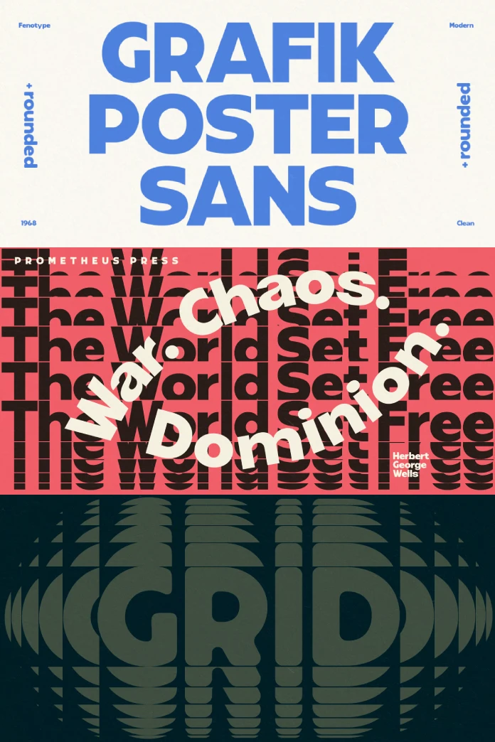
Have you ever felt that pull towards designs from the past? There’s a certain undeniable charm, a visual energy in graphics from decades like the 1960s and 70s. It was an era of experimentation, of breaking rules, and of truly eye-catching visual communication. Think about album covers, movie posters, and bold advertisements from that time. They had an impact. They weren’t afraid to be loud and proud. What if you could capture some of that retro energy, that confident swagger, but make it feel completely fresh and relevant for today’s designs? What if there was a font that bottled that specific kind of magic? Well, you might just be in luck. Prepare to meet a typeface that does exactly that. It’s a font that feels both familiar and excitingly new. It’s called Grafik Poster, and it’s ready to make a statement.
You can download the typeface from these platforms:
The Grafik Poster Font Offers Bold Retro Vibes for Your Modern Designs
Let’s get acquainted with the Grafik Poster font. This isn’t just another sans serif font filling up your design software. No, Grafik Poster is something special. Crafted by the talented folks at Fenotype, a type foundry known for its quality and creative flair, this font brings a distinct flavour. Imagine stepping back into the vibrant, visually dynamic world of graphic design from the 1960s and 70s. That’s the soul of this retro display typeface. It channels that era’s boldness, confidence, and unapologetic style. But here’s the clever part: it doesn’t feel dated. Instead, it feels like a modern interpretation, a respectful nod to the past while standing firmly in the present. It’s a bridge between then and now.
You can download the typeface from these platforms:
Inspired by an Era, Built for Today
So, what exactly does it mean to be inspired by 60s and 70s graphic design? Think bold shapes and clean lines but with personality. Think visual weight and undeniable presence. Grafik Poster takes cues from various typographic styles popular during those decades. You might see hints of geometric sans serifs, maybe a touch of groovy curves, perhaps the solidity of lettering used on impactful posters. Fenotype cleverly combined these elements. They didn’t just copy one style; they synthesized features, creating something unique yet evocative. The result? A bold display sans serif that commands attention. It’s designed specifically for situations where you need your words to be seen and felt. Think headlines that pop and posters that stop people in their tracks. Think anywhere you need maximum visual impact. That’s the sweet spot for Grafik Poster.

The Power of Grafik Poster in Display Use
Why is Grafik Poster so effective for display purposes? Its inherent boldness is key. The thick strokes give it significant visual weight, ensuring it stands out against backgrounds and other design elements. Furthermore, its clean sans serif structure maintains readability even at large sizes. It avoids fussiness, focusing instead on clarity and impact. This makes the typeface incredibly versatile for:
- Posters: As the name suggests, this is prime territory. Whether for events, products, or announcements, Grafik Poster delivers headlines that grab attention from afar.
- Headlines: Website headers, magazine titles, section breaks in reports – anywhere you need a strong title, this font works beautifully.
- Branding: Need a logotype or wordmark with vintage flair but modern sensibilities? Grafik Poster could be a fantastic starting point.
- Social Media Graphics: Create eye-catching quotes, announcements, or promotional images that stand out in a crowded feed.
- Packaging: Give products a retro-cool vibe that feels authentic and appealing.
Essentially, anywhere you need type to be a primary visual element, Grafik Poster steps up. Its strong character ensures it doesn’t just convey information; it adds personality and style.
Smart Features: More Than Meets the Eye with Grafik Poster
Fenotype didn’t just create a visually appealing font; they packed Grafik Poster with thoughtful features that enhance its usability, especially for demanding graphic design tasks. These aren’t just bells and whistles; they solve real-world design challenges.
One standout feature involves diacritics – those little marks above or below letters (like accents, umlauts, etc.). In many bold fonts, uppercase letters with diacritics can become excessively tall. This often forces designers to increase the space between lines (leading), potentially disrupting the desired visual density. Grafik Poster offers a clever solution. Tucked away in the Stylistic Alternates is a set of lowered uppercase diacritics. What does this mean for you? It means you can set text lines much closer together, creating tight, impactful text boxes without awkward collisions or excessive spacing. Imagine crafting a powerful headline where the lines sit snugly together – Grafik Poster makes that easier to achieve cleanly.
But the Stylistic Alternates offer more. Fenotype included triangular quotation marks. Switching to these alternates gives your text an even more geometric, stylized feel. It’s a subtle touch, perhaps, but it reinforces that mid-century modern aesthetic. It shows an attention to detail that can elevate a design from good to great. Have you ever struggled with getting text blocks to look just right, especially with uppercase letters and accents? Grafik Poster anticipates that challenge.
Why Choose Grafik Poster Now?
Design trends ebb and flow, but the appeal of retro aesthetics seems enduring. There’s a warmth, an authenticity, and a visual richness in designs inspired by the past. Grafik Poster taps directly into this. It offers a way to infuse projects with that desirable retro charm without looking like a cheap imitation. Its boldness resonates with the current need for clear, impactful communication in a visually saturated world.
Moreover, its blend of styles gives it a unique personality that helps designs stand out. It’s not generic. It has character. Using Grafik Poster is a conscious choice to embrace a specific aesthetic – one that is confident, stylish, and visually engaging. Are you looking for a font that feels both nostalgic and forward-looking? Grafik Poster strikes that balance perfectly. It allows you to leverage the power of retro design while ensuring your work feels current and professional.
Finding Your Voice with Grafik Poster
Ultimately, choosing a font is about finding the right voice for your message. Grafik Poster speaks with confidence. It’s friendly but bold. It’s stylish but readable. It evokes a sense of cool nostalgia while being perfectly equipped for modern digital and print design.
Think about your next project. Do you need a headline that truly sings? Are you designing a poster that needs to stop traffic? Are you building a brand identity that blends retro cool with modern polish? Consider Grafik Poster. Explore its bold forms. Play with its Stylistic Alternates. See how those lowered diacritics allow you to craft tighter, more powerful text compositions. See how the triangular quotes add that extra geometric flair.
Grafik Poster by Fenotype is a typeface for creating visually arresting designs. It’s an homage to a golden era of graphic design. And it might just be the perfect voice you’ve been searching for. Ready to give your designs a dose of bold, retro energy? Grafik Poster is waiting.
You can download the typeface from these platforms:
Feel free to find other trending typefaces in the Fonts section on WE AND THE COLOR.
Subscribe to our newsletter!


