Dishoom KX Godown – restaurant brand identity design by studio & SMITH
The creative guys of & SMITH have been working with Dishoom over the last two years to evolve their visual identity and help with anything print based. Dishoom’s concept takes inspiration from Bombay’s beautiful old Irani cafés.
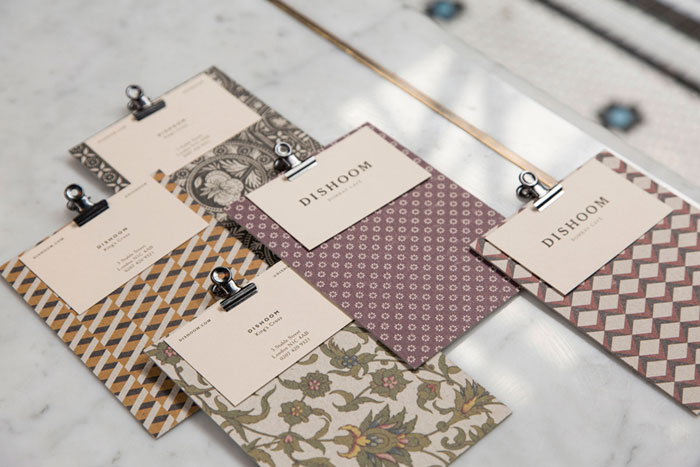
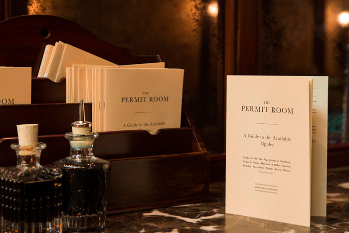
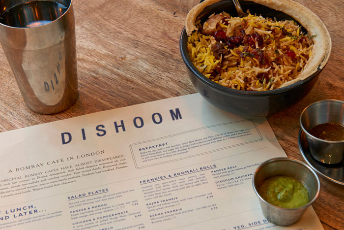
With & SMITH’s most recent project they helped to launch a new restaurant in King’s Cross – the Dishoom KX Godown. They worked on their new logo, menus, exterior signage, cocktail packaging and a number of other printed pieces.
Each Dishoom has its own back story, and this one is inspired by its location – an old railway transit shed. Dishoom imagined a young Irani in 1928, who sees the opportunity to start selling chai to railway workers, and slowly builds a ramshackle Irani restaurant. Dishoom King’s Cross is this restaurant decades later, now established, even something of an institution, and still serving the local people, railwaymen and office workers of the local area. The name itself – ‘Godown’ – is an old Indian word for warehouse.
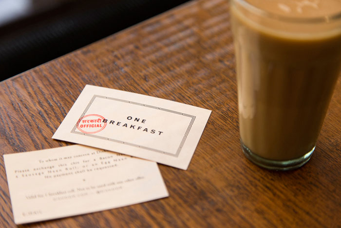
Inspiration for the look and feel came from old Indian train paraphernalia mixed in with the vintage Bombay style that runs right through all their restaurants. The designers worked with Kalapi Gajjar-Bordawekar, an expert in Indian typefaces, to make sure their style felt authentic.
