This post contains affiliate links. We may earn a commission if you click on them and make a purchase. It’s at no extra cost to you and helps us run this site. Thanks for your support!
Cordillera Font Review
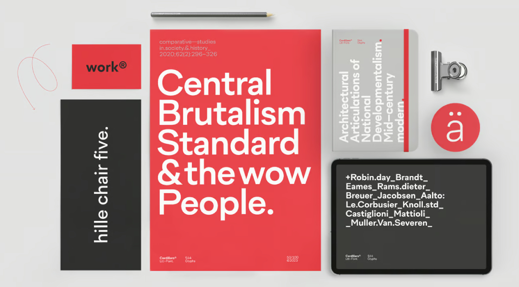
The Cordillera font family, meticulously designed by Luciano Vergara in the year 2023, stands as a testament to modern typographic craftsmanship. Hailing from the esteemed Latinotype foundry, this font family embodies a blend of clarity, simplicity, and remarkable versatility, making it a prime choice for a myriad of design applications.
At its core, Cordillera exudes an elegant seriffed style infused with classic proportions, seamlessly intertwined with geometric and neo-grotesque elements. This synthesis of design elements results in a font that transcends the boundaries of traditional typographic norms. The marriage of these features ensures that Cordillera offers a balance between the timeless and the contemporary.
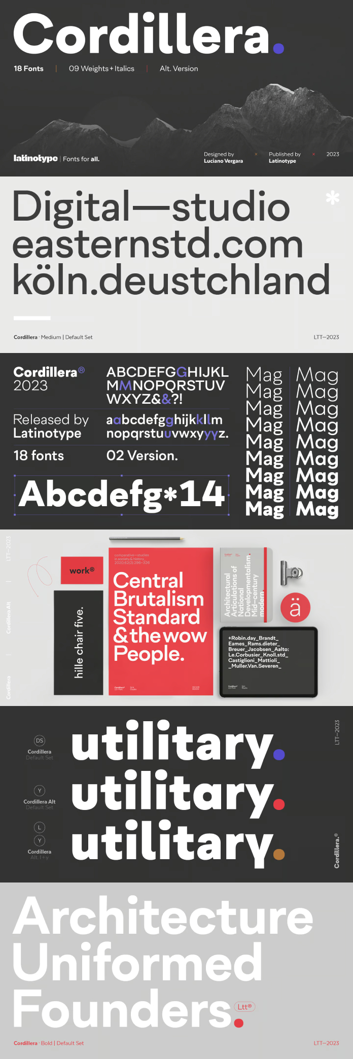
One of the standout features of Cordillera is its array of alternative characters, a thoughtful addition by the designer. These alternative characters open up a world of possibilities, enabling a smooth transition from bold and expressive titles to subtle and neutral body text, all while maintaining the overall harmony of the typographic system. This feature proves instrumental in allowing designers to tailor their compositions to suit various contexts and design requirements.
Cordillera’s beauty lies not only in its visual appeal but also in its functional prowess. The font family’s legibility is exceptional, making it a practical choice for both print and digital platforms. The characters are meticulously crafted, ensuring each letter flows seamlessly into the next, enhancing the overall reading experience. This attention to detail showcases Vergara’s dedication to ensuring that Cordillera is as functional as it is aesthetically pleasing.
Moreover, the font family’s versatility makes it a valuable asset for designers across industries. Whether it’s branding, editorial design, web design, or any other creative endeavor, Cordillera effortlessly adapts to the design intent, adding a touch of sophistication and modernity. Its ability to communicate messages with clarity and poise makes it an excellent choice for conveying information in a visually engaging manner.
In conclusion, Cordillera from the Latinotype foundry, designed by Luciano Vergara in 2023, is a remarkable font family that elegantly marries classic proportions, geometric elements, and neo-grotesque characteristics. Its versatility, harmonious design, and thoughtful inclusion of alternative characters make it an indispensable tool for designers seeking a font that seamlessly transitions between expressive titles and neutral body text. Cordillera is a testament to the ever-evolving world of typography, enriching the design landscape with its timeless yet contemporary appeal.
Feel free to find more font reviews of trending typefaces on WE AND THE COLOR.
Subscribe to our newsletter!

