This post contains affiliate links. We may earn a commission if you click on them and make a purchase. It’s at no extra cost to you and helps us run this site. Thanks for your support!
Conto, the basis typeface of the Conto super font family.
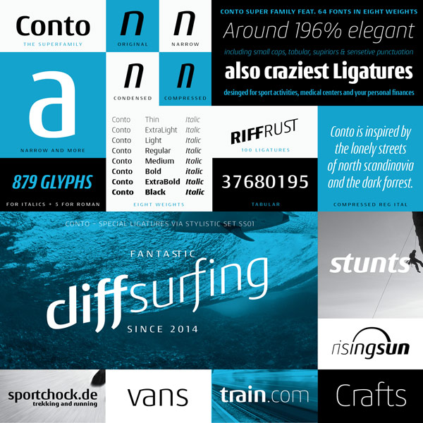
After our review of Nils Types’ Conto Slab font family, Nils Thomsen suggested me to have a look at the basic Conto typeface, which is the basis version of the entire Conto super family.
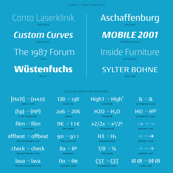
Just like the entire superfamily, Conto has been designed for professional typography. With its diverse weights, Italic versions, plenty of OpenType features and alternate characters, the typographic possibilities seem endless. You can use it for both large headlines as well as short text sections. The Conto font family works excellent in branding projects, packaging design or large-scaled advertisements. The minimalistic and significantly reduced lowercases are a striking feature of this family. With its extensive character set, Conto supports all common latin-script based languages. The great set of OpenType features includes small caps, old style numbers, superiors, diverse alternates, ligatures, ordinals, different arrows, and many more. All members of this superfamily are available as desktop fonts and webfonts.
Nils Thomsen worked for many years on the whole superfamily. The type designer says his inspiration for this simple geometric typeface came from the lonely roads of Scandinavia and the almost untouched nature. For additional information on this great typeface by Nils Thomsen, please follow the link below.
You can get this contemporary type family on MyFonts.
This sans serif font family is available for purchase on MyFonts.com
You can find more of our great font reviews here.







sweet