Art Direction, Graphic Design, Branding, and Packaging by studio Eskimo for roasting company Caffè Pagani.
The small family business was founded in 1949 by Giorgio Pagani in the picturesque town of Lugano, Switzerland. Today the roasting company is managed by the second generation of the family. These “craftsmen of good taste” (as they call themselves) produce aromatic mixtures of finest coffee mainly for hotels, restaurants, and cafes as well as private consumers and offices. Read more below.

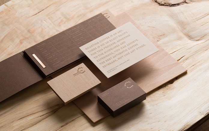
Russian design studio Eskimo was commissioned to develop a new brand identity which refers to the years of experience and the high quality of the coffee. The entire roasting process is based on circles, therefore it’s no surprise that the design team came up with the idea of creating a round logo as a metaphor for the circulation during the roasting process.
The coffee packaging design concept.
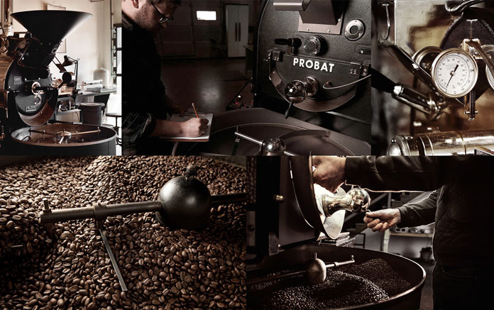
The round packaging is inspired by the look of an old roasting machine, which usually had the shape of a cylinder with a round thermometer on the front side. The designers transformed these typical details into a unique and lovely packaging design to convey the idea of freshly roasted coffee beans. A short logo version was designed to symbolize circulating coffee beans during the entire roasting process. Each mixture has its own name and a capital letter for quick identification. Therefore, the letter E is used for Espresso, G for Grani Naturali, etc. Only natural materials have been used in different shades of brown colors in order to convey the traditional craftsmanship of roasting and most of all the coffee itself. The following images give you an impression of studio Eskimo’s sophisticated work.
For more of studio Eskimo’s graphic work, please check out some of our older features or visit their website.


You want to see more stunning brand identities and packaging concepts? Feel free and check out our Graphic Design, Branding, and Packaging categories.


